

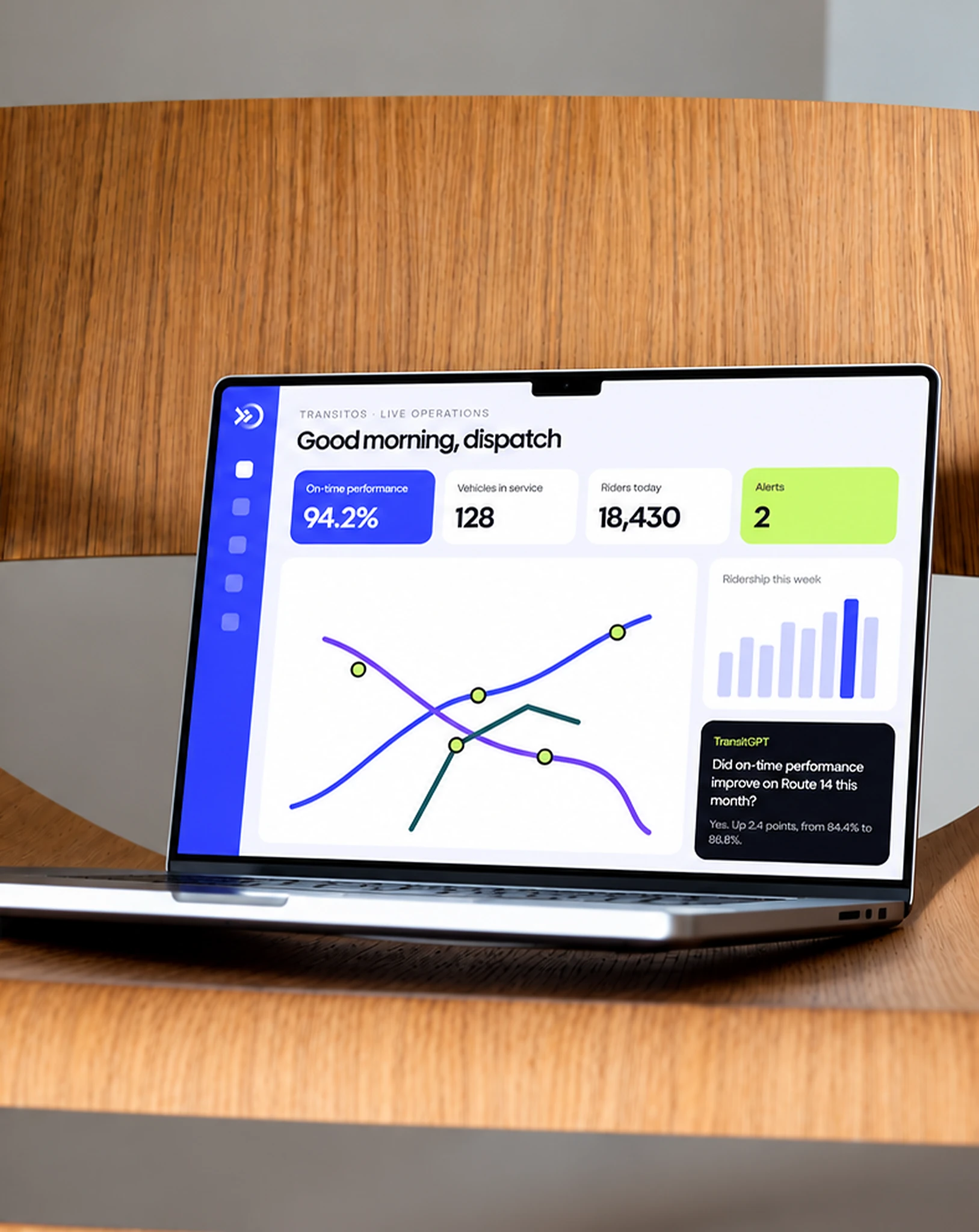
ETA Transit builds the technology transit agencies rely on every day: CAD/AVL, automatic passenger counting, rider information and TransitOS, its AI-powered operations layer. Align created a new identity for ETA that carries the same promise as its products: every vehicle moving, every rider arriving on time.
“Align.vn has done an amazing job.”
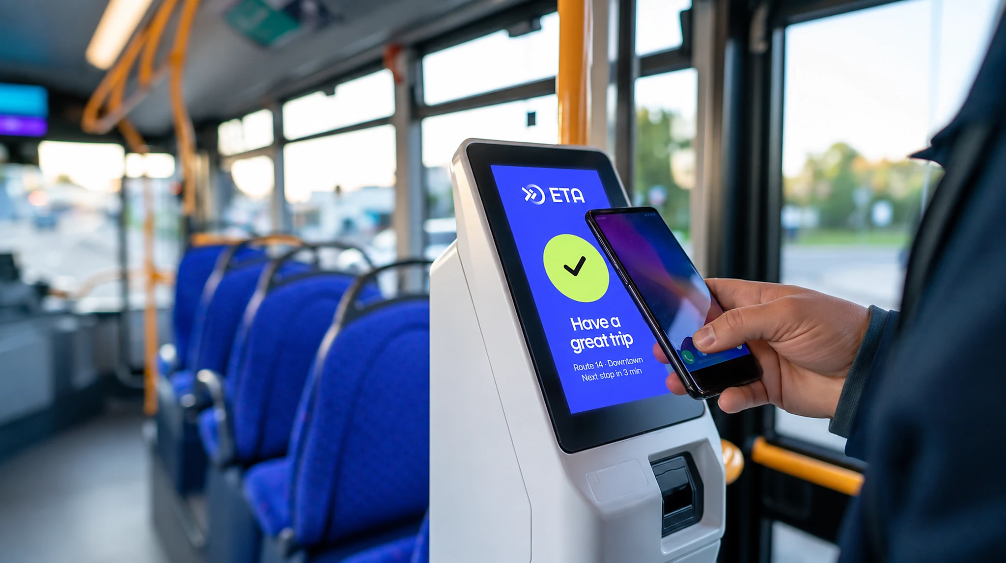
ETA had grown from a single CAD/AVL product into a connected platform, with new AI products like TransitOS and TransitGPT on the way. The old identity still looked like a niche hardware vendor. It was hard to read at small sizes, inconsistent from one product to the next, and did not work as an app icon or on the screens inside a bus. ETA needed one mark that agency leaders would trust, drivers would recognize at a glance, and every new product could sit under.
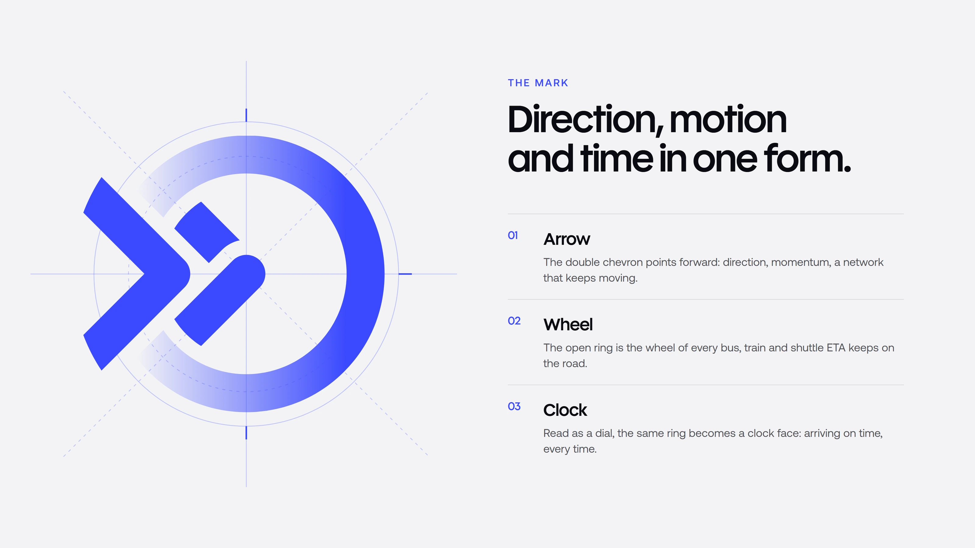
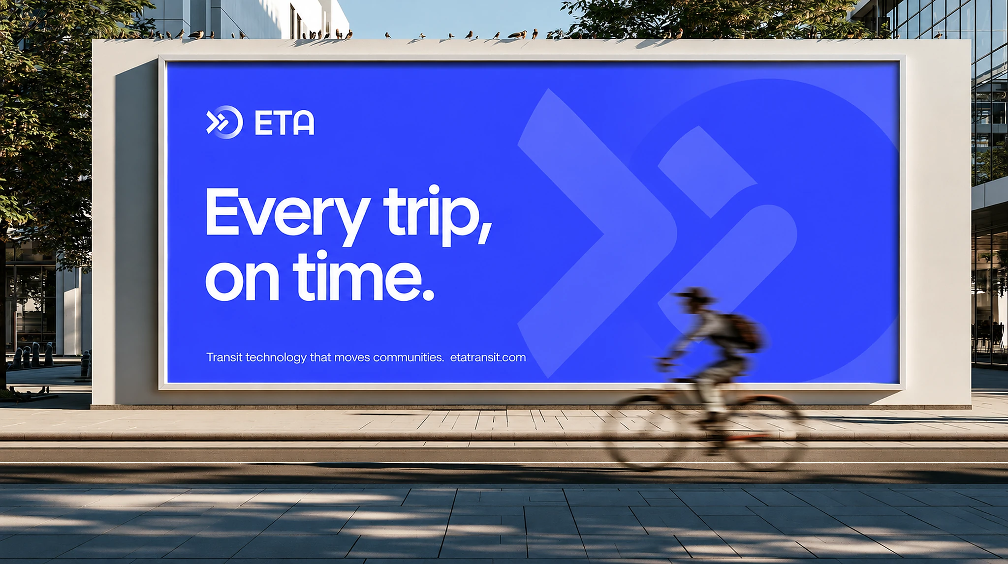
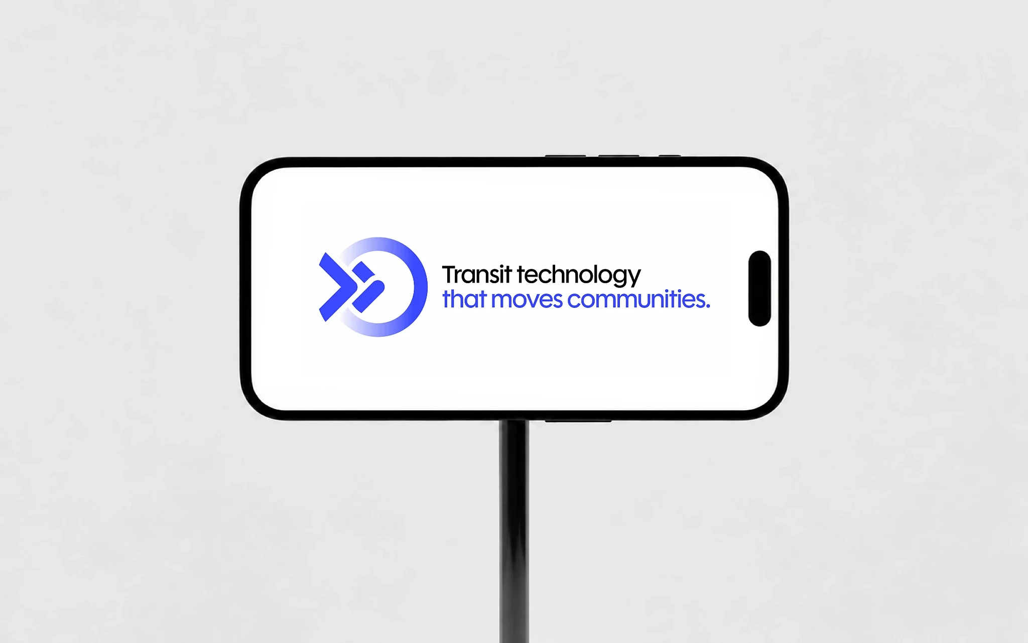
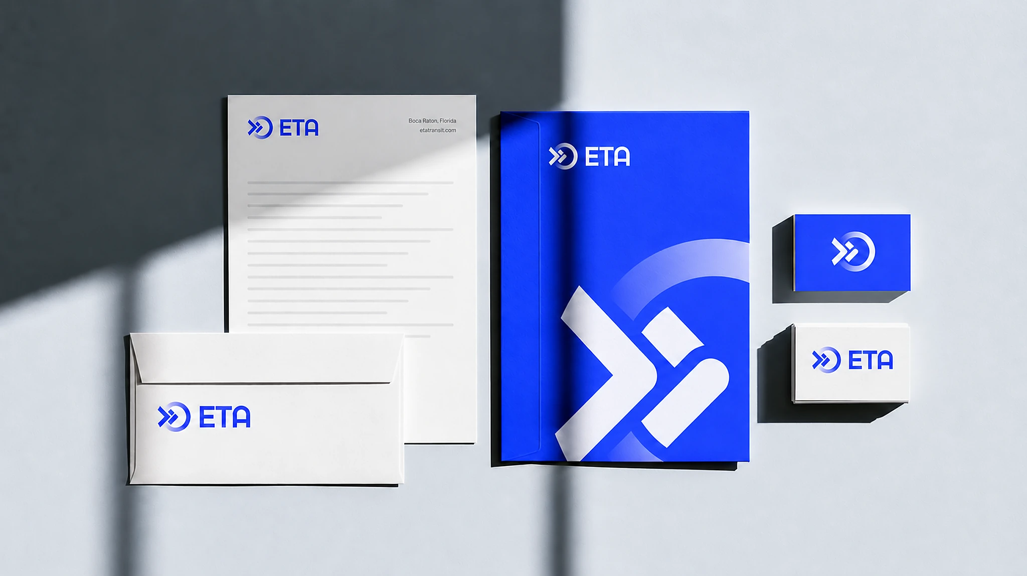
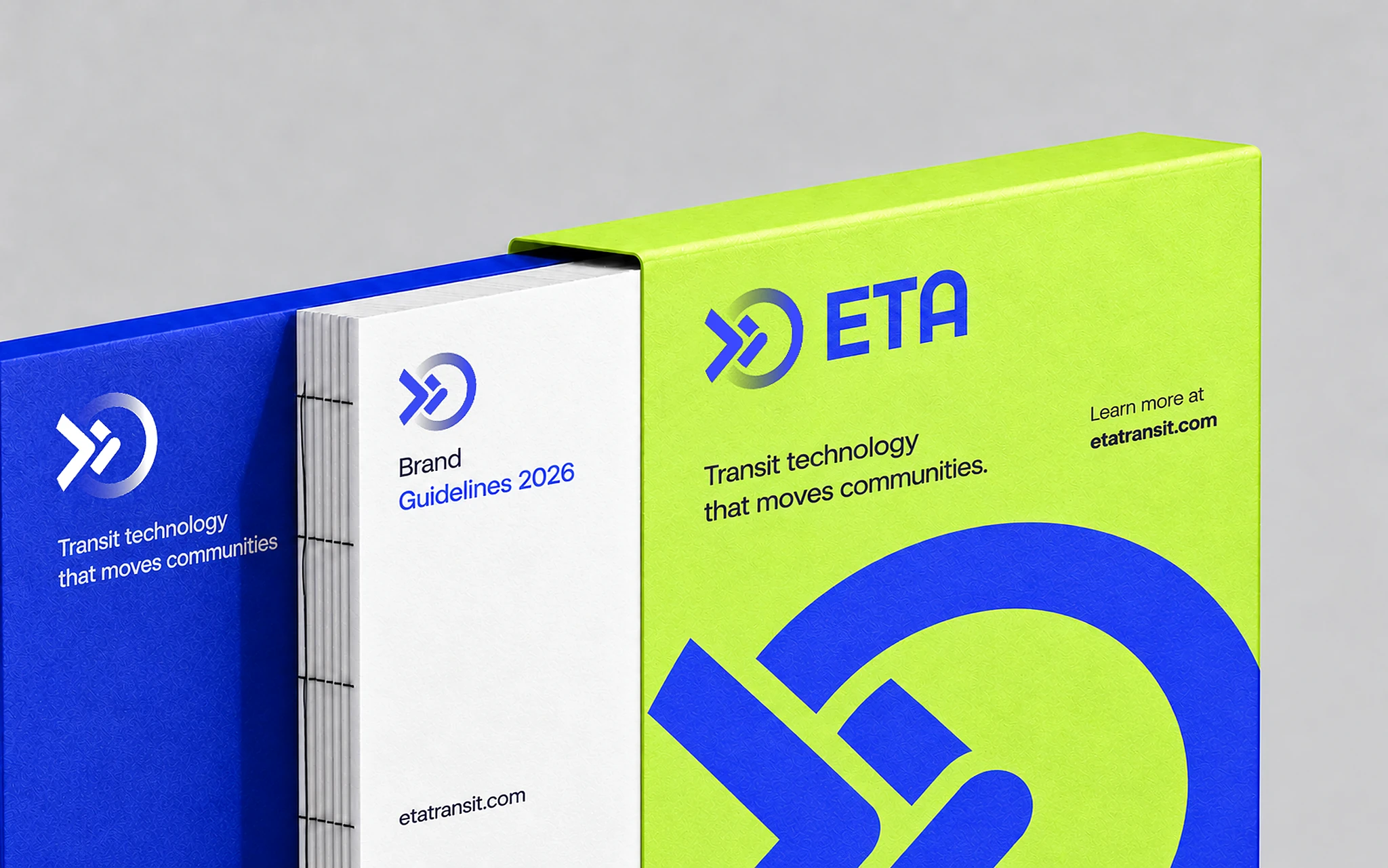
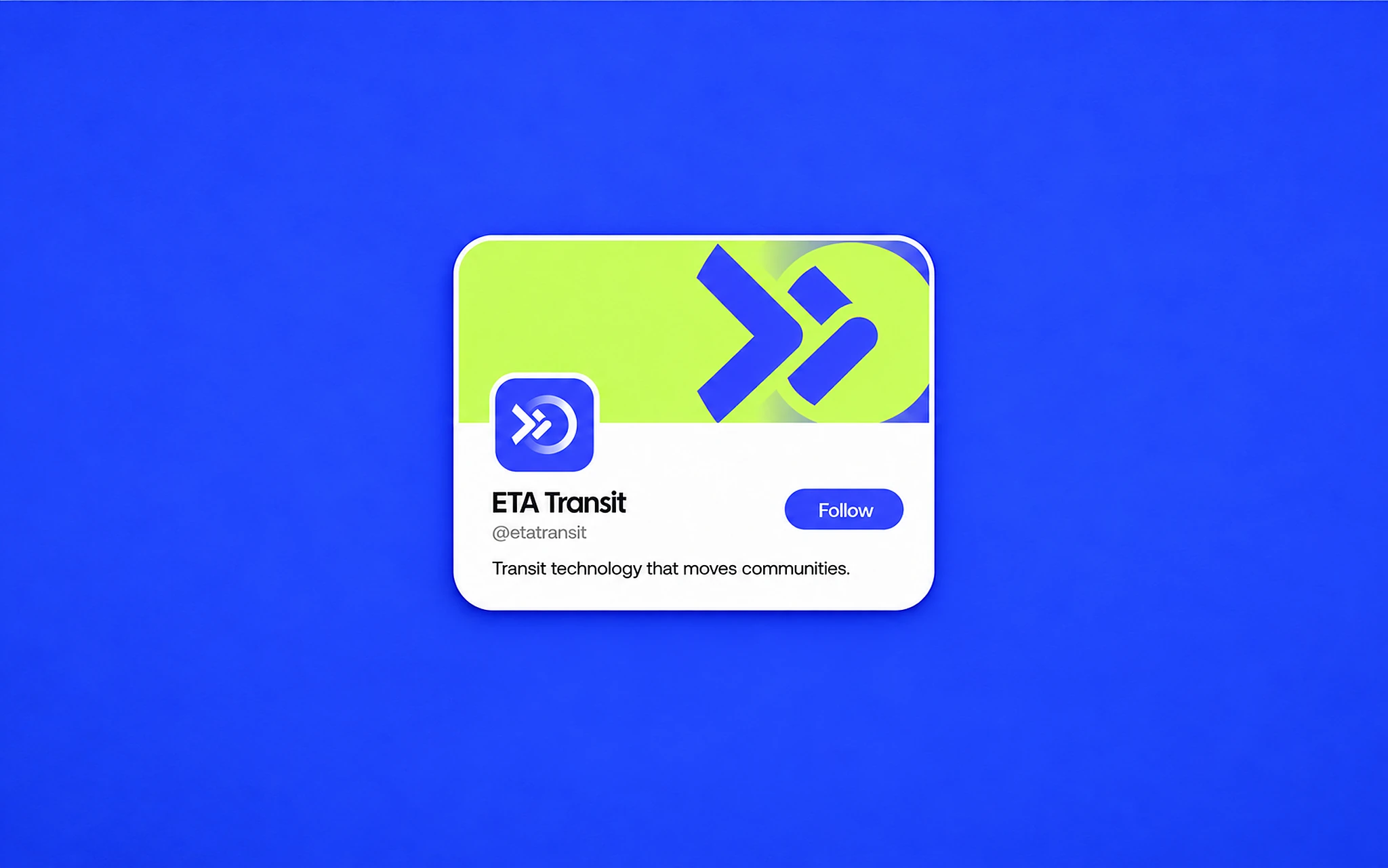
The mark brings three ideas into one form. The double chevron is an arrow: direction, momentum and a network that keeps moving. The ring around it is a wheel, the bus, train or shuttle on the road. Read as a dial, the same ring becomes a clock, the promise behind the name: Estimated Time of Arrival, kept. The ring fades as it closes, so the mark feels like it is still in motion.
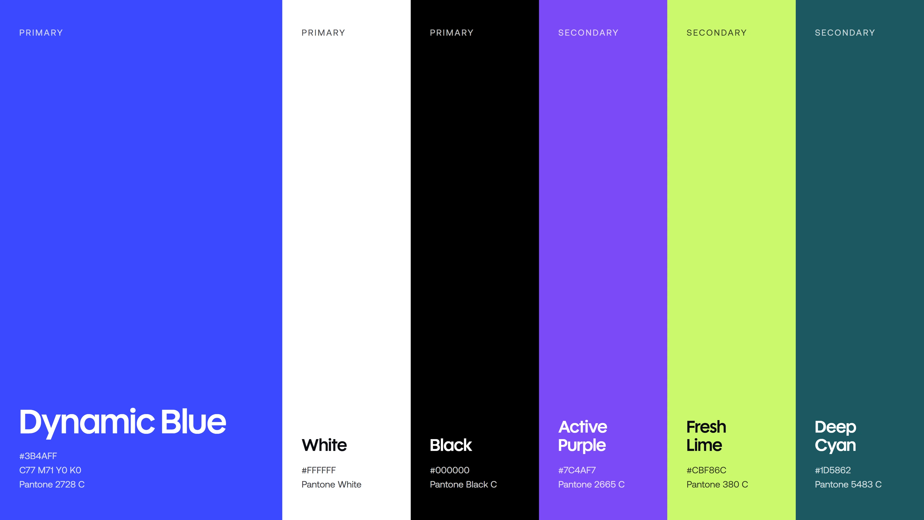
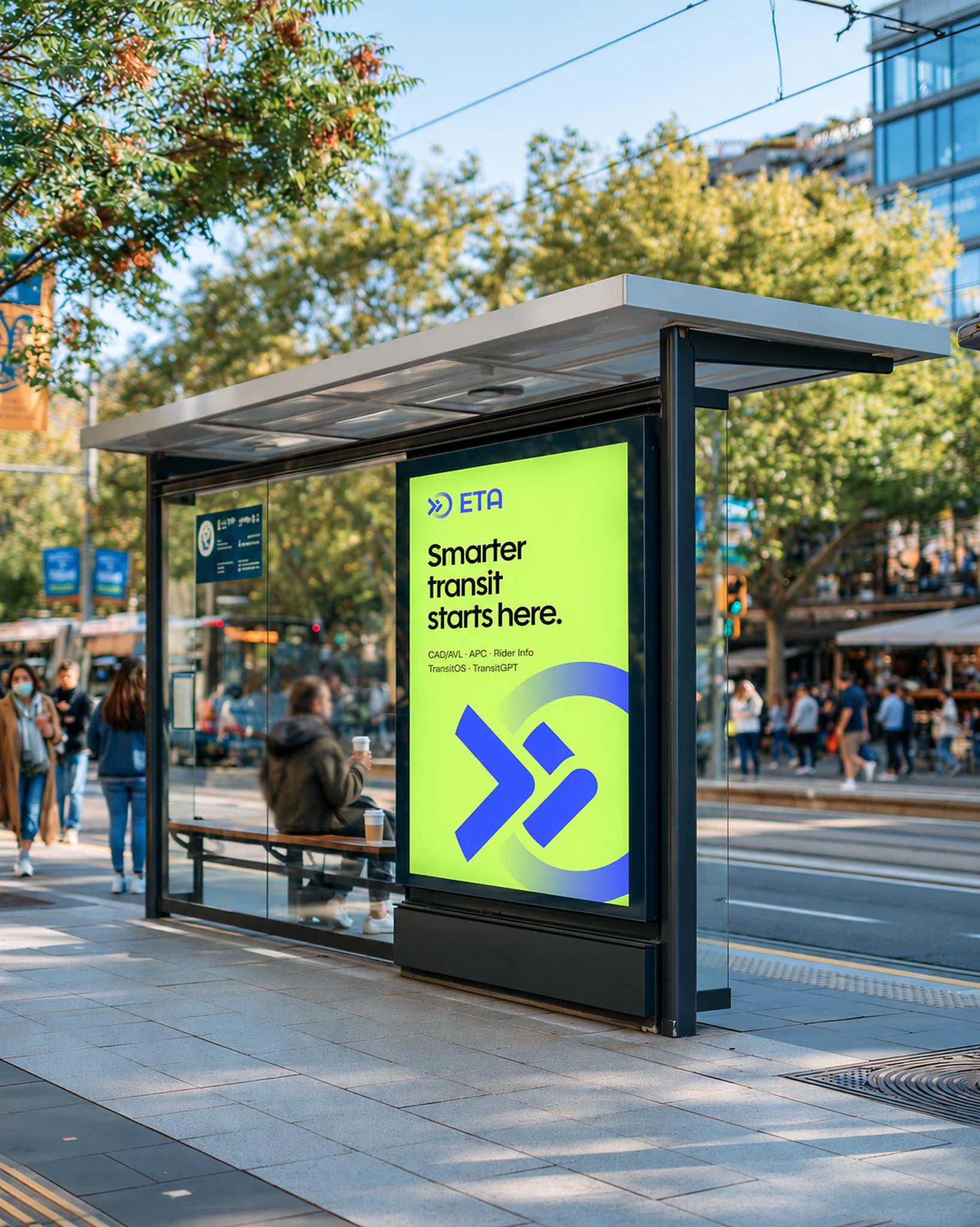
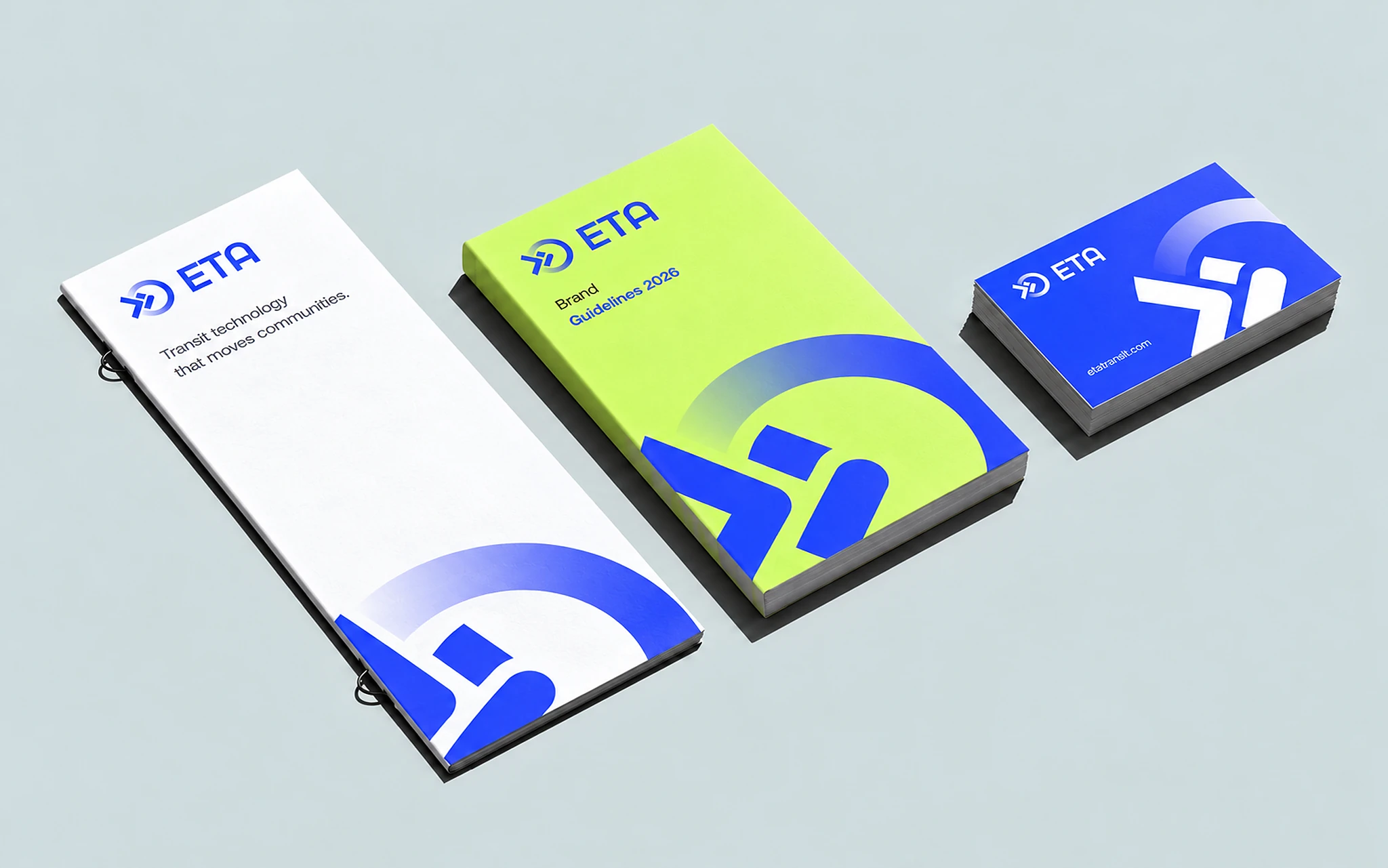
Dynamic Blue leads the system: bright, confident and easy to spot on a vehicle, a screen or a bus stop. White and black keep layouts clean. Active Purple, Fresh Lime and Deep Cyan support data, product lines and campaigns without competing with the blue.
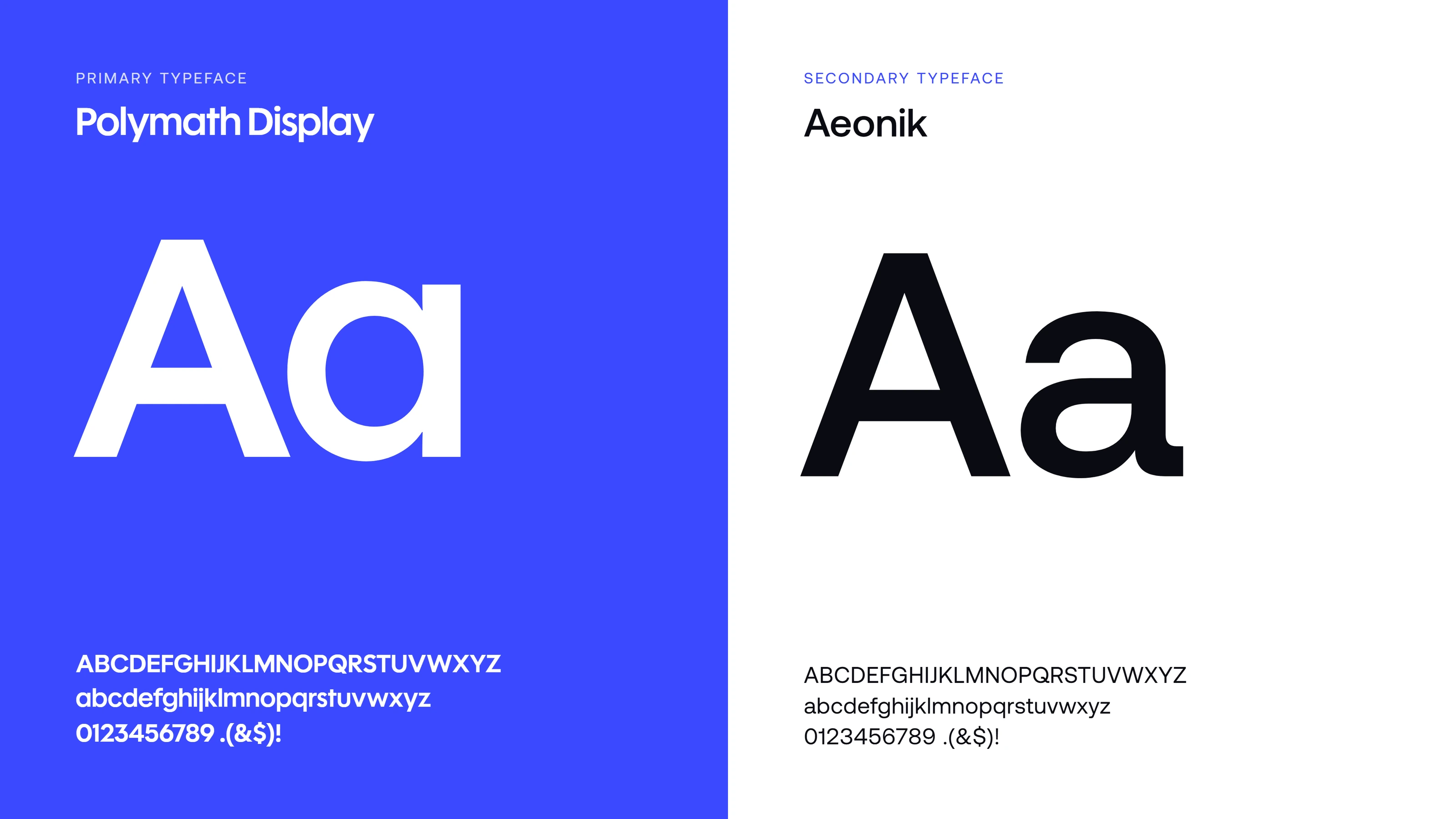
Polymath Display gives headlines a geometric, engineered voice that matches the mark. Aeonik handles everything else, from timetables to dashboards, with open forms that stay clear in long reading and on small screens.
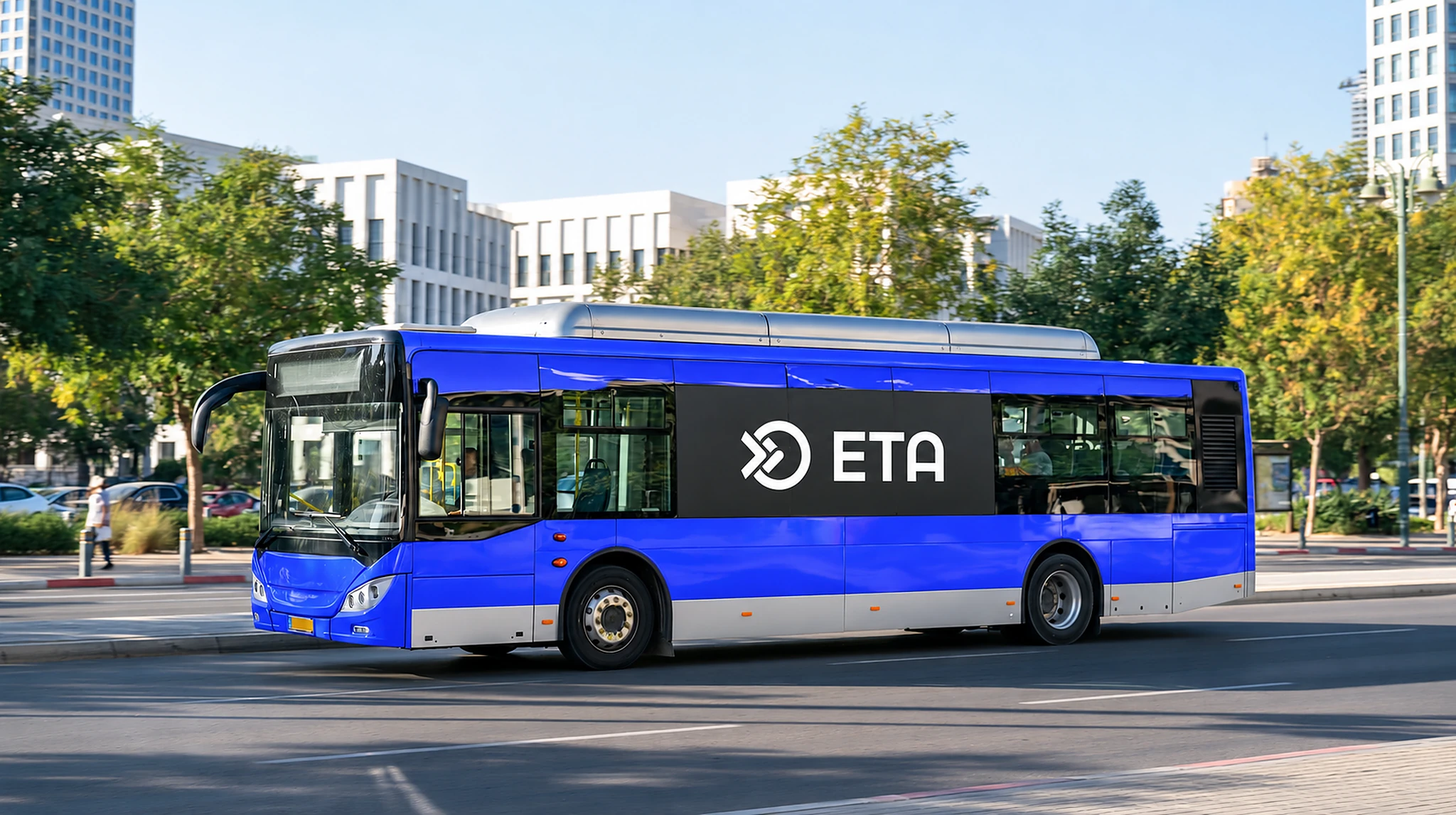
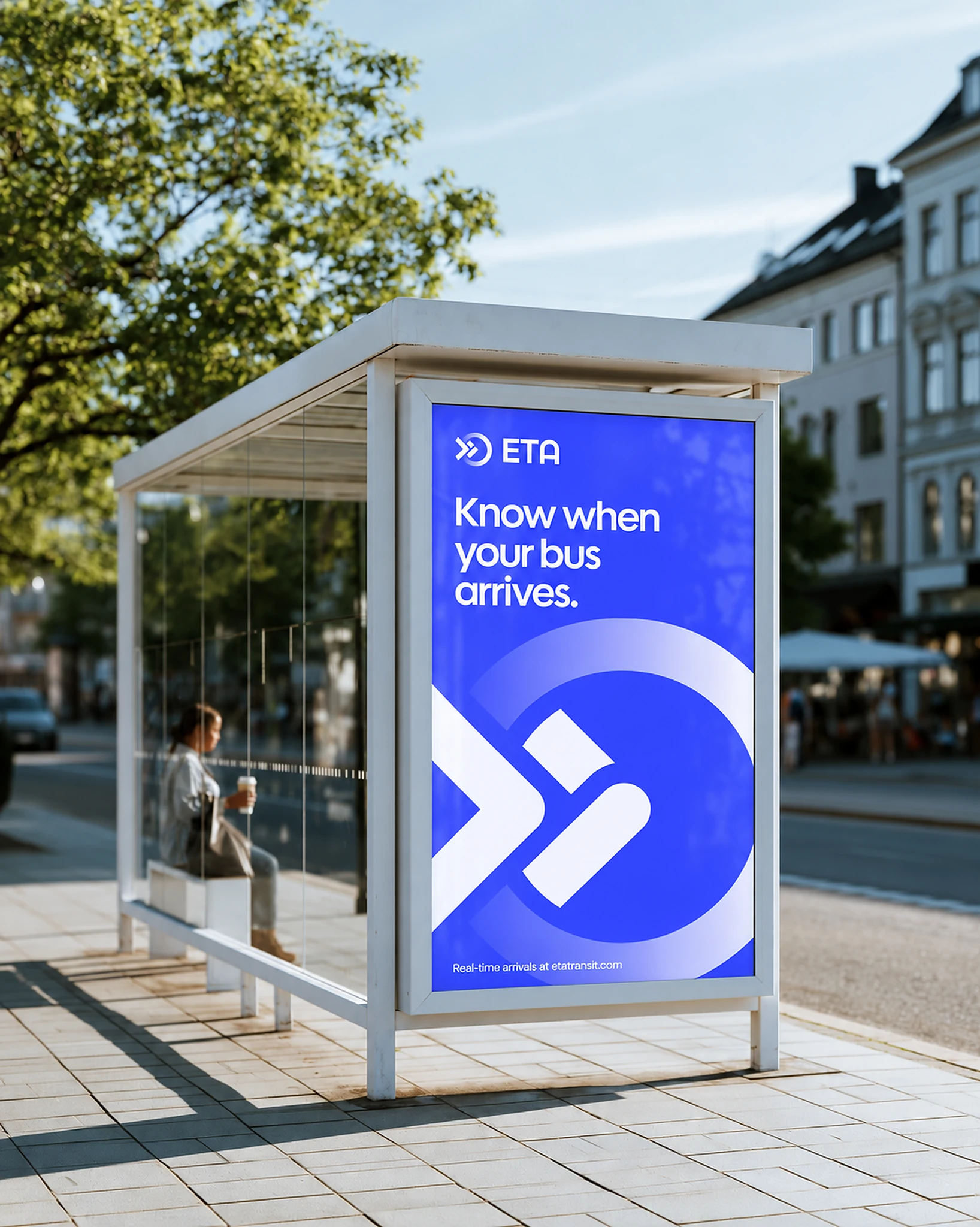
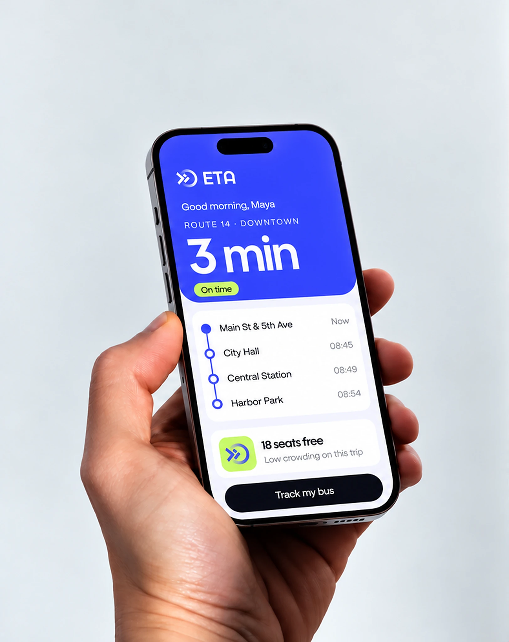
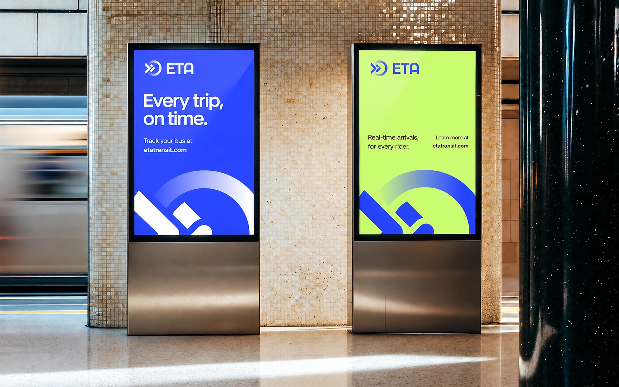
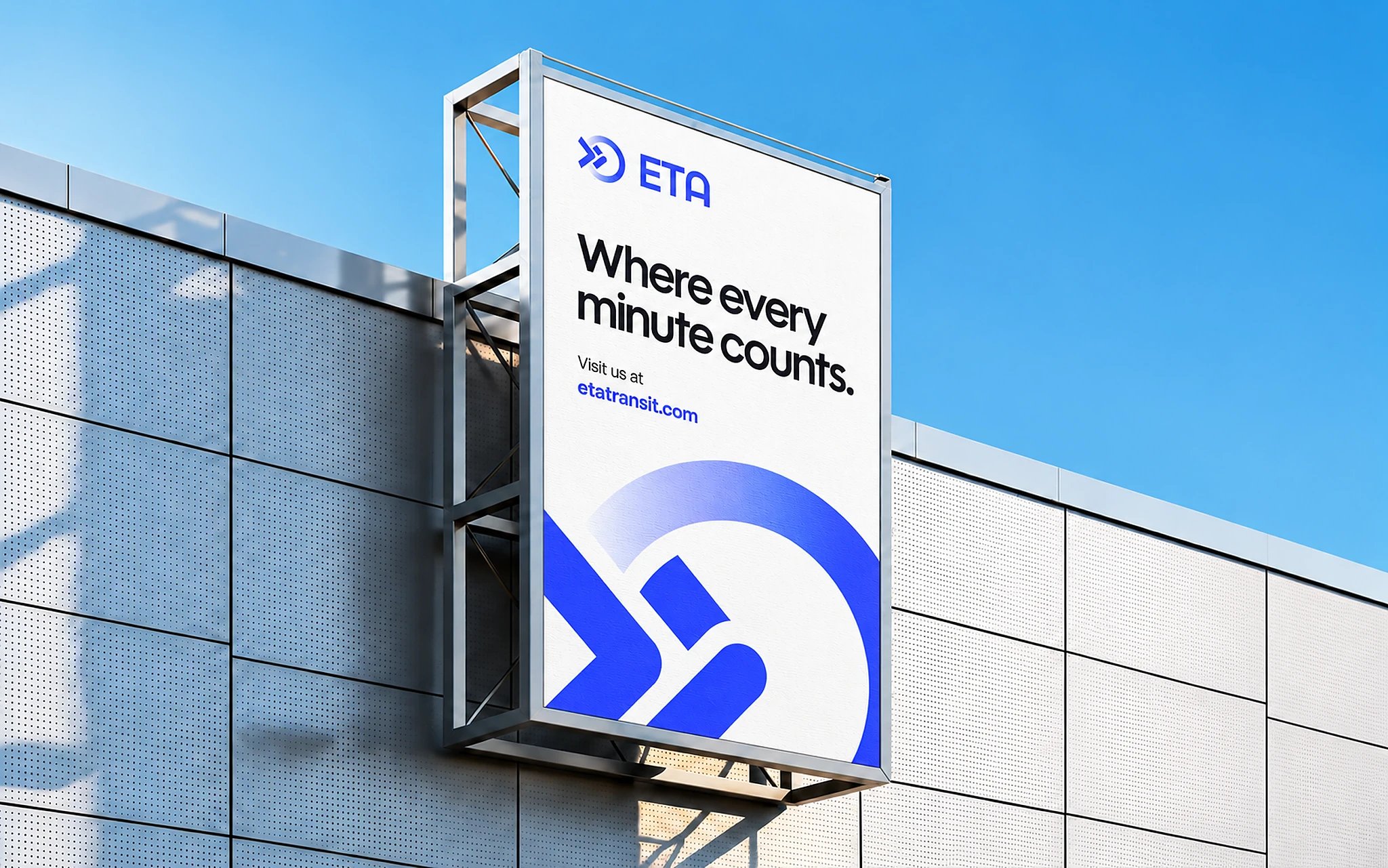
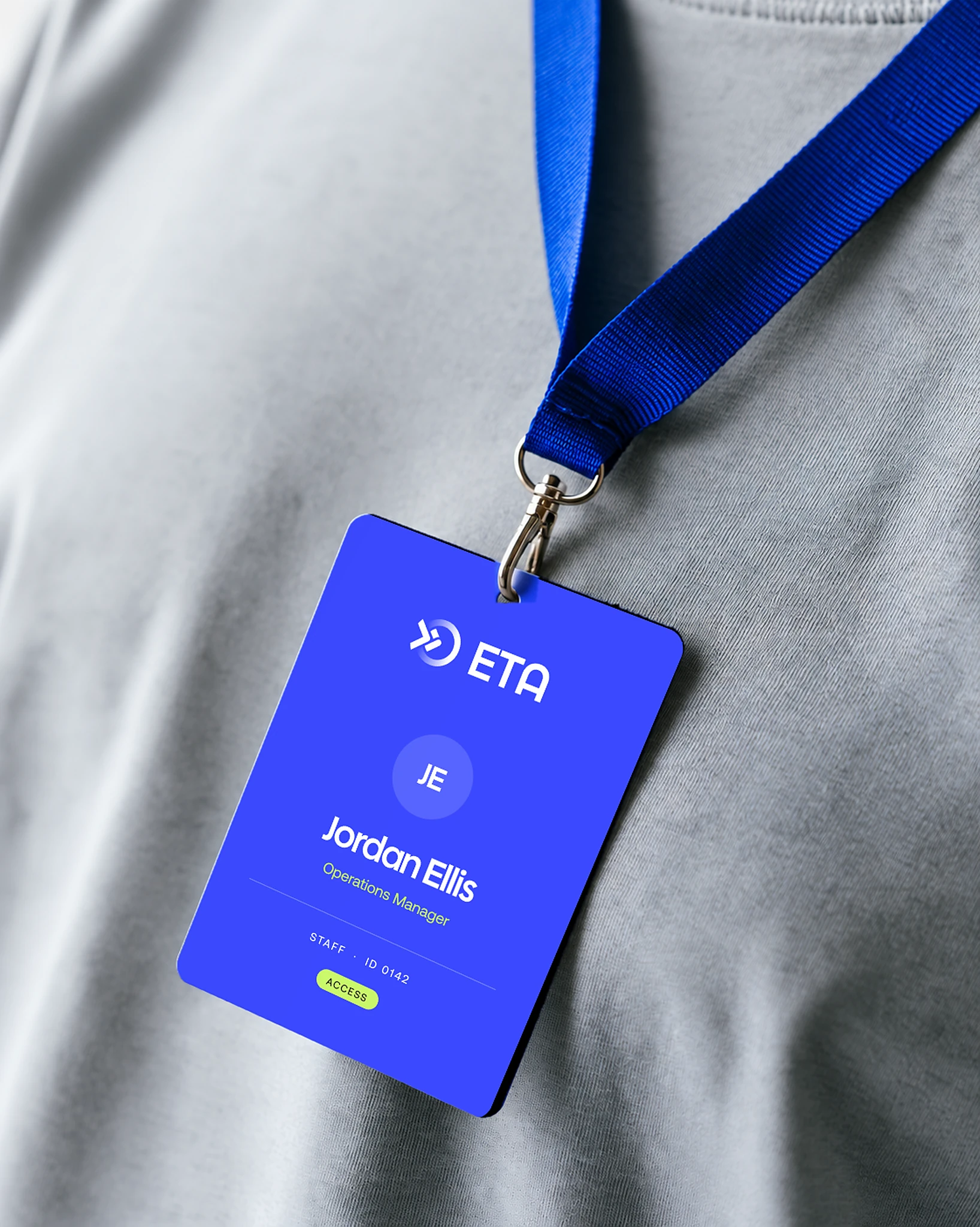
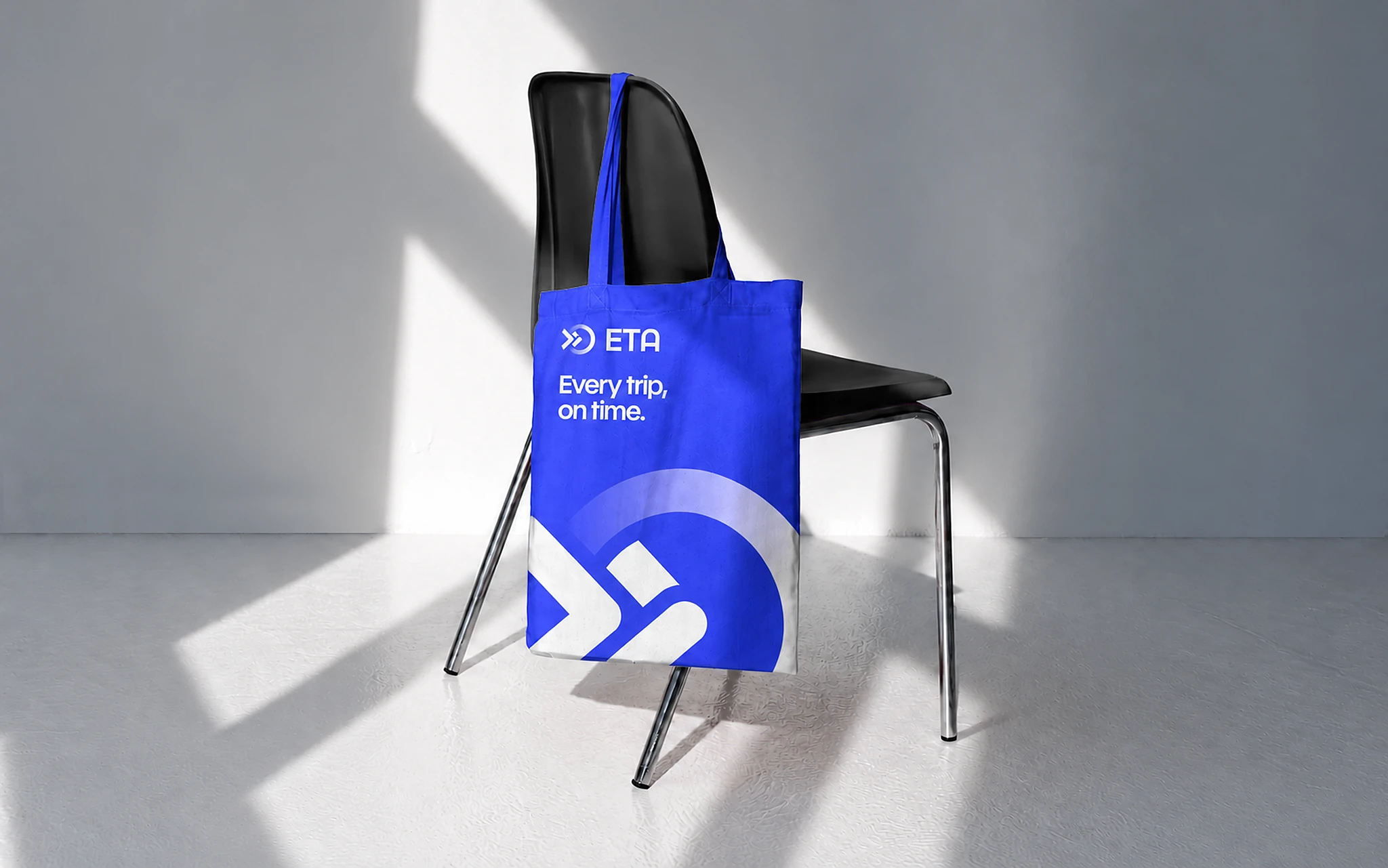
The identity was built for the places riders actually meet ETA: on the side of a bus, at the stop, on the fare validator and in the app that says when the next one arrives. The full mark, scaled up and rising from the bottom edge, became the one graphic device that ties posters, screens and print together.


-
One mark across every product
The ETA platform, TransitOS and TransitGPT now share one family look.
-
Built for small sizes
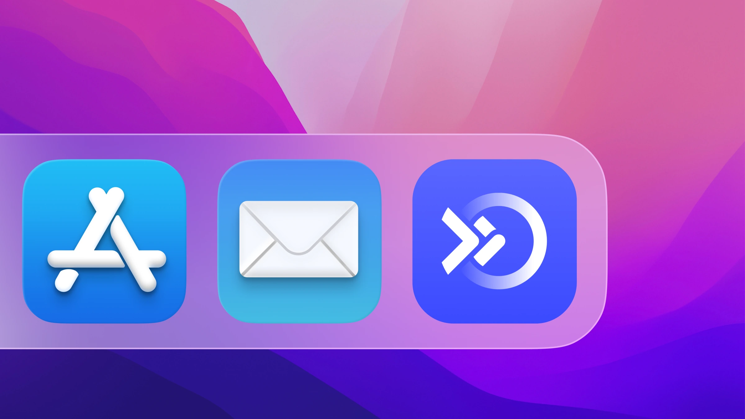
Clear as an app icon, a favicon and on in-vehicle displays.
-
A complete guideline
Logo, grid, clear space, colors, typography and applications, so ETA and its partners can apply the brand on their own.
-
Carried into the website
The identity runs straight into the new etatransit.com, designed and built by Align.

