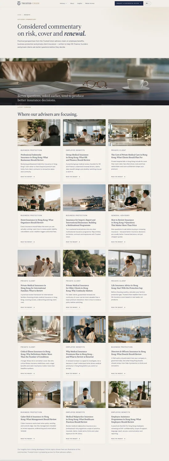
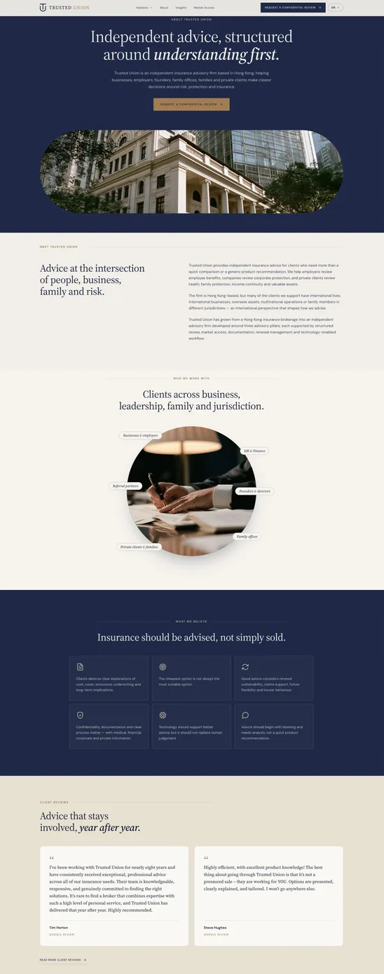
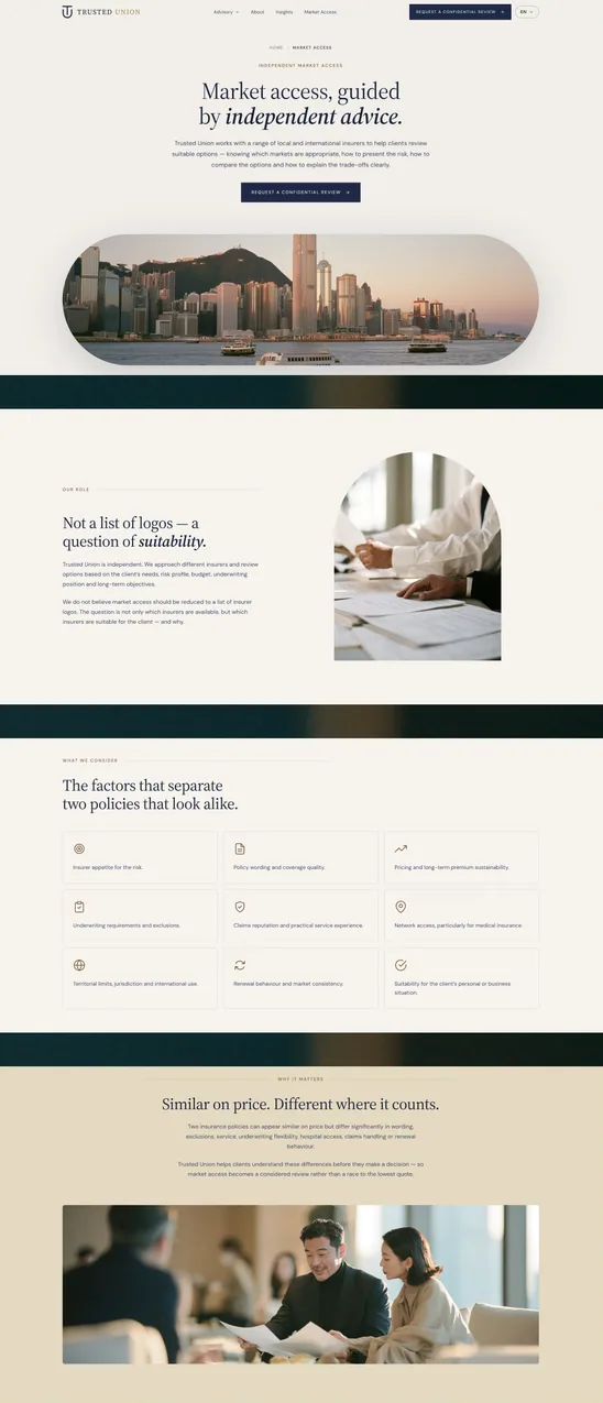
Trusted Union is an independent insurance advisory in Hong Kong, licensed by the Insurance Authority as a broker. It advises companies and private clients across employee benefits, business protection and private client cover, and it competes with firms many times its size by being the adviser that actually stays involved, at renewal and at claim. Then its website was hacked. Pages nobody at the firm had written were sitting at the firm's own address, and those were the pages a prospective client, a partner or an investor would meet first. A licensed advisory sells trust before it sells anything else, so this was not a redesign that could wait for a redesign's timetable. Align replaced the whole thing: the structure, the design system, the copy layout and a working 52-page front end in plain HTML and CSS, handed over seventeen days after the first commit, which our own developers then converted to WordPress.
A compromised site, live, with the clock running. The old install could not be cleaned and kept; anything left of an infected theme, plugin or database row is an invitation to the same thing happening again. It had to be replaced, and a 52-page advisory site is normally three to four months of work. We do not run the stages one after another and we do not hand the whole job to a model either. Design, copy and build run on the same pass, each with a person directing an AI that drafts, generates and converts at a speed no studio schedule accounts for, and each with that person responsible for what ships. Seventeen days from the first commit to the full 52-page front end handed over for conversion. Nothing came across from the old install: new repository, new markup, new images, so there was no infected file left to inherit.
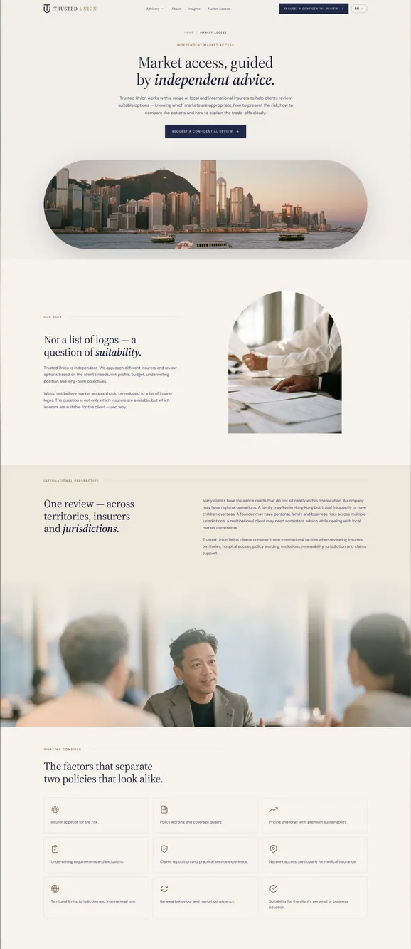
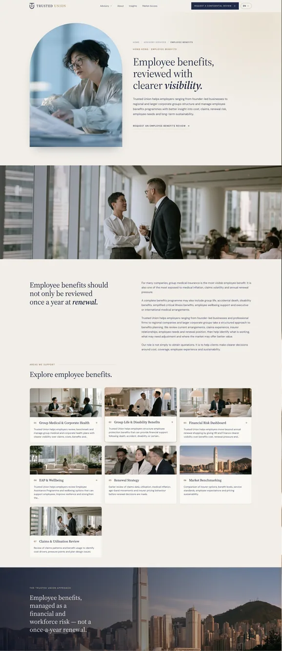
Everything on the page is regulated. A licensed broker cannot write marketing copy the way an agency normally would: no implied guarantees of cover, no invented review counts, no star ratings, no claim that a policy will pay. The client testimonials came with an approved brief that set its own rules, the client's own words only, shortened but never rewritten, one job title approved and no others, and no partner logos. Fourteen reviews had to be placed across nine pages without a single one being touched up.
Built as code first, converted to WordPress after. The site was designed and built as plain HTML and CSS before any of it touched a CMS, and only then converted. Working in that order is deliberate: the code version is where the design gets settled, with nothing hidden behind a page builder and nothing agreed in a static mock-up that falls apart in a browser. But 52 pages written out by hand is how sites rot, a footer link gets added on thirty pages and forgotten on twenty-two. We wrote a generator that reads the client's own copy documents and emits 45 of the pages, leaving six hand-authored pages that the generator still keeps in sync, with one 2,500-line stylesheet serving all of them. The constraint underneath every decision: whatever we designed had to map cleanly onto WordPress templates and repeatable fields, or the conversion would mean designing the same page twice.
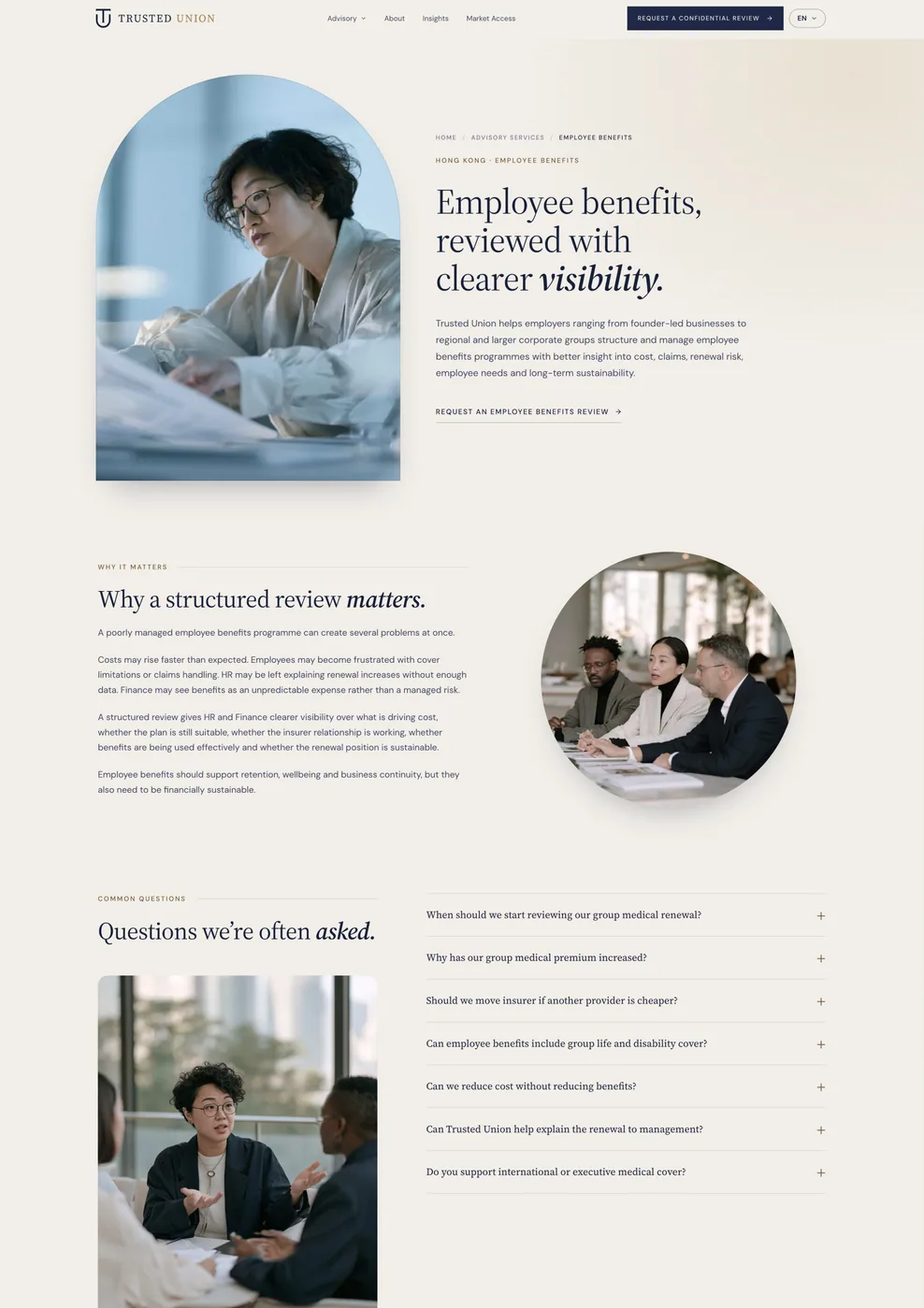
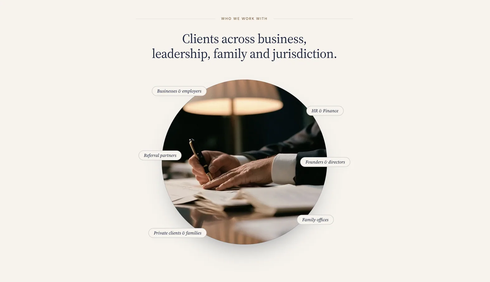
The imagery carried other people's trademarks. Part of the private client section had been illustrated with branded photography: maker's marks, branded packaging, warranty papers. For a regulated broker that reads as an endorsement nobody has agreed to. Every image in the section was audited, the branded photography replaced with brand-free alternatives, and the alt text rewritten to carry no manufacturer name.
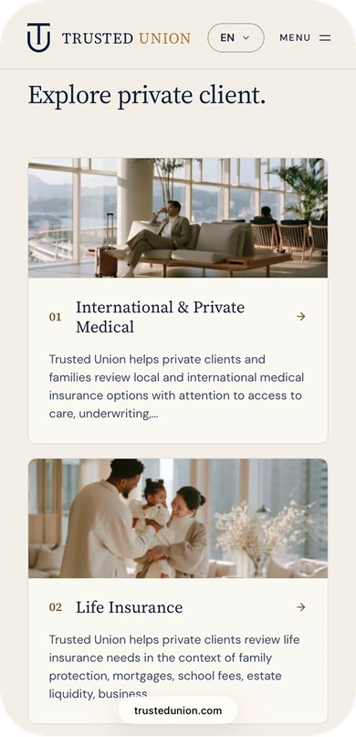
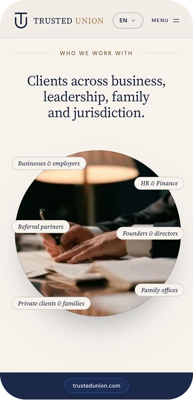
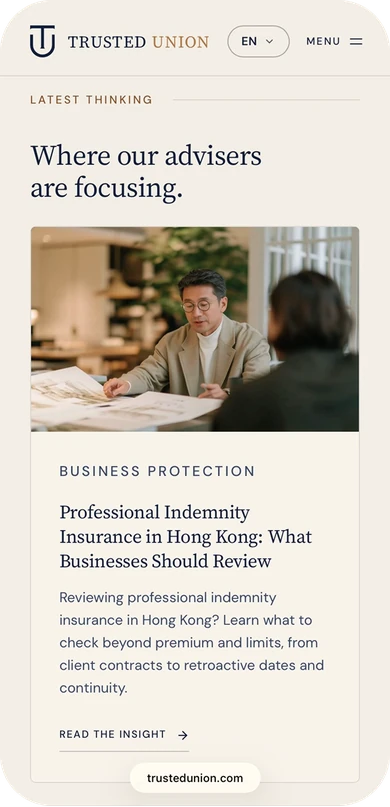
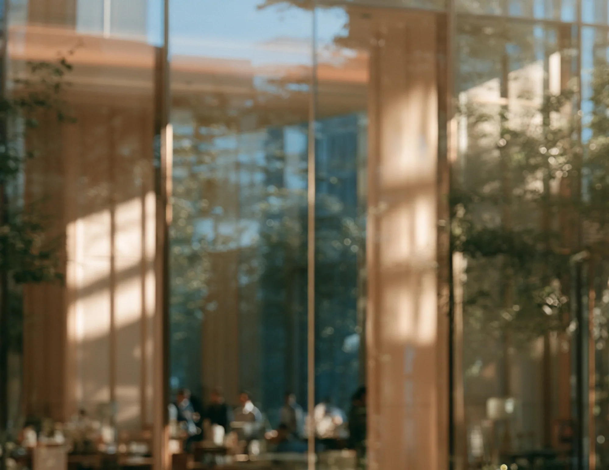
AI-generated photography needs a human pass. We art-directed the replacement imagery rather than buying stock, which is faster and gives the site a look of its own, and brings its own defects. Book spines came back with lettering that was almost, but not quite, language. Watch dials carried text no watchmaker would print. Each one was either retouched or rejected and regenerated, and where retouching looked worse than the flaw we left the original and said so. Then the crops: a square photograph in a fixed-height full-width band loses more of its subject the wider the screen gets, which cut the head off a portrait at 1900px while looking perfect at 1280px. Both bands were rebuilt with viewport-relative heights and per-image focal points.
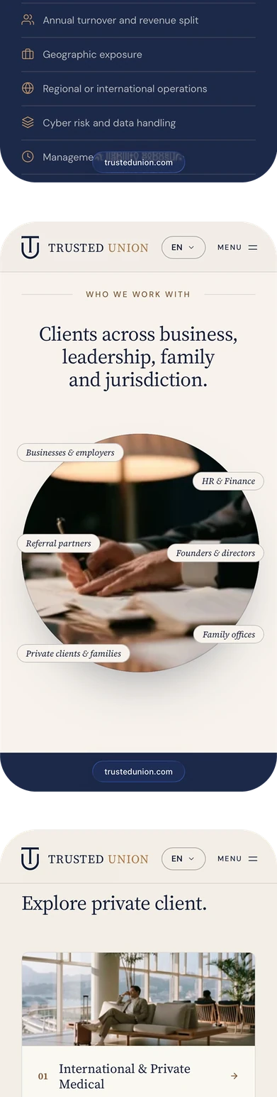
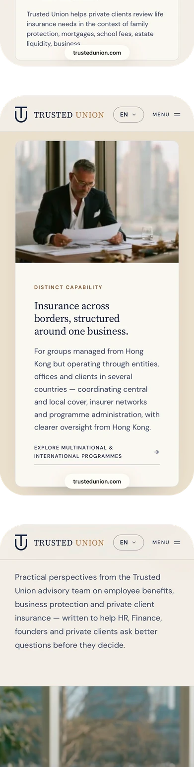
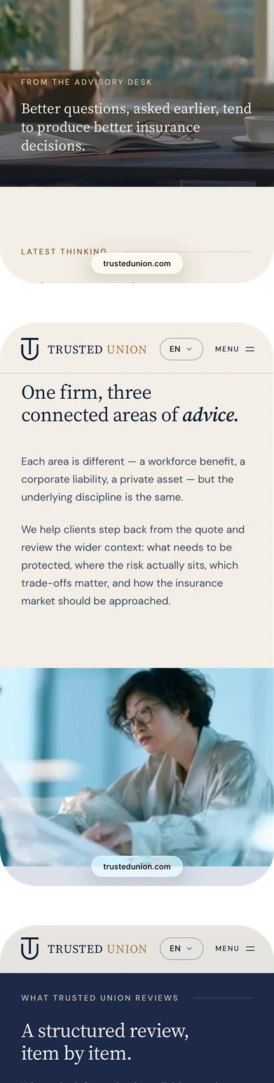
The brand's accent colour failed its own contrast check. The bronze that carries the brand reaches only 3.3:1 on the light background, which is fine for a rule or a border and not legible as 11px uppercase label text. Rather than drop it or let it ship illegibly, we split it: a decorative bronze for lines, bullets and buttons, and a deeper text-safe bronze for anything a person has to read.
Seventeen days from the first commit to a 52-page advisory site handed over for conversion. The planted pages went with the old install, and what replaced them is compliant by construction, consistent on every page, clean in search, and settled in a browser before a line of it was converted.
-
Nothing Left of the Compromise
The site was rebuilt from an empty repository rather than cleaned in place, so no infected theme, plugin, file or database row survived into it. Every page at the address is a page the firm wrote, and the search result for the firm's name is the firm again.
-
Advice Structured Like Advice
Three pillars, sixteen service pages and fifteen insight articles, organised so a visitor lands on the cover they came for and finds the next question answered beneath it.
-
One Source of Truth for Every Review
Fourteen client reviews live as structured data, placed across nine pages from one file. Changing a review is one edit and a rebuild, never a search across 52 pages.
-
Compliance Built Into the Build
Regulated copy, licence disclosure, the four legal pages and the testimonial rules are part of the system, not a legal pass bolted on at the end.
-
A Design System, Not a Set of Pages
One 2,500-line stylesheet, a documented token set, a contrast-safe accent, reduced-motion support and a published design-system page, so the site still looks like itself on the page nobody has designed yet.
-
Imagery That Carries No One Else's Brand
An art-directed image library with no third-party trademarks, generic alt text, and responsive crops that keep the subject in frame from 375px to 1900px.
-
A Hand-off That Survives the Conversion
The design did not stop at a file. Tagged releases, a changelog written for the WordPress build rather than for git, implementation notes with live preview links beside code links pinned to the exact lines of a release tag, and the review set exported as structured data ready to import. Nobody on the build had to guess what changed.
Google PageSpeed Insights on the live site, each category scored out of 100, with the site audit crawl beside it.
- 98Performance
- 93Accessibility
- 100Best Practices
- 100SEO
- 100Performance
- 93Accessibility
- 100Best Practices
- 100SEO