
B2B Website UX Audit: What to Check and Why

A B2B website can look polished and still make it hard for a buyer to understand the offer, find proof or take the next step. A UX audit finds that friction before you spend money on a full redesign or more content.
This guide explains what a B2B website UX audit should check, how to run one and how to turn the findings into a plan. It is written for founders and marketing leads who need findings tied to business results, not opinions about colors.
Quick Answer: What Is a B2B Website UX Audit?
A UX audit is a structured review of how people use your site to do the things that matter: understand the offer, compare options, find proof and get in touch. It combines analytics, Search Console, sales and support feedback, a few usability sessions and an expert review. It checks five areas: navigation, message clarity, proof, conversion paths and mobile use. The output should be a short list of problems, each with evidence, the pages affected and a next step.
If you want a second pair of eyes on your site before deciding on a redesign, send Align the address and tell us where you think buyers get stuck.
Start With Business Goals and Real Tasks
Write down what the site should help people do. Understand a service. Compare products. Read a case study. Book a call. A UX audit works when it tests real tasks, not taste.
Then list the people involved in a purchase. A marketing lead may be shortlisting agencies. A technical reviewer may be checking integrations or security. An executive may want the business case in one screen. They do not need separate websites, but they need different information at different moments.
Pick a few high-value journeys and walk through each one:
- Home, then a service page, then a case study, then the contact form
- A search result, then an article, then the related service page
- A pricing question, then the answer, then a next step
At each step, ask whether the next choice is obvious.
Five Areas a B2B Website UX Audit Should Check
1. Navigation and structure
Can a first-time visitor tell where to start? Do the service names mean anything to someone outside your company? Check for pages that are buried, duplicated or grouped by your internal teams instead of by what customers look for.
Test the mobile menu separately. A menu that works with a mouse can be awkward on a phone or with a keyboard. Focus states should be visible, and the menu should close without trapping anyone.
Data Society is a clear example. Visitors came for one of two services, and a cluttered menu buried both. Align rebuilt the structure around the two offers and gave each page a clear hierarchy, so a visitor reaches the right one in a click or two.
2. Message clarity
In the first screen, can a buyer tell what you do, who it is for and why it matters to them? Does each page answer one main question? Do the headings describe the content, or are they clever lines that hide it?
Look for unexplained acronyms, walls of text, several competing buttons and claims with nothing behind them. A clear page does not have to be short. It needs a structure that lets people scan, then go deeper. A quick test: ask someone outside the business to summarize a page after thirty seconds.
3. Proof and trust
B2B purchases involve budget, risk and several people. Buyers need evidence that you understand the problem and can deliver. Check whether case studies explain the challenge, the decisions and the result, whether testimonials carry names and roles, and whether claims are backed up.
Put proof next to the question it answers. A service page should link to a relevant project, and the project should link back to the service. The ETA Transit case study shows why: each product page follows the same order, problem, approach, proof and next step, so agency leaders, planners and IT teams each find their part.
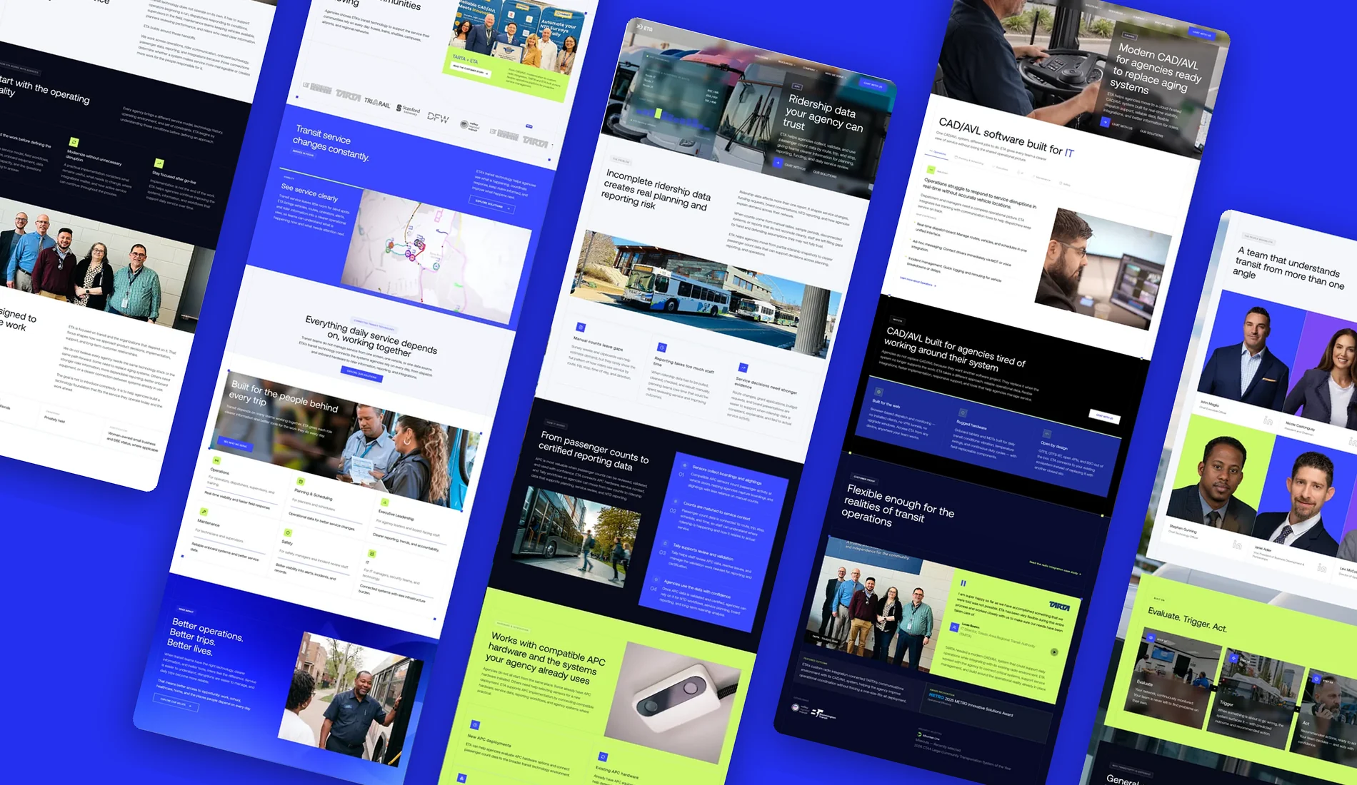
ETA Transit: complex software explained in plain language, with the detail procurement teams check.
4. Conversion paths and forms
Read every button label. Does it say what happens next? Is the step the right size for the visitor's intent? "Talk to sales" suits a product page. A checklist download may suit an early-stage article better.
For forms, ask only for what the follow-up needs. Check labels, error messages, required fields, privacy text, the confirmation and how the form behaves on a phone. If it feeds a CRM, test the whole path from submit to notification. A form that fails silently is both a UX problem and a revenue problem.
5. Mobile, accessibility and speed
Run the key journeys on a real phone, not only in a desktop preview. Check text size, tap targets, menus, tables, video and form fields. The site should still work when zoomed in and when used with a keyboard.
Use WCAG 2.2 as the accessibility reference and Core Web Vitals for speed. Pair automated tools with manual checks, because a score cannot tell you whether someone finished the task. Align tests every build on a mid-range Android over a normal connection for this reason.
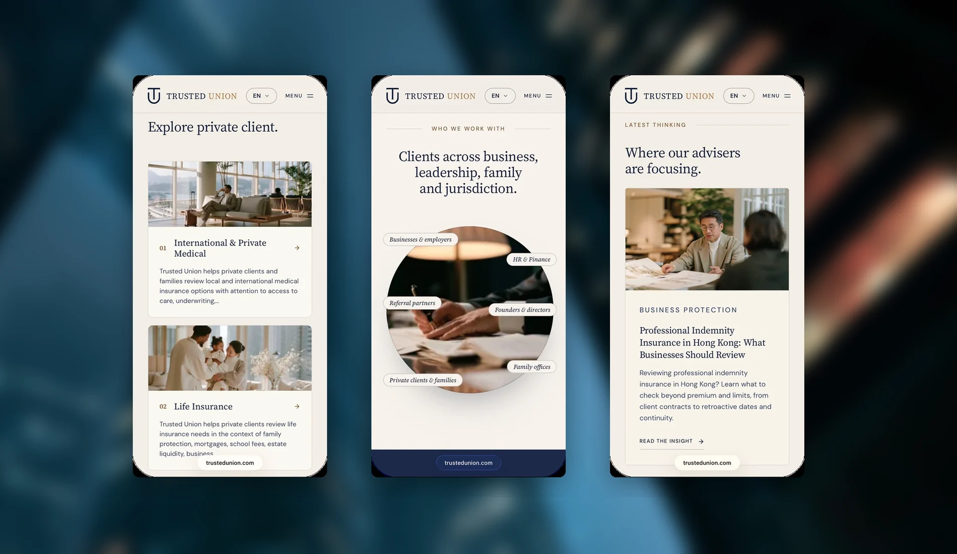
Run the key journeys on a real phone, not only in a desktop preview.
Evidence to Collect
No single source tells the whole story. Combine them:
| Source | What it shows | Its limit |
|---|---|---|
| Analytics | Which pages and paths get used, and where journeys end | Not why people leave |
| Search Console | Which queries and pages bring organic visitors | Not every need behind a search |
| Sales and support | Which questions and objections keep coming back | Only from people who got in touch |
| Usability sessions | Whether people can finish a task, and what they expect | Small samples find problems, not percentages |
| Accessibility review | Whether controls work for different input needs | Automated scans miss many barriers |
| Expert review | Known usability and content problems | Needs checking against real context |
Keep observations apart from guesses. "Visitors leave the contact page" can be seen in analytics. "The form is too long" is a guess until someone watches people use it.
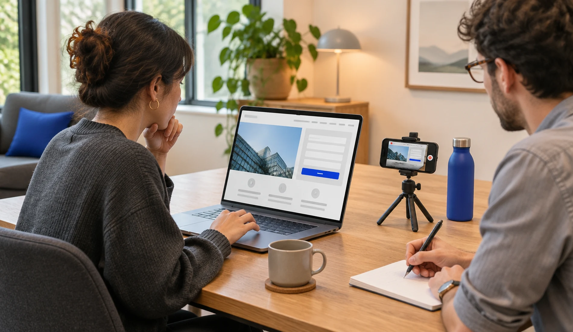
Usability sessions show whether people can finish a task. Small samples find problems, not percentages.
Turn Findings Into a Ranked Plan
An audit should not end with fifty equal recommendations. Rate each finding by user impact, business importance, confidence and effort. Then give it an owner and a next step.
| Priority | Example finding | First action |
|---|---|---|
| High | Visitors cannot tell two core services apart | Rewrite labels, fix the hierarchy, add cross-links |
| High | The contact form fails or shows no confirmation | Test the full submit and CRM path |
| Medium | Case studies lack context for a buyer | Add challenge, approach, proof and a service link |
| Medium | Key pages are hard to use on mobile | Test the templates, then fix layout and controls |
| Later | A decorative section gets little attention | Check whether it supports a real task first |
Not every problem needs a rebuild. A clearer label, a better link or a fixed form can solve a lot. If the structure itself is the problem, the audit becomes the evidence for a redesign brief, and our guide to website redesign cost explains how to budget for one.
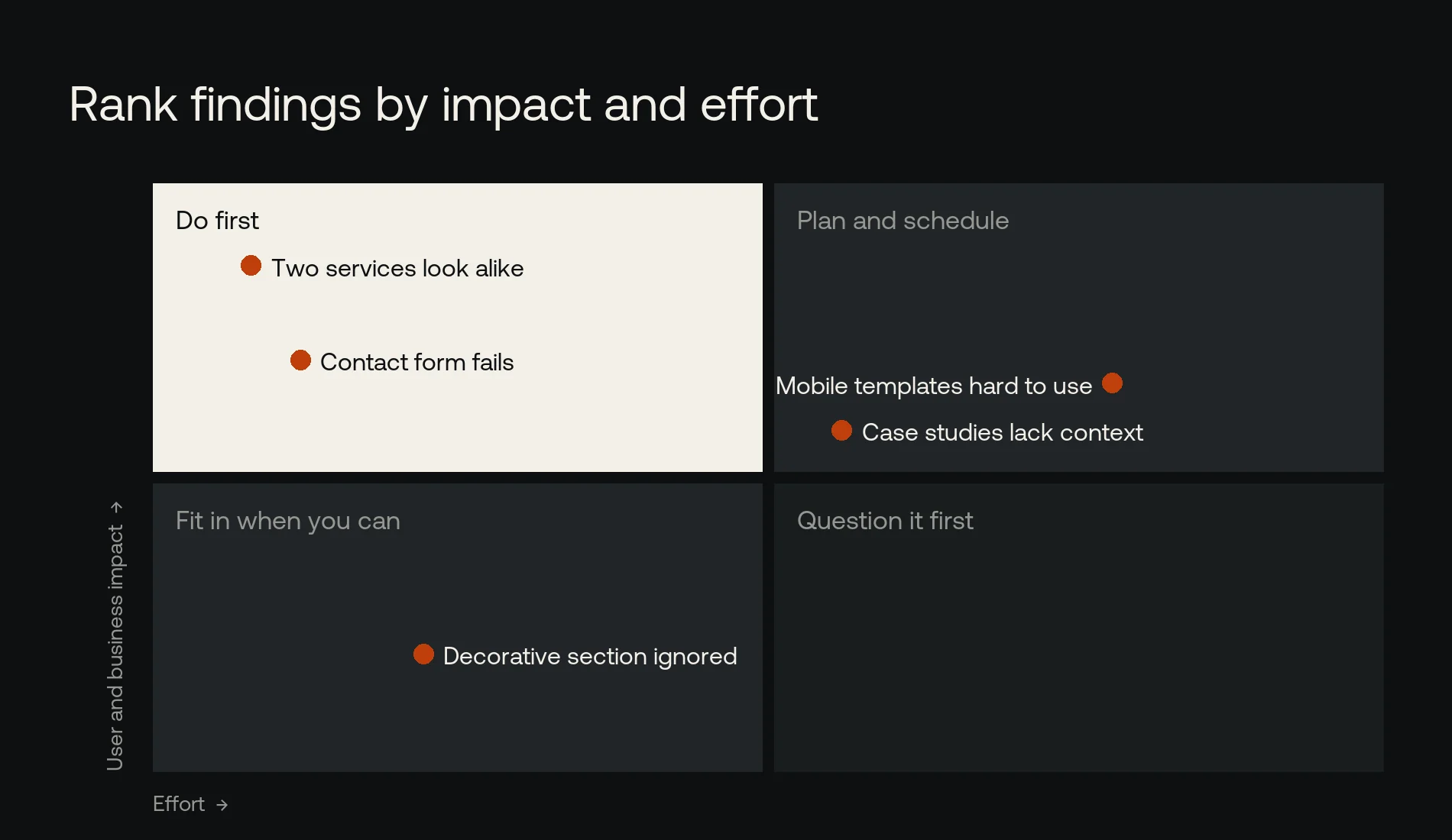
Most fixes land top left: high impact, little effort. Do those before anything that needs a rebuild.
B2B Website UX Audit Checklist
- Visitors can tell what the company does and who it is for in the first screen
- Service names make sense to a first-time buyer
- Each audience can find the details and proof it needs
- Case studies link to the related services, and back
- Buttons match the intent of the page
- Forms work on a phone and with a keyboard
- Error messages and confirmations are clear
- The site works at common screen sizes and when zoomed
- Accessibility and speed checks are part of the review
- Every finding has evidence, an impact rating and a next step
Frequently Asked Questions
How often should we run a UX audit?
When the audience or goals change, when analytics or feedback point to a problem, before a redesign and after a major launch. A lighter review can also run as part of ongoing optimization.
Does a UX audit include user testing?
It can. Some audits rely on expert review and existing data; others include interviews or task sessions with real users. Ask who will take part, which tasks they will try and what the sample can and cannot prove.
Can a UX audit help SEO?
Yes, where the two overlap: unclear structure, poor mobile use, weak internal links and content that does not answer the question. It does not replace an SEO strategy, but it feeds one. For the search side, see what a technical SEO audit includes.
Should a UX audit come before a redesign?
Usually. It shows what needs to change and stops you rebuilding old problems in a new design. Urgent technical or accessibility faults should be fixed alongside the planning.
Not Sure Where Buyers Get Stuck?
Align plans and builds B2B websites around the tasks buyers come to do. See how our website design service works, or send us your site with the journey you are worried about. We will tell you what we see and what we would check first.
References
- W3C: Web Content Accessibility Guidelines (WCAG) 2.2
- web.dev: Web Vitals
- Google Search Central: SEO Starter Guide


