Your website’s voice isn’t just about the words you write; it is about how those words look on the screen. Choosing the right typography in web design is the difference between a user who stays to explore your brand and one who bounces because your content feels cluttered or unreadable. While many treat font selection as a final aesthetic polish, it is actually the core architecture of your user interface and the primary vehicle for your brand’s personality.
This guide explores the transition from the limited system fonts of the early internet to the modern era of high-performance web typography. We will break down the anatomy of type, analyze how to maintain legibility on mobile devices, and look at the technical shift toward formats like WOFF, which has become a standard for delivering compressed, high-quality fonts without sacrificing site speed. Whether you are building a tech platform or a medical portal, you will learn how to choose typefaces that resonate with your specific audience.[1]
From the nuances of Google Fonts to the complexities of global scripts like Vietnamese and Arabic, we cover the full spectrum of digital type. By the end of this article, you will have a clear roadmap for implementing typography that is both beautiful and functional across every culture and device.
The Evolution of Typography in Web Design
In the early days of the internet, designers were trapped in a technological cage. We relied on web-safe fonts, which were essentially the small handful of typefaces pre-installed on every user’s computer, such as Arial, Verdana, and Times New Roman. If a designer wanted to use a custom brand font, they often had to resort to slicing images of text, which was a nightmare for SEO and accessibility. This era was defined by technical limitations rather than creative choice, making the web feel remarkably uniform and, quite frankly, a bit dull.
From Web-Safe Fonts to @font-face
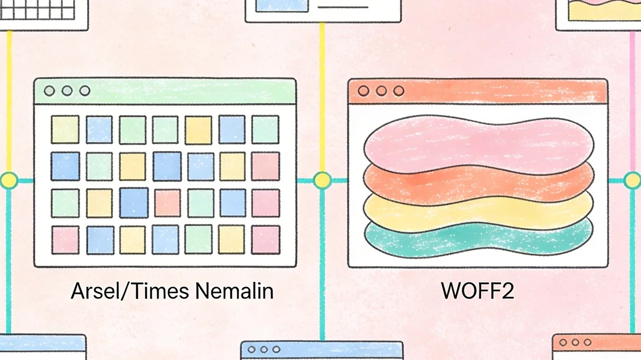
The real shift began in the late 2000s with the widespread adoption of the @font-face CSS rule. This allowed browsers to download font files directly from a server, liberating designers from the constraints of system defaults. However, early implementation was clunky; large file sizes slowed down page loads significantly. The introduction of the Web Open Font Format (WOFF) and its successor, WOFF2, revolutionized performance by providing high compression levels that kept sites snappy while looking sharp. Today, using WOFF2 is the industry standard for modern browsers, offering the best balance of quality and speed.[2]
The Impact of Google Fonts and Adobe Fonts
The launch of Google Fonts in 2010 democratized high-quality typography. By providing a free, open-source library of hundreds of typefaces, it allowed even small businesses to look professional without expensive licensing fees. Adobe Fonts (formerly Typekit) followed a similar path for the premium market, integrating seamlessly with creative workflows. These platforms didn’t just provide files; they provided a content delivery network (CDN) infrastructure that made font loading predictable and fast across the globe.
Quick Breakdown: The Web Font Timeline
- The 90s: The era of Web-Safe fonts; Arial and Georgia rule the screen.
- 2009-2010: The @font-face explosion and the launch of Google Fonts.
- 2014-Present: WOFF2 becomes the gold standard for web performance.
- The Future: Variable fonts allow a single file to handle multiple weights and styles.
Variable Fonts: The Future of Responsive Type
We are currently entering the era of Variable Fonts (OpenType Font Variations). Unlike traditional font files where you need a separate file for ‘Bold’, ‘Light’, and ‘Italic’, a variable font contains all these variations within a single, compact file. This allows for fluid transitions in weight or width based on screen size or user interaction. It is the ultimate tool for responsive design, reducing HTTP requests while giving designers infinite control over the typographic hierarchy.
Modern web typography is no longer just about picking a pretty font; it is a technical discipline where performance and personality must exist in perfect equilibrium.
Understanding Type Styles and Anatomy: Typography in Web Design
Choosing the right typeface is the most significant aesthetic and functional decision a designer makes. To master typography in web design, you must first understand the structural DNA of letters. Every curve, terminal, and axis carries a specific psychological weight that influences how a user perceives your brand before they even read a single word of your copy.
Technically speaking, a ‘typeface’ is the creative design of the letterforms, while a ‘font’ is the digital file or delivery mechanism used to display that design. You choose a typeface, but you use a font.
Serif vs. Sans Serif: Psychological Impacts
The debate between Serif and Sans Serif is more than just a matter of ‘little feet’ at the ends of strokes. Serif fonts, such as Times New Roman or Playfair Display, evoke feelings of tradition, authority, and reliability. They are often the go-to choice for editorial sites or luxury brands. Conversely, Sans Serif fonts like Helvetica or Inter feel modern, clean, and efficient. Because Sans Serifs lack decorative flourishes, they often perform better at smaller sizes on low-resolution screens, making them the standard for app interfaces and tech-heavy platforms.
Monospace, Script, and Display Typefaces
While Serifs and Sans Serifs do the heavy lifting for body text, other categories serve specialized roles. Monospace fonts, where every character occupies the same horizontal space, are essential for coding environments and technical documentation. Script fonts mimic handwriting and should be used sparingly for personality or signatures, as they can quickly degrade accessibility. Display typefaces are the ‘divas’ of the design world; they are designed for large headings and carry intense personality, but they become illegible if applied to long-form body text.
Typography Decision Framework:
- Readability First: Use Sans Serif for functional UI and Serif for immersive long-form reading.
- Contrast: Pair a high-personality Display font for headers with a neutral Sans Serif for body copy.
- Hierarchy: Ensure at least a 2:1 size ratio between your H1 and body text to guide the eye.
- Accessibility: Avoid thin font weights for body text to maintain high contrast ratios.
Key Terminology: Kerning, Leading, and Tracking
Refining typography in web design requires a grasp of spatial mechanics. Leading (line height) is the vertical space between lines of text; for web accessibility, a leading of 1.5x the font size is generally the sweet spot. Tracking refers to the uniform spacing across a range of characters, which is often increased in all-caps headers for better legibility. Kerning is the manual adjustment of space between two specific characters to eliminate awkward gaps. While most modern web fonts have built-in kerning tables, designers must often manually adjust these properties in CSS using the ‘letter-spacing’ and ‘line-height’ attributes to ensure the text feels balanced and professional.
The Technical Foundation: Custom Fonts and Performance
Choosing the perfect typeface is only half the battle; the other half is ensuring that those font files do not cripple your site speed. Typography in web design is a heavy asset class, often accounting for a significant portion of a page’s total weight. When a browser encounters a custom font, it must download the file before it can render the text exactly as intended. If these files are unoptimized, users are left staring at a blank screen or a jarring shift in layout, both of which trigger poor Core Web Vitals scores and frustrate potential customers.[4]
Self-Hosting vs. Google Fonts CDN
The debate between self-hosting your fonts and using a Content Delivery Network (CDN) like Google Fonts usually comes down to control versus convenience. While Google Fonts is incredibly easy to implement, self-hosting allows you to eliminate third-party requests and leverage your own server’s caching policies. This is often the preferred route for high-performance sites where every millisecond counts.
| Method | Pros | Cons |
|---|---|---|
| Google Fonts CDN | Global delivery, easy setup, automatic format selection. | Privacy concerns (GDPR), reliance on third-party uptime. |
| Self-Hosting | Full control, no external DNS lookups, better privacy. | Requires manual optimization and maintenance. |
Optimizing Font Loading (FOIT vs. FOUT)
How your text appears while the font is loading determines the perceived speed of your site. Flash of Invisible Text (FOIT) hides the text until the font is ready, which can make a site feel broken on slow connections. Flash of Unstyled Text (FOUT) shows a system fallback font immediately and then swaps it for your custom choice. We recommend using the CSS property ‘font-display: swap;’ to ensure users can start reading your content immediately, even if the brand font takes an extra second to arrive.
Subsetting Fonts for Better Core Web Vitals
Most font files contain hundreds of characters you will never use, such as glyphs for languages your site doesn’t support or obscure mathematical symbols. Subsetting is the process of stripping away these unnecessary characters to create a leaner, faster file. By limiting your font file to only the Latin character set or the specific characters used in your headlines, you can reduce file sizes by up to 80 percent, leading to much faster Largest Contentful Paint (LCP) times.
Performance is a design feature; a beautiful typeface that takes five seconds to load is a typeface your users will never stay long enough to see.
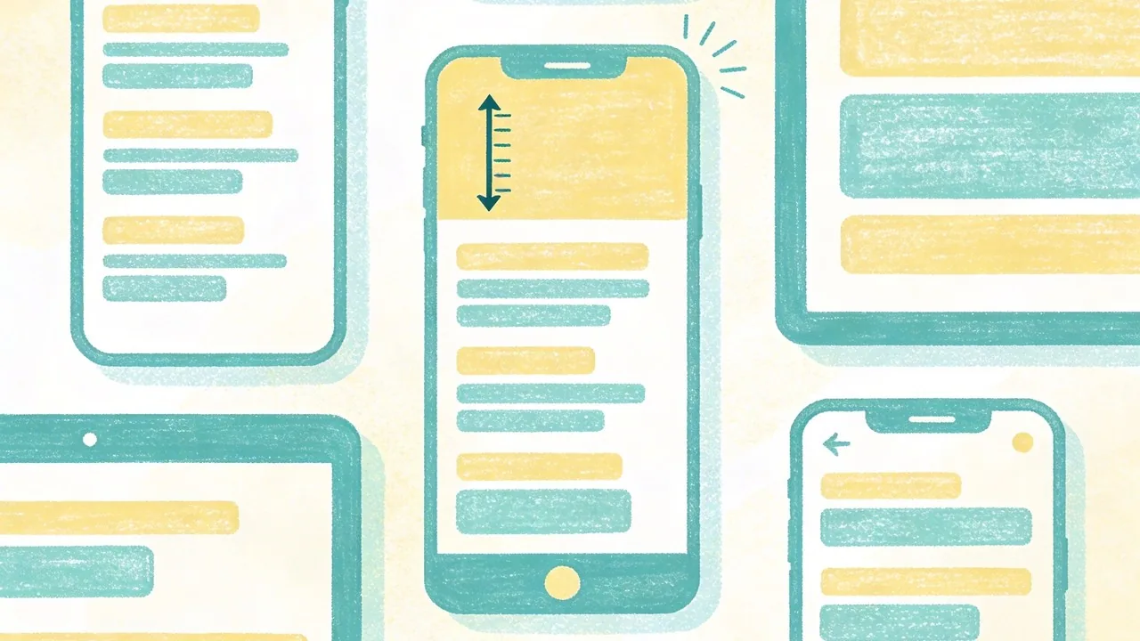
Mobile Typography: Designing for the Small Screen
Designing typography for mobile is not about shrinking your desktop layout; it is about reframing the entire reading experience for a handheld device. When users view your site on a phone, they are often on the move, dealing with glare, or navigating with a single thumb. This makes legibility and spacing the primary drivers of your design decisions, rather than purely aesthetic flourishes. A mobile-first approach ensures that your core message remains readable even in the most challenging environments.
The 16px Rule and Modern Scale Standards
The industry standard for mobile body copy is 16px. Anything smaller often triggers browsers like iOS to zoom in automatically on input fields, which disrupts the user experience. While 16px is the baseline, modern high-density displays often benefit from slightly larger sizes, such as 17px or 18px, to improve scanability. To maintain a cohesive hierarchy, use fluid typography scales based on viewport units (vw). This allows your headlines to scale proportionally as the screen grows, preventing a massive H1 from pushing all your content below the fold on a small device.
Mobile Typography Checklist:
- Set body text to at least 16px to prevent accessibility issues.
- Maintain a line height of 1.5x to 1.6x for comfortable reading.
- Use fluid scaling (clamp) to transition between mobile and desktop sizes.
- Limit paragraph width to 45–60 characters per line.
Touch Targets and Line Length on Mobile
Typography on mobile is also an interactive element. Links and buttons must be large enough to be tapped without frustration. This means ensuring that your line height provides enough vertical space between links so users do not accidentally click the wrong one. Additionally, line length is critical; while 75 characters is acceptable on desktop, mobile screens feel cramped if lines are too long. Aim for a narrower measure to keep the eye moving naturally down the page without losing track of the next line.
Adjusting Contrast for Outdoor Readability
Mobile users are frequently outdoors where sunlight can wash out a screen. High contrast is your best friend here. While subtle gray text might look sophisticated in a dark design studio, it disappears under direct sun. Ensure your typography meets WCAG AA standards at a minimum. Furthermore, the use of modern formats like the Web Open Font Format (WOFF2)[5] ensures that these high-quality, legible fonts load almost instantly, even on spotty 4G connections.
In mobile design, typography is the interface; if the text isn’t legible at a glance, the user experience has already failed.
Industry Rankings: Choosing Type for Business Verticals
Typography in web design is never just an aesthetic choice; it is a psychological trigger that tells your audience whether you are a trusted institution or a disruptive innovator before they even read a single word. Different business verticals require specific typographic personalities to align with user expectations and industry standards. By selecting fonts based on proven user perception, you can subconsciously guide the visitor toward the desired conversion action.
Tech and SaaS: Cleanliness and Innovation
For technology companies, the goal is to communicate efficiency, modernity, and ease of use. Sans-serif fonts dominate this space because they mirror the sleek lines of hardware and the clarity of digital interfaces. High-growth startups often favor geometric or neo-grotesque typefaces that feel neutral yet forward-thinking.
Medical and Healthcare: Trust and Accessibility
In the medical field, typography must prioritize legibility and a sense of calm authority. Patients and practitioners often access these sites under stress, meaning high-contrast, highly legible fonts are non-negotiable. Serif fonts can convey traditional expertise, while rounded sans-serifs offer a more approachable, human-centric bedside manner.
Education and Non-Profits: Readability and Authority
Academic institutions and non-profits need to balance heritage with modern accessibility. These sites often handle large volumes of long-form text, making font pairings that include a robust serif for body copy essential for reducing eye strain during deep reading sessions.
| Vertical | Primary Font Goal | Top Recommendations |
|---|---|---|
| Tech & SaaS | Innovation & Speed | Inter, Roboto, Geist, Montserrat |
| Medical | Trust & Safety | Source Sans Pro, Lato, Open Sans |
| Education | Authority & Focus | Playfair Display, Merriweather, Georgia |
The right typeface serves as a silent brand ambassador; it builds the emotional bridge between your digital interface and your user’s trust.
Typography Trends Shaping the Modern Web
For several years, the digital landscape was dominated by a minimalist obsession. Every tech startup and lifestyle brand seemed to adopt the same clean, geometric sans-serif aesthetic, leading to a phenomenon often called design homogenization. While these fonts offer excellent legibility, they frequently lack the distinct personality required to stand out in a saturated market. Today, we are seeing a vibrant course correction where typography in web design is reclaiming its role as a primary brand differentiator. Designers are moving away from the safe and predictable, opting instead for typefaces that carry a unique voice and emotional weight.
The Rise of Maximalist Display Type
Maximalism is making a loud return to the web. This trend involves using oversized, heavy-weight display fonts that often span the entire width of the viewport. These typefaces are not just for reading; they are the central visual element of the design. By treating text as a graphic component, brands can convey confidence and scale without relying on heavy imagery. This approach works particularly well for creative agencies and fashion brands looking to make an immediate, unmissable impact the moment a user lands on the site.
Vintage and Retro-Serif Revivals
There is a growing nostalgia for the warmth of 1970s and 80s editorial design. We are seeing a massive shift toward high-contrast serifs with soft curves and expressive terminals. These fonts evoke a sense of heritage and approachability that modern geometric fonts often lack. This trend is particularly effective for direct-to-consumer brands that want to feel more human, artisanal, or established. By pairing these vintage styles with modern layouts, designers create a sophisticated tension between the past and the present.
Experimental Kinetic and Animated Typography
Static text is no longer the limit. With the advancement of variable fonts and browser rendering capabilities, kinetic typography has become a staple of high-end web design. Whether it is text that reacts to scroll depth, letters that morph as the mouse hovers over them, or subtle liquid animations, movement adds a layer of storytelling that keeps users engaged. This experimental phase allows designers to break the traditional grid, using warped or stretched characters to create a sense of rhythm and energy.
Quick Breakdown: Current Typography Shifts
- Personality over Polished: Moving from sterile geometric fonts to expressive, quirky typefaces.
- Scale as Strategy: Using massive font sizes to replace traditional hero imagery.
- Tactile Serifs: Embracing high-contrast, vintage-inspired serifs for a premium feel.
- Motion Interaction: Leveraging variable fonts to create text that responds to user behavior.
Typography is the visual manifestation of a brand’s voice; choosing a trend should never come at the cost of your unique identity.
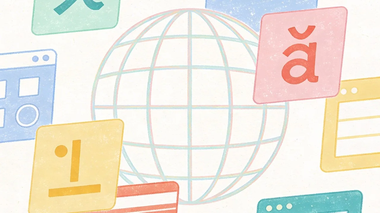
Global Typography: Designing Beyond Western Alphabets
Expanding your brand into international markets requires more than just a translation of words; it demands a deep understanding of how typography in web design functions across different scripts. While Western designers often focus on the balance of uppercase and lowercase Latin characters, global typography introduces unique challenges in vertical rhythm, character density, and script flow that can break a layout if not addressed during the wireframing stage.
Vietnamese: Managing Complex Diacritics
Vietnamese is a Latin-based script, but it is unique due to its extensive use of diacritics to indicate tone and vowel sounds. A single character might have two stacked accents, which significantly increases the height of the line. If your line-height is too tight, these accents will crash into the line above, making the text illegible. When selecting a font for the Vietnamese market, you must ensure the typeface explicitly supports the 89+ specific character combinations used in the language, as many standard Western fonts will default to a mismatched system font for accented characters.
CJK (Chinese, Japanese, Korean): Weight and Spacing Challenges
Designing for CJK languages is a lesson in scale and performance. Unlike the Latin alphabet with its 26 letters, a comprehensive Japanese font may contain thousands of glyphs, leading to massive file sizes that can slow down page loads. To combat this, developers often use subsetting or rely on system fonts. Visually, these scripts are more dense and square-shaped than Latin text. Because there are no spaces between words in Chinese or Japanese, achieving a balanced ‘gray’ value on the page requires careful adjustment of letter-spacing and font-weight to prevent the text from looking like a solid, overwhelming block.
Arabic and RTL: Layout Inversions and Script Flow
Arabic is a Right-to-Left (RTL) script that is inherently cursive, meaning characters change shape based on their position in a word. This requires more than just right-aligning your text; the entire layout usually needs to be mirrored. Typography in an Arabic context should prioritize the flow of the script. Many Western fonts that offer an ‘Arabic version’ feel clunky or overly calligraphic, so it is vital to choose a typeface that maintains readability at small sizes while respecting the traditional proportions of the script.
Quick Breakdown: Global Type Checklist
- Line Height: Increase leading by at least 20% for Vietnamese to accommodate stacked diacritics.
- Performance: Use Google Fonts’ regional slicing for CJK scripts to load only the necessary glyphs.
- Mirroring: Ensure UI elements like ‘back’ arrows are flipped for RTL languages like Arabic.
- Fallback Logic: Always define a local system font stack to ensure a seamless experience if custom web fonts fail to load.
True global design isn’t about making other languages fit into a Western template; it is about building a flexible system that respects the unique geometry of every script.
Practical Implementation: A Typography Checklist
Mastering typography in web design requires moving beyond aesthetic intuition and into the realm of technical precision. When you transition from a design tool like Figma to a live environment, the details often get lost in translation; lines might feel cramped, or the hierarchy might collapse on smaller screens. To ensure your vision remains intact, you must treat type as a living system rather than a static asset.
Establishing a Visual Hierarchy
Visual hierarchy is the roadmap that guides a user through your content. Start by defining a clear scale where your H1 is unmistakably the most important element, followed by descending sizes for subheadings and body copy. A common mistake is relying solely on font size to create contrast; instead, experiment with varying weights and colors to distinguish sections without making the text feel oversized. Using a modular scale helps maintain mathematical harmony across all screen sizes, ensuring that the relationship between your header and paragraph text feels intentional and balanced.
Pairing Fonts Like a Professional Designer
Successful font pairing is about finding the right balance between harmony and contrast. If you select two fonts that are too similar, they will clash; if they are too different, the design may feel disjointed. A reliable strategy is to pair a character-heavy serif for headings with a clean, neutral sans-serif for body text. For inspiration, platforms like Typewolf or Fontshare provide excellent real-world examples of how different typefaces interact. Always test your pairings at various weights to ensure the personality of the brand shines through without sacrificing readability.
Accessibility Standards (WCAG) for Type
Accessibility is not an afterthought; it is a fundamental requirement of modern web design. To meet WCAG standards, ensure your color contrast ratio is at least 4.5:1 for body text. Avoid using small font sizes; a 16px base is generally the industry minimum for legibility. Furthermore, pay attention to line height and letter spacing, as cramped text is difficult for users with visual impairments or dyslexia to navigate. Using the WOFF2 format is also a best practice for performance, as it provides high compression and faster load times for custom fonts.[1]
The Designer’s Hand-off Checklist
- Scalability: Verify that font sizes are defined in relative units like ‘rem’ or ’em’ for better responsiveness.
- Line Length: Keep body text between 45 to 75 characters per line to prevent eye fatigue.
- Font Loading: Use CSS ‘font-display: swap’ to ensure text is visible while custom fonts load.
- Weight Check: Ensure you are only loading the specific weights (e.g., 400, 700) you actually use to save bandwidth.
Great typography is often invisible; it works when the user can absorb the message without ever noticing the mechanics behind the letters.
Internal CTA
Ready to elevate your digital presence? At Align, we combine world-class UX/UI design with technical SEO expertise to build websites that look stunning and perform even better. Explore our design and branding services to see how we can bring your vision to life.
Conclusion: Mastering Typography in Web Design
Mastering typography in web design is a continuous journey that balances historical tradition with modern technical constraints. From the early days of system-safe fonts to the boundless creative possibilities offered by variable fonts and global type foundations, the way we display language defines the user experience. By understanding the nuances of serif versus sans-serif, optimizing for mobile readability, and respecting the cultural requirements of scripts like Vietnamese or Arabic, designers can create interfaces that are both accessible and evocative. Typography is not merely about choosing a pretty font; it is a strategic tool that influences how information is processed and how a brand is perceived on a global scale. As web technologies continue to evolve, staying ahead of performance optimization and accessibility standards will ensure your typography remains functional and inclusive. Whether you are building for a local niche or an international audience, your typographic choices serve as the voice of your digital product, making clarity and character your two most important allies in the design process.
Elevate Your Brand with Expert Design at Align
Choosing the right typography is a foundational step in building a digital presence that resonates with your audience, yet it is only one piece of the larger design puzzle. At Align, our experts specialize in blending high-end UX/UI aesthetics with technical SEO performance to ensure your website looks incredible and ranks effectively in competitive markets. We understand that every font choice, color palette, and layout decision impacts your bottom line and brand authority. Whether you are looking to refresh your current identity or build a high-performance platform from the ground up, our team is ready to help you navigate the complexities of modern web design. Visit Align to explore our portfolio and discover how we can transform your digital strategy into a seamless, engaging experience that speaks clearly to your customers across the globe.