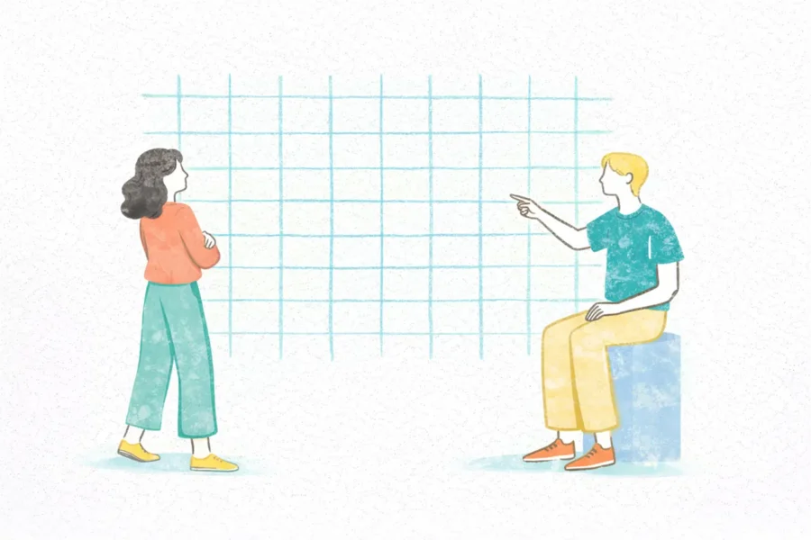
Have you ever wondered why some designs appear effortlessly balanced and easy to navigate, while others feel cluttered and chaotic? The answer often lies in the invisible foundation – the grid layout. Studies by researchers like Colin Ware have shown that grids improve visual search and information processing. By providing a structured framework, grids act as the secret weapon of designers, ensuring a professional and user-friendly experience.
What is Grid Layout Design?
Imagine trying to build a Lego castle without a baseplate. Everything’s wobbly, right? That’s your design without a grid. A grid layout design is a visual framework consisting of horizontal and vertical lines that subdivide the design space. These lines, while often unseen in the final product, act as guides for positioning elements like text, images, and buttons. This structured approach offers a multitude of benefits:

Grids come in various forms, each tailored to specific design needs. Understanding the different types of grids and their applications can help designers choose the best structure for their projects. Here are some of the most common types of grids used in design:
1. Manuscript Grid
The manuscript grid, also known as a single-column grid, is the simplest and most traditional type of grid. It is essentially a large rectangular area that accommodates continuous text, making it ideal for text-heavy designs such as books, articles, and blogs. This grid type provides a clean and straightforward layout, ensuring that the reader’s focus remains on the content without unnecessary distractions.

Use Cases:
The multicolumn grid divides the layout into multiple vertical columns. This type of grid is highly versatile and is commonly used in magazines, newspapers, and websites. By dividing the content into columns, designers can create more complex and visually engaging layouts. It allows for the easy placement of text, images, and other elements side by side, facilitating a dynamic flow of information.

Use Cases:
A modular grid is an extension of the multicolumn grid but adds horizontal divisions as well, creating a matrix of cells or modules. Each module can contain a different type of content, such as text, images, or videos. This grid type offers a high degree of flexibility and is especially useful for web and app design, where diverse content types need to be presented cohesively.

Use Cases:
The baseline grid focuses on the alignment of text, ensuring that text lines up across different columns. This type of grid is especially important in typography, as it enhances readability and creates a uniform appearance. By aligning text along a common baseline, designers can achieve a consistent look across various sections of a layout.

Use Cases:
The hierarchical grid is less rigid than the other grid types and adapts to the content rather than enforcing a strict structure. It is used to emphasize certain elements over others, creating a natural visual flow. This grid type is ideal for designs that require a more organic and flexible layout, allowing for creative freedom while maintaining a sense of order.

Use Cases:
The golden ratio grid is based on the mathematical ratio of 1:1.618, which is often found in nature and is aesthetically pleasing to the human eye. This grid type divides the layout according to the golden ratio, creating a harmonious and balanced design. It is particularly effective in designs where visual balance and proportion are crucial.

Use Cases:
An asymmetrical grid intentionally avoids uniformity, creating a layout that feels dynamic and modern. This grid type breaks away from the traditional structure to create visual interest and draw attention to specific elements. It is often used in contemporary web design and advertising to create unique and eye-catching layouts.

Use Cases:
Working with grids can significantly enhance the quality and functionality of your designs. To make the most out of grid layouts, it’s crucial to follow some best practices and tips. Here are some essential tips for mastering grid layouts:
When beginning a new design project, start with a simple grid structure. Establish a foundation with a basic column layout, and then gradually add complexity as needed. This approach allows you to maintain a clean and organized design, avoiding unnecessary clutter from the outset.
Tip: Use grid systems that suit the nature of your project. For instance, a multicolumn grid is ideal for magazine layouts, while a modular grid works well for web design.
Consistency in alignment is key to a cohesive design. Ensure that all elements, whether text, images, or buttons, align perfectly within the grid. This not only enhances the aesthetic appeal but also improves the readability and flow of the design.
Tip: Use alignment tools available in design software like Adobe XD, Sketch, or Figma to ensure precise alignment.
White space, or negative space, is the empty area between design elements. Proper use of white space prevents the layout from appearing crowded and makes the content more readable and visually appealing. It allows the design to breathe and guides the user’s eye through the content naturally.
Tip: Don’t be afraid of leaving spaces empty. White space can be as important as the content itself in creating a balanced design.
While grids provide structure, it’s important to remain flexible. Sometimes, breaking the grid can create visual interest and draw attention to specific elements. Flexibility allows for creative freedom while maintaining an overall structured layout.
Tip: Use intentional grid breaks to highlight important content or create a unique visual effect. However, ensure that these breaks enhance rather than detract from the overall design.
In today’s multi-device world, it’s essential to ensure that your grid adapts well to different screen sizes and resolutions. Test your design on various devices to make sure it remains functional and visually appealing across all platforms.
Tip: Utilize responsive design tools and frameworks like Bootstrap or CSS Grid to create adaptable layouts. Regularly test your design on different devices during the development process.
Grids play a significant role in typographic design. Use baseline grids to align text consistently across columns, improving readability and creating a professional look. Consider the size, spacing, and alignment of text within the grid to enhance the overall design.
Tip: Use tools like Adobe Typekit or Google Fonts to access a wide range of fonts and ensure your typography aligns perfectly with your grid layout.
Grids help establish a clear visual hierarchy, guiding the user’s eye through the content in a logical order. Use different grid sections to prioritize information, ensuring that the most important elements stand out.
Tip: Combine grid layouts with visual hierarchy principles, such as using larger fonts for headings and strategically placing call-to-action buttons to guide users effectively.
Don’t be afraid to experiment with different grid variations to find the best layout for your design. Mix and match different types of grids, like combining a multicolumn grid with a baseline grid, to create unique and effective layouts.
Tip: Use design software that allows easy manipulation of grid settings, enabling you to quickly test and iterate on different grid configurations.
Modern design software comes equipped with robust grid and layout features. Take advantage of these tools to streamline your workflow and create precise designs.
Tip: Familiarize yourself with grid features in tools like Adobe XD, Sketch, Figma, and InDesign. Utilize guides, rulers, and snapping features to enhance your grid-based designs.
By following these tips, you can master the art of grid layout design, creating structured, visually appealing, and user-friendly designs. Grids provide a solid foundation, but it’s your creativity and attention to detail that will bring your designs to life.

Designers have access to a variety of tools and software that make creating grid layouts efficient and precise. Here are some top choices:
Adobe XD : A powerful tool for web and mobile design, Adobe XD offers customizable grid settings that allow designers to create responsive layouts easily. It supports features like repeat grids, which streamline the creation of complex designs.
Sketch : Favored by many UI/UX designers, Sketch provides robust grid and layout tools. Its customizable grids and smart guides ensure precise alignment, making it ideal for detailed design work.
Figma : Known for its collaborative capabilities, Figma allows multiple designers to work on the same project in real-time. Its flexible grid system adapts to various screen sizes, perfect for responsive design.
InDesign : Primarily used for print design, InDesign offers extensive grid options. Its baseline grid feature is particularly useful for aligning text across columns, ensuring typographic consistency.
Canva : A user-friendly tool with a wide range of templates, Canva is great for beginners. Its grid options make it easy to create balanced layouts for social media, presentations, and more.
These tools provide the flexibility and precision needed to create professional grid layouts across various design projects.
Grid layout design is an essential technique for creating structured, visually appealing, and user-friendly designs. By understanding the benefits and types of grids, and following practical tips, designers can harness the power of grids to enhance their work. With the right tools, even the most complex designs can be achieved with efficiency and precision. Embrace grid layout design to elevate your design projects to new heights.