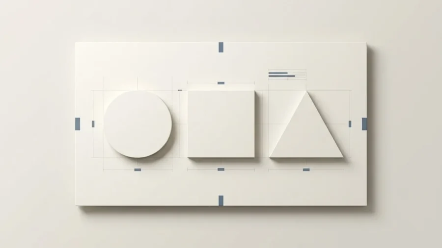
Some of the most recognized logos in the world are built from nothing more than a circle, a triangle, or a hexagon. No illustration, no gradient, no complexity. Just shape, proportion, and intention. It is proof that a logo does not need to scream to be powerful. Sometimes, a simple shape can do the talking beautifully.
Think about it. The strongest logos are often the easiest to recognize. They work as a website header, a social media profile picture, a business card, an app icon, a favicon, and even that tiny little logo on a presentation slide that nobody thinks about until it looks blurry. A good geometric logo design is not just “pretty geometry.” It is strategy, structure, meaning, and brand personality packed into a simple visual form.
For businesses building or refreshing a brand identity, geometric logo design offers something that more elaborate approaches rarely deliver: clarity that scales, meaning that transfers instantly, and a visual identity that holds up across decades rather than design cycles. This article breaks down why geometric logos work, what the different types look like in practice, and how to avoid the mistakes that undermine an otherwise strong concept.
What Is Geometric Logo Design And Why Does It Work?
At its core, geometric logo design is the art of using fundamental shapes like circles, squares, and triangles to build a visual identity. While it might seem like a simple choice, these shapes are the building blocks of human visual language. They carry inherent psychological weight that communicates a brand’s values before a single word of copy is read. By stripping away the clutter of illustrative or complex designs, geometry allows a brand to speak with a voice that is both loud and incredibly clear.[1]
The reason this approach works so effectively is rooted in how our brains process information. Simple shapes are easier for the eye to recognize and for the mind to store in long-term memory. When you think of the world’s most iconic brands, you likely envision a swoosh, a bitten fruit, or three parallel stripes. Geometric logo design leverages this cognitive shortcut, ensuring that a brand remains recognizable even when viewed for a split second on a fast-moving social media feed or a tiny mobile app icon.
In a world of visual noise, geometry is the ultimate filter; it transforms complex brand stories into a single, unshakeable point of focus.

The Psychology Behind Geometric Shapes in Branding: Why Simple Shapes Are So Easy to Remember
Every shape carries psychological weight. Before a viewer reads a brand name or processes a tagline, they have already formed an impression based on the geometry in front of them. That response is not random, it is rooted in how humans have assigned meaning to visual forms across cultures and centuries. Understanding shape psychology is one of the most practical tools available to anyone making branding decisions.
| Shape | Psychological Association | Brand Example |
|---|---|---|
| Circle | Unity, continuity, warmth, trust | BMW, Olympics, Pepsi |
| Triangle | Direction, ambition, energy, tension | Adidas, Google Play |
| Square / Rectangle | Stability, reliability, order, structure | Microsoft, American Express |
| Hexagon | Precision, connection, efficiency | Honeywell, numerous tech brands |
| Spiral / Abstract polygon | Innovation, movement, transformation | Airbnb, Mitsubishi |
The reason these associations hold across contexts is that geometric shapes tap into something more primal than trend or convention. Circles have no beginning or end, they suggest continuity and completeness. Triangles are inherently directional, they point somewhere, which is why they appear so often in brands built around progress or ambition. Squares suggest groundedness and permanence, which explains their prevalence in financial and institutional branding.
Shape is the first thing a viewer processes and the last thing they forget. It is the silent argument a brand makes before it says a single word.
This psychological shorthand becomes a strategic asset when the shape chosen genuinely reflects the brand’s values. When it does not when a financial services company chooses jagged angles for no considered reason, or a wellness brand defaults to sharp geometry the disconnect registers subconsciously, even if the viewer cannot articulate why.

5 Types of Geometric Logo Design (With Examples)
Geometric logo design is not a single style, it is a category with meaningful variation. Understanding the distinctions helps brands make a more deliberate choice rather than defaulting to whatever looks current.
1. Flat geometric:
The most common contemporary execution: clean shapes, solid fills, no gradients or shadows. The visual language is immediately legible and scales without any loss of fidelity. Airbnb’s bélo mark and Chase’s octagon are built entirely on this principle, distinctive forms that read instantly at any size and in any color context.
2. Grid-based geometric:
These logos are constructed using mathematical systems, golden ratio grids, modular spacing, or strict proportional rules before a single visible line is drawn. The Twitter bird (before the rebrand) and Apple’s iconic mark were both constructed on underlying grid systems that make the final shape feel inevitable rather than arbitrary. The grid is invisible in the final output, but its discipline is what gives the mark its sense of precision and intentionality.
3. Layered / overlapping shapes:
Transparency, overlap, and the interaction between shapes create depth and visual interest without adding complexity. The Olympic rings are the canonical example: five simple circles, overlapping in a specific sequence, produce something far more meaningful than any of the individual elements. This approach works particularly well for brands that want to communicate connection, multiplicity, or collaboration.
4. Abstract geometric mark:
Not immediately recognizable as an object or concept, but highly distinctive and memorable over time. The Nike swoosh, stripped down to its most essential geometry — communicates momentum and direction without depicting anything literal. Abstract marks require more time to build association, but once established, they often become the strongest identifiers because they carry no baggage from the real world.
5. Geometric + wordmark combo
The most practical choice for small and growing businesses. A geometric mark paired with a logotype gives a brand immediate name recognition during the early stage of building awareness, while establishing a visual icon that can eventually stand alone. This combination gives teams flexibility: the full lockup for primary brand contexts, the mark alone for icons, favicons, and social avatars.

How Geometric Logo Design Builds Stronger Brand Recognition
1. Efficiency in Recognition:
2. Scalability across every context
3. Versatility across backgrounds and formats
4. Timelessness over trend
5. Providing Consistency:
Beyond speed, geometry provides a sense of consistency that organic shapes often lack. Because these shapes are built on mathematical ratios, they remain legible whether they are scaled down to a tiny favicon or blown up on a highway billboard. This mathematical integrity ensures that the brand’s ‘silhouette’ remains intact across every touchpoint, which is a critical factor in building long-term consumer trust. As noted by industry experts at Ramotion[2], the psychology of these shapes plays a massive role in how a brand is perceived, with different geometries triggering specific emotional responses before the viewer even reads the brand name.
The most effective logos are those that can be drawn from memory after a single glance; geometry is the shortest path to that level of recall.

Common Mistakes in Geometric Logo Design
While the simplicity of geometric forms is their greatest strength, it also leaves no room for error. Because these shapes are so fundamental, any slight misalignment or lack of purpose becomes immediately obvious to the viewer. The most frequent pitfall is choosing a shape based on aesthetics alone without considering the underlying message it sends to the audience.
Overcomplicating the Geometry
Designers often fall into the trap of adding too many layers, intersections, or mathematical flourishes in an attempt to look sophisticated. This clutter destroys the primary benefit of geometric design: instant recognition. When a logo becomes a complex puzzle, it loses its ability to scale effectively on small screens or business cards. True mastery lies in subtraction, ensuring every line and angle serves a specific functional purpose.
Ignoring Visual Balance
Mathematical perfection does not always equal visual perfection. Placing a triangle inside a circle using exact center coordinates often looks off-center to the human eye due to the weight of the shapes. Relying solely on software grids without making optical adjustments leads to logos that feel uncomfortable or ‘heavy’ in certain corners. According to insights on the psychology of shapes[3], these subtle visual tensions can distract from the brand’s intended emotional impact.
A geometric logo should feel inevitable, as if the shapes could not exist in any other configuration to represent that specific brand.
Geometric Design Red Flags:
- Poor Contrast: Using thin geometric lines that disappear at small sizes.
- Generic Execution: Creating ‘logo soup’ with basic shapes that look like every other startup.
- Forced Meaning: Trying to make a square represent ‘speed’ when its inherent nature is stability.
Best Practices for Creating a Memorable Geometric Logo
Executing a successful geometric logo design requires a balance between mathematical precision and visual intuition. While it is tempting to rely solely on the grid, the most iconic marks often incorporate subtle optical adjustments to ensure they look balanced to the human eye. Consistency in line weight and corner radius is essential; varying these elements without a clear purpose can make a professional brand look amateurish and cluttered.
Simplicity and Scalability
A geometric mark must remain legible whether it is on a massive billboard or a tiny favicon. Designers should test their concepts at multiple scales early in the process to ensure that negative space does not collapse and intricate patterns do not turn into a blurry smudge. Limiting the palette to two or three colors helps maintain this clarity, allowing the strength of the geometry to lead the brand identity.
| Design Element | The Goal | The Risk |
|---|---|---|
| Line Weight | Uniformity | Visual instability |
| Corner Radius | Softness or Sharpness | Inconsistent brand voice |
| Negative Space | Hidden Meanings | Cluttered compositions |
Furthermore, the choice of shapes should align with the brand’s core values. According to research on the psychology of shapes in logo design[4], circles often evoke feelings of community and unity, while squares suggest efficiency and professionalism. Selecting the right geometric foundation ensures the visual language supports the business objective.
The best geometric logos do not just sit on a page; they own the space around them through mathematical harmony and purposeful simplicity.
The Power of Iteration
Never settle for the first iteration of a grid. Refine the proportions until the relationship between every angle and curve feels intentional. At Align, we believe that a truly memorable geometric logo is one that feels both timeless and modern, avoiding fleeting trends in favor of structural integrity.
Geometric Design Checklist:
- Ensure all angles are consistent throughout the mark.
- Verify that the logo remains recognizable in grayscale.
- Check that the spacing between elements is mathematically proportional.
- Test the design at the smallest possible size for legibility.
Align Helps Brands Build Identity That Lasts
Creating a geometric logo design that resonates requires more than just snapping shapes together on a digital canvas; it requires a deep understanding of how those forms influence human perception. At Align, we bridge the gap between mathematical precision and emotional storytelling to ensure your brand mark is not just seen, but remembered. We specialize in stripping away the noise to find the core essence of your business, translating your values into a visual language that stands the test of time.
A great logo doesn’t just represent a company; it anchors the entire brand experience through intentional geometry and structural clarity.
Our process focuses on scalability and versatility, ensuring that your identity remains sharp whether it is on a tiny favicon or a massive physical storefront. We believe that the psychology of shapes is the foundation of effective branding, as different forms can evoke specific feelings of stability, innovation, or community in your audience. According to research on the psychology of shapes in logo design[5], geometric elements like circles suggest unity and protection, while squares imply strength and efficiency.
The Align Identity Framework:
- Strategic Discovery: We define the core message before drawing a single line.
- Mathematical Precision: Every curve and angle is calculated for visual balance.
- Future-Proofing: We design for longevity, ensuring your mark outlasts seasonal trends.
- Comprehensive Guidelines: We provide the tools you need to maintain consistency across all platforms.
Ready to transform your brand into a visual powerhouse? Let our team at Align help you craft a geometric identity that speaks volumes through simplicity. Reach out today to start your design journey.
The Power of Geometric Simplicity
Geometric logo design is far more than a stylistic choice; it represents a strategic commitment to clarity and timelessness. By stripping away unnecessary ornamentation and focusing on fundamental shapes, brands can communicate complex values like stability, innovation, or community in a single glance. These mathematical foundations ensure that a visual identity remains legible across diverse mediums, from tiny mobile icons to massive physical signage. Ultimately, the most successful logos are those that find the perfect balance between structure and soul, using the inherent psychology of geometry to forge a lasting connection with their audience. When you embrace the logic of shapes, you build a brand that is built to endure.