In today’s fast-paced digital world, a brand’s visual identity must be as dynamic as its audience. With the variety of devices and screen sizes that consumers use, from smartphones and tablets to desktops and smartwatches, a one-size-fits-all logo no longer suffices. This need for adaptability has given rise to the concept of responsive logos.
A responsive logo is not just a trend; it’s a necessity for brands aiming to maintain consistency and visibility across all platforms. According to a study by Google , 61% of users are unlikely to return to a mobile site they had trouble accessing, and 40% visit a competitor’s site instead. This statistic underscores the importance of responsive design, starting with the logo.
What is a Responsive Logo?
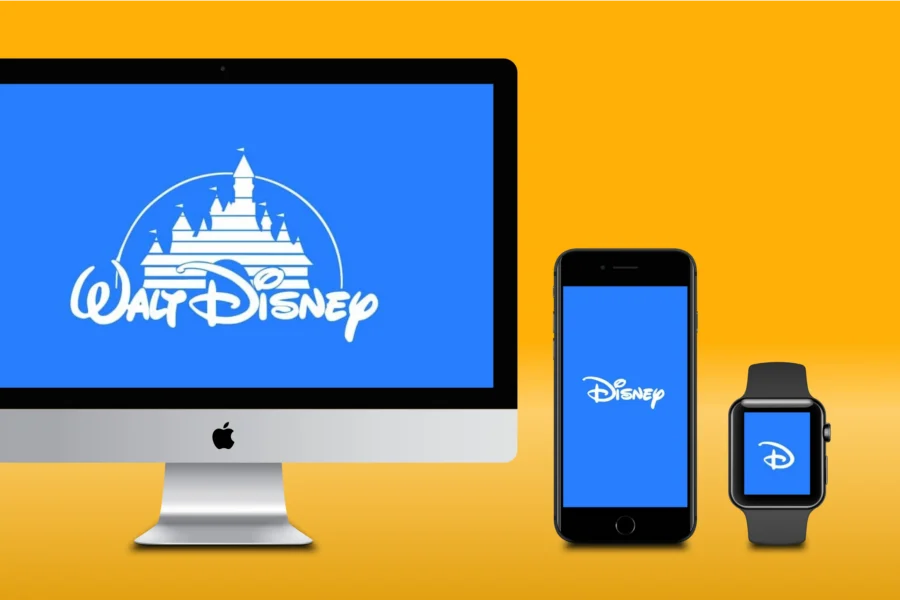
A responsive logo is a logo designed to adapt to different screen sizes and resolutions. This means it can change in size, complexity, or layout to ensure it remains recognizable and effective, regardless of the medium. Responsive logos might have different versions: a full detailed version for large screens, a simplified version for smaller screens, and even a minimalist icon for very small interfaces like app icons or favicons. The key is that all these versions maintain the core visual elements of the brand, ensuring consistency and brand recognition across all platforms.

Benefits of a Responsive Logo: Beyond Pixel Perfection
Sure, a responsive logo ensures your brand avoids the dreaded pixelated fate mentioned in the introduction. But the benefits go far deeper than just maintaining visual clarity across screens. Here’s how a responsive logo can truly elevate your brand:
1. Consistency Across Platforms:
Responsive logos ensure that your brand is consistently represented across all digital touchpoints. Whether viewed on a large desktop monitor, a tablet, or a smartphone, a responsive logo maintains its integrity and recognizability. This consistency builds trust and recognition among consumers, as they can easily identify the brand regardless of the medium. According to a study by Google, a consistent brand presentation across all platforms can increase revenue by up to 23% ( Charley Grey ).

2. Improved User Experience:
A responsive logo enhances the overall user experience by ensuring that your logo looks good and functions well on any device. This contributes to a more professional and polished appearance, which is crucial in maintaining user engagement and satisfaction. When users encounter a well-designed responsive logo, they are more likely to perceive the brand as professional and reliable, which can lead to increased user loyalty. This is supported by Google’s research, which found that 52% of users said a bad mobile experience made them less likely to engage with a company ( Charley Grey ).
3. Better Brand Recall:
By having a logo that is easily recognizable in any format, you increase the chances of brand recall. This is particularly important in today’s crowded digital marketplace, where consumers are bombarded with countless brands and advertisements. A responsive logo ensures that your brand stands out and is memorable, regardless of the device being used.
4. Versatility:
Responsive logos provide versatility, allowing your brand to seamlessly integrate into various platforms without losing its identity. This includes websites, mobile apps, social media, and print materials. For instance, a responsive logo can be simplified for a mobile app icon while retaining its full detail on a website header. This versatility ensures that your logo is effective and visually appealing in any context. A versatile logo also makes it easier to adapt to new digital trends and technologies, keeping your brand relevant and up-to-date ( Charley Grey ).
5. Enhanced Accessibility:
esponsive logos can be designed to enhance accessibility for users with visual impairments. By simplifying the design and ensuring high contrast, responsive logos can be more easily recognized by screen readers and users with low vision. This not only broadens your audience but also demonstrates a commitment to inclusivity and accessibility, which can positively impact your brand’s reputation.
6. SEO and Search Engine Visibility:
Responsive logos can contribute to better search engine optimization (SEO) by improving the overall mobile-friendliness of your website. Google’s algorithm favors mobile-friendly sites, and a responsive logo is a key component of a mobile-friendly design. This can lead to higher search engine rankings, increased visibility, and more organic traffic to your website.
7. Future-Proofing Your Brand:
Investing in a responsive logo helps future-proof your brand against technological advancements and changes in digital consumption habits. As new devices with varying screen sizes and resolutions are introduced, a responsive logo ensures that your brand remains adaptable and relevant. This forward-thinking approach can save time and resources in the long run, as your logo will not require frequent redesigns to accommodate new technologies. According to a report by Statista, the number of mobile users worldwide is projected to reach 7.33 billion by 2023, underscoring the importance of adaptable branding strategies ( Charley Grey ).
How to Make Your Logo Responsive
Creating a responsive logo involves several steps that ensure it maintains its recognizability and effectiveness across various devices and screen sizes. Here’s a detailed guide on how to make your logo responsive:
1. Simplify the Design:
Start with your full logo and identify which elements are essential. As the screen size decreases, simplify the logo by removing less critical elements while retaining the core components. This might involve:
– Removing intricate details that might not render well on smaller screens.
– Using fewer colors to maintain clarity.
– Ensuring that the typography remains legible at smaller sizes.

2. Create Multiple Versions:
Design multiple versions of your logo for different screen sizes:
– Full version : For large screens such as desktops and laptops, keep all the details intact.
– Simplified version : For tablets, remove some intricate details but maintain the overall structure.
– Minimalist icon : For very small interfaces like mobile apps or favicons, use a simplified icon or monogram that represents the brand.
Each version should be tested to ensure it looks good and functions well across different devices. For example, Nike’s iconic swoosh is scalable and maintains its identity across all platforms.
3. Maintain Proportions and Alignment:
Ensure that each version of your logo maintains the same proportions and alignment. This helps in preserving the visual harmony and consistency of your brand identity. Use grid systems and alignment guides to keep the elements proportionate as they scale down.
4. Use Scalable Vector Graphics (SVG):
SVG is a vector image format that scales perfectly without losing quality, making it ideal for responsive logos. Unlike raster images, SVG files remain crisp and clear at any size, which is crucial for responsive design. According to a report by Smashing Magazine, SVG files are smaller in size compared to traditional image formats like PNG or JPEG, which helps in faster loading times and better performance.
5. Optimize for Different Backgrounds:
Ensure that your logo works well on various backgrounds. This might involve creating versions with different color schemes or using transparent backgrounds. Test the logo on light, dark, and complex backgrounds to ensure visibility and readability.
6. Test Across Devices:
Testing is a crucial step in the design process. Ensure that each version of your logo looks good and functions well across different devices. This involves:
– Viewing the logo on various screen sizes and resolutions.
– Ensuring clarity and recognizability.
– Making adjustments based on feedback and observations.
7. Maintain Brand Consistency:
All versions of your logo should use the same color scheme, typography, and core design elements to maintain brand consistency. This ensures that regardless of the device, the brand’s identity remains intact. According to a report by Lucidpress, consistent branding can lead to an average revenue increase of 33%.
8. Incorporate Feedback and Iterate:
Gather feedback from users and stakeholders about the different versions of your responsive logo. Use this feedback to make necessary adjustments and improvements. Responsive design is an iterative process, and continuous improvements based on real-world usage and feedback will ensure your logo remains effective.
9. Documentation and Guidelines:
Create a set of guidelines that document the different versions of your responsive logo and their appropriate use cases. This should include:
– Detailed design specifications for each version.
– Usage examples across different platforms.
– Guidelines on spacing, alignment, and color variations.
These guidelines ensure that everyone in your team or any third-party designers can maintain the integrity of the logo across all applications.
Conclusion
In an era where digital presence is paramount, having a responsive logo is not just an option; it’s a necessity. Responsive logos ensure that your brand remains consistent, recognizable, and professional across all devices and screen sizes. By simplifying the design, creating multiple versions, and maintaining brand consistency, you can create a logo that not only adapts but thrives in the digital age. Embracing responsive logo design is a step towards future-proofing your brand in a continuously evolving digital landscape.