

Introduction
Bizen Catering Co., Ltd. is a family-owned company established in 2012 in Bien Hoa, Dong Nai Province, Vietnam. They’re dedicated to providing professional and nutritious meals for the hardworking factory workers in the surrounding industrial zones, particularly AMATA Dong Nai. Beyond catering delicious meals, Bizen Catering also produces and distributes pure drinking ice and water throughout the area.
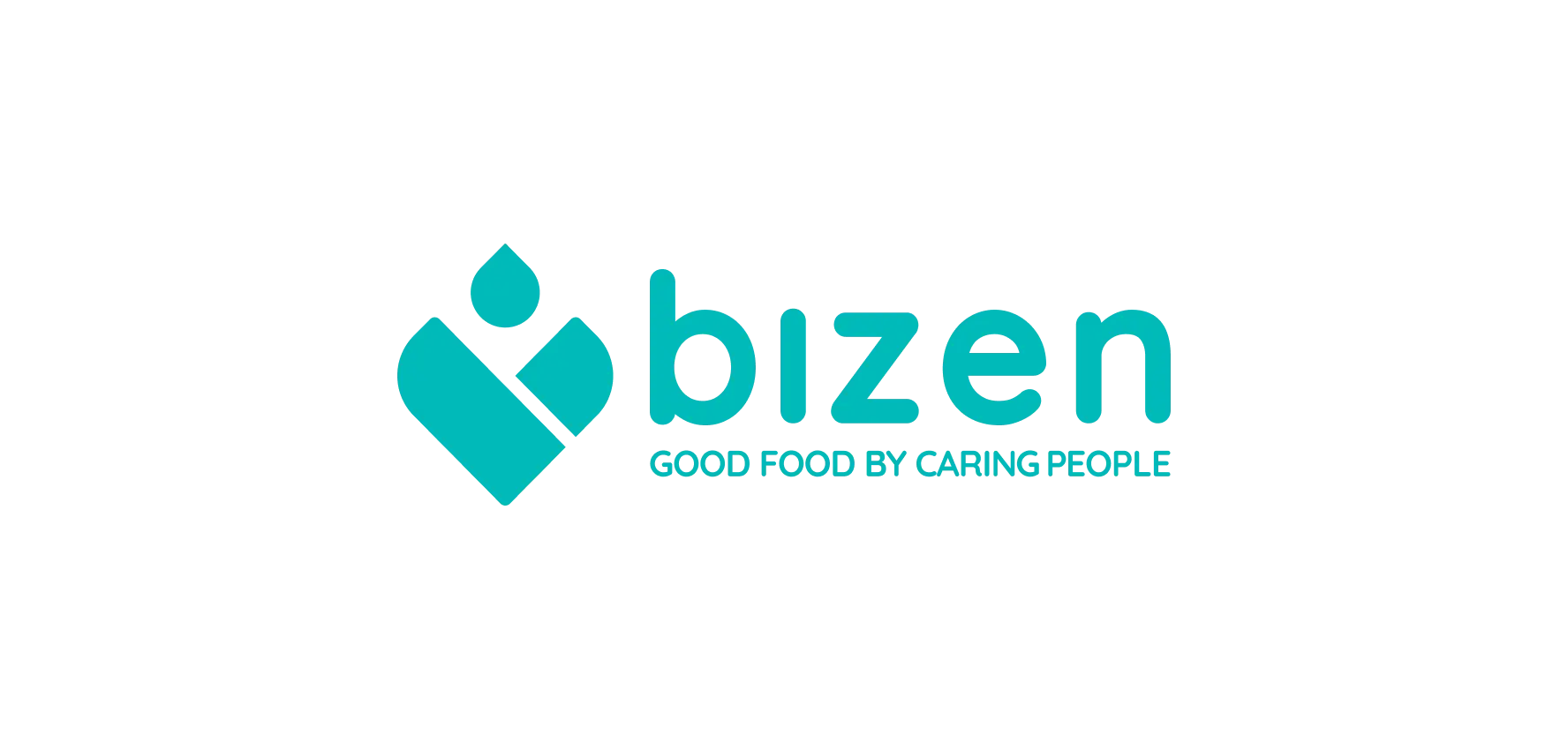
Behind The Logo
Six ingredients, one delicious story.
Bizen’s logo isn’t just a picture, it’s a recipe. Every element – from caring hands cradling a spark to fresh water and a nourishing feast – tells a story of passion and purpose. It’s the heart of every meal, the fuel for hard work, and the symbol of a community cared for.
This version keeps the focus on the symbolism and meaning behind each element, creating a more engaging narrative. It also emphasizes the emotional connection Bizen strives to build with its customers.
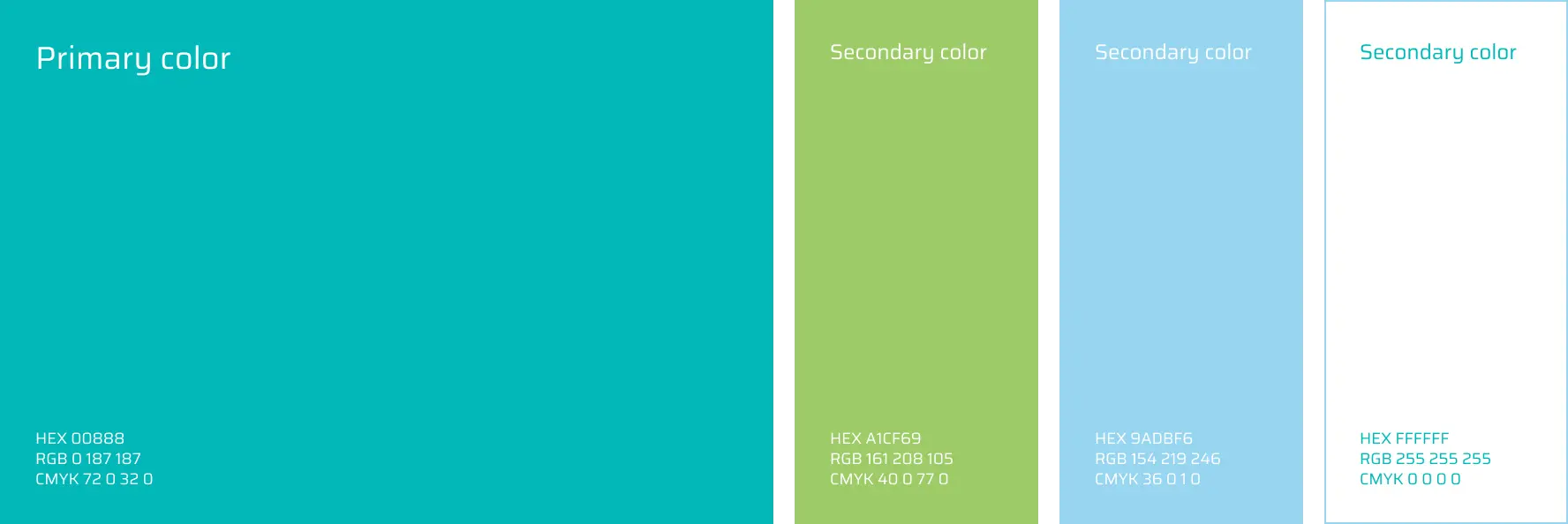
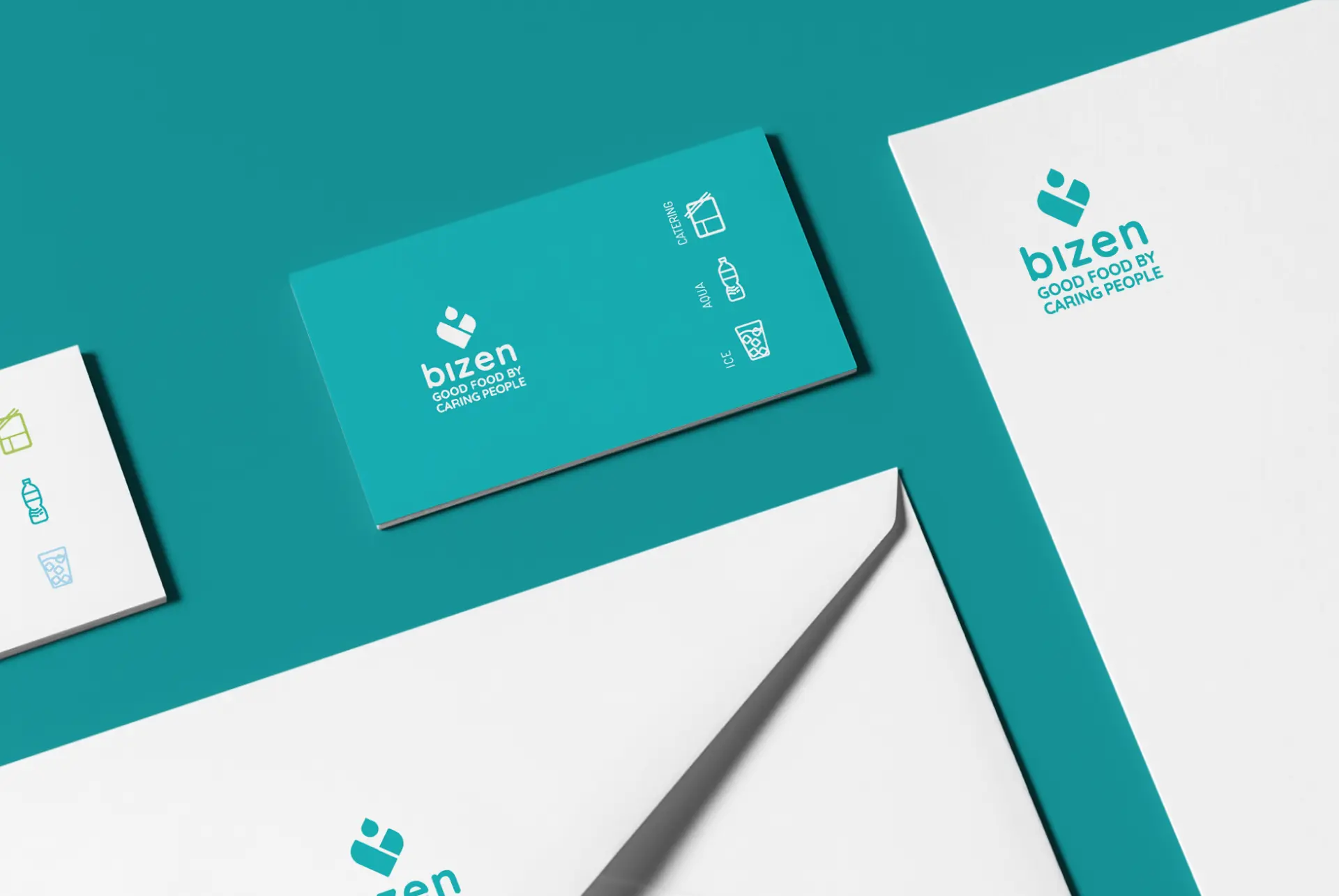
Colors
The gentle turquoise is like a calm ocean wave washing over you, while soft green accents whisper like leaves in the breeze. It’s a symphony of colors made just to relax your mind and soothe your soul. Think clear water, green meadows, and a deep breath in. That’s what Bizen’s colors feel like. It’s a place to pause, recharge, and savor the moment.
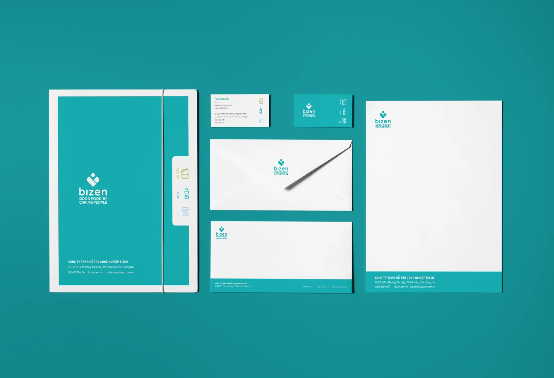
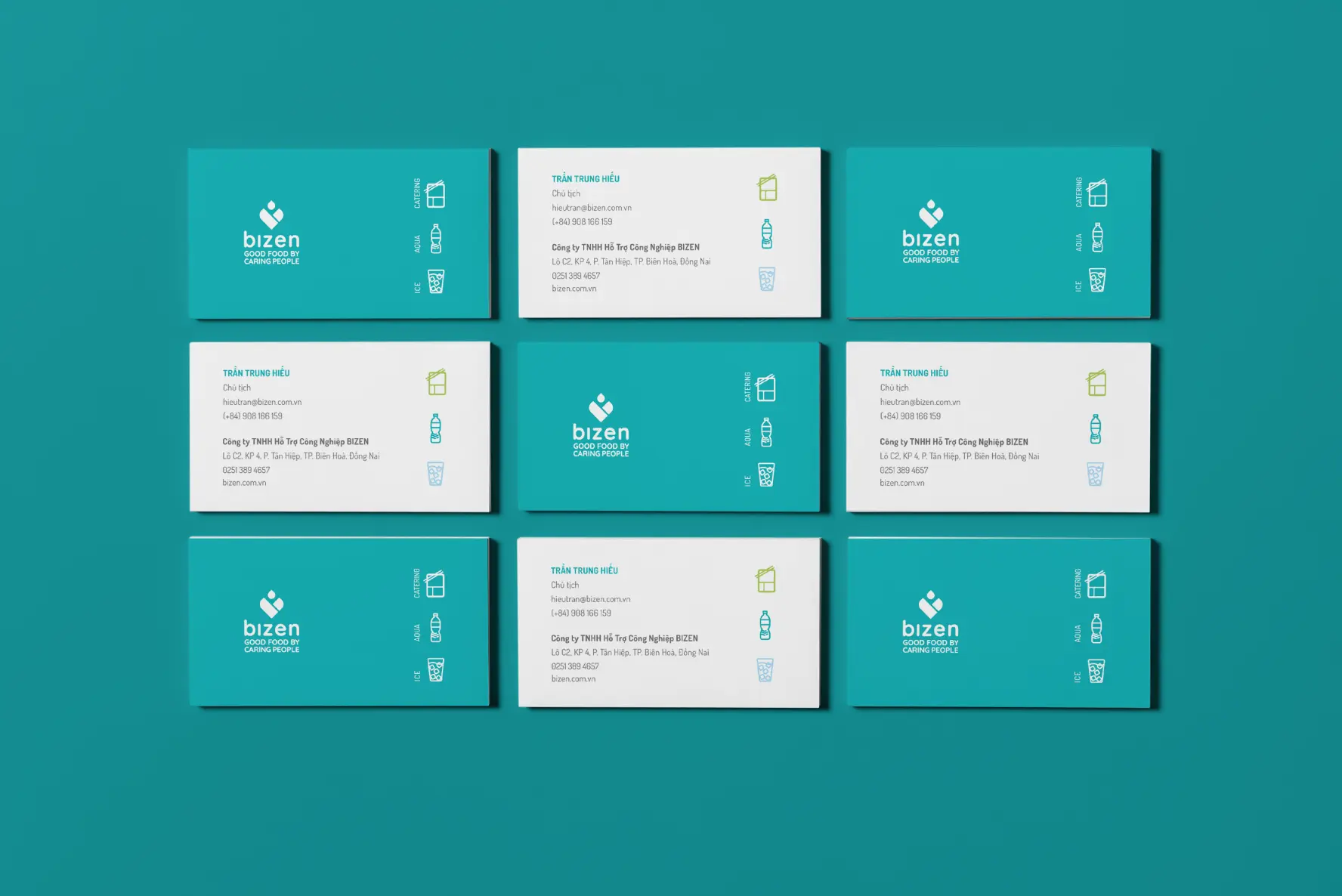
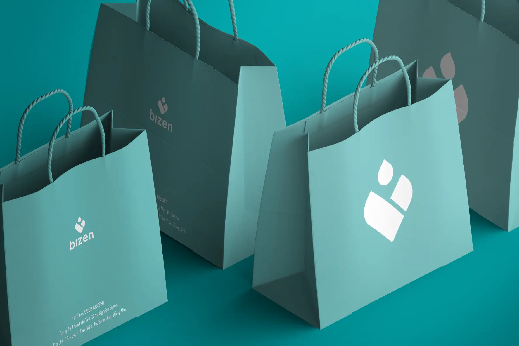
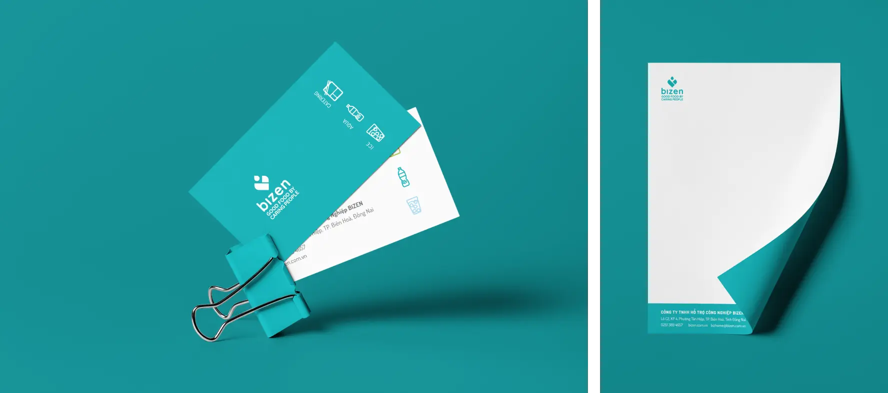
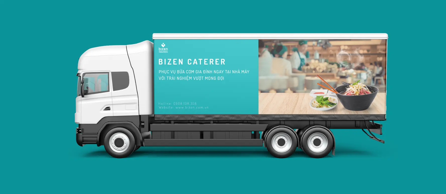
Visual
Remember Bizen’s amazing new look? The cool turquoise and calming greens that feel like a relaxing oasis? Yep, Align didn’t just stop there! We helped Bizen spread that amazing feeling everywhere on their applications.
Credit
Creative Director
Luan Jenkins
Project Manager
Van Pham
Branding Designer
Sa Luu