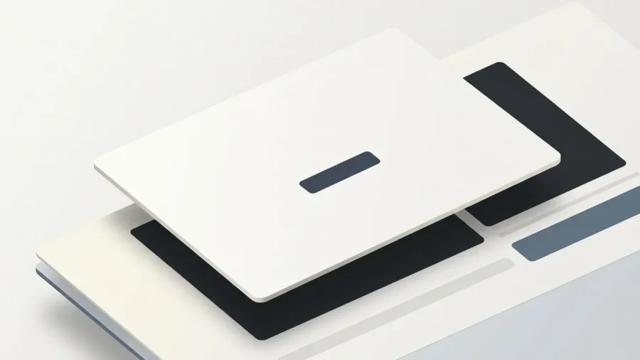
Good design isn’t just about what you put on the screen; it is about what you leave out. Mastering css white space is the secret to transforming a cluttered, overwhelming interface into a premium digital experience that breathes. When users land on your site, they shouldn’t have to hunt for information through a dense forest of text and images. Instead, strategic spacing acts as a visual map that guides the eye toward your most important calls to action.
While many stakeholders view empty areas as wasted real estate, expert designers know that negative space is a functional tool for clarity. By balancing your layout with intentional gaps, you reduce cognitive load and make your content significantly more digestible. Effective use of spacing creates a sense of luxury and professionalism, ensuring your brand feels sophisticated rather than cramped. Let’s dive into how modern CSS techniques can help you harness this power to build cleaner, more accessible websites.
Understanding the Fundamentals of CSS White Space
In the world of web design, white space is often misunderstood as merely ‘the stuff in between.’ However, professional designers treat it as a structural element as vital as your typography or color palette. When we talk about css white space, we are discussing the intentional use of negative area to define relationships between objects and prevent a layout from feeling overwhelming.
Defining Macro vs. Micro White Space
Macro white space refers to the large gaps between major layout elements, such as the margins between sections or the padding around a hero image. This serves as the container for your content, providing the breathing room necessary for a high-end, premium feel. Micro white space, conversely, focuses on the smaller details like letter-spacing, line-height, and the gaps between buttons and icons. While subtle, these micro-adjustments are what make a page truly readable and polished.
Passive vs. Active Spacing Strategies
Passive white space is the natural result of content flow, such as the space at the end of a paragraph. Active spacing is where the magic happens; it is the deliberate addition of gaps to draw focus or create a specific visual flow. By using CSS properties like margin and padding with intent, you can force the user’s eye toward a primary Call to Action (CTA) or a key value proposition.
The Psychological Impact on User Cognition
Effective spacing isn’t just about aesthetics; it is rooted in how our brains process information. Dense layouts increase cognitive load, forcing the brain to work harder to distinguish between different units of data. By increasing white space, you allow the user to scan and categorize information more efficiently, which leads to better retention and a more enjoyable browsing experience.[1]
Simplicity is not the absence of clutter; it is the presence of clarity through intentional design.
Quick Breakdown: Why Spacing Matters
- Reduces cognitive load for faster information processing
- Establishes a clear visual hierarchy between elements
- Enhances readability and accessibility across devices
- Elevates the brand perception to feel more professional

The Technical Toolkit: Modern CSS Methods for Spacing
Translating a clean design into a functional browser experience requires a deep understanding of how to implement css white space effectively. While designers often think in terms of ‘breathing room,’ developers must translate that vision into specific properties that govern the flow of elements. Modern CSS has moved far beyond simple hacks; we now have a robust set of tools that allow for fluid, responsive layouts that maintain their integrity across different screen sizes.[2]
Mastering the Box Model: Margin and Padding
The foundation of all spacing begins with the CSS Box Model. Padding creates space inside an element, effectively pushing the content away from the border, while margin creates space outside the element to separate it from its neighbors. Choosing between them is not just about visual results; it is about how the element interacts with background colors and borders. When you need to increase the clickable area of a button while maintaining its position, padding is your best friend.
| Property | Location | Best Use Case |
|---|---|---|
| Margin | Outside the border | Separating adjacent components or centering blocks. |
| Padding | Inside the border | Increasing internal breathing room or hit areas. |
| Gap | Between grid/flex items | Consistent gutters without worrying about outer edges. |
The Power of the Gap Property in Flexbox and Grid
One of the most significant improvements to css white space management is the gap property. Previously, developers had to rely on complex margin calculations or ‘negative margin’ tricks to create gutters between items. With Flexbox and Grid, the gap property allows you to define the exact distance between child elements without affecting the outer edges of the container. This ensures that your layout remains perfectly aligned with your design grid while keeping the code clean and maintainable.
Using Logical Properties for Responsive Layouts
As the web becomes more global, logical properties like margin-block and padding-inline are replacing physical properties like ‘top’ or ‘left.’ These properties adapt based on the writing mode of the document, ensuring that your white space remains consistent even when a site is translated into right-to-left languages. This forward-thinking approach to spacing ensures that your design intent is preserved regardless of how the user accesses the content.
Precision in your CSS spacing is the difference between a website that looks ‘good’ and one that feels truly premium.

How Proper Spacing Improves UX and Accessibility
Effective use of css white space is not just an aesthetic choice; it is a critical component of a functional user experience. When elements have room to breathe, users can process information without feeling overwhelmed by a cluttered interface. This clarity directly impacts how long a visitor stays on your page and how easily they can navigate your content, which are key signals for both user retention and SEO performance.
Enhancing Readability and Text Scannability
Typography requires generous spacing to be legible. By managing line-height and paragraph margins, you prevent the ‘wall of text’ effect that causes users to bounce. According to WCAG 2.1 guidelines, specific text spacing requirements; such as ensuring line height is at least 1.5 times the font size; help users with visual impairments or cognitive disabilities consume content more effectively.[3]
Creating Clear Visual Hierarchies
Spacing acts as a silent conductor, guiding the eye from the most important headline to the secondary call to action. By increasing the white space around a button or a key value proposition, you signal its importance without needing to increase its font size to an obnoxious degree. This proximity, or lack thereof, helps users mentally group related features together, making the interface intuitive to navigate.
Improving Touch Targets for Mobile Users
On mobile devices, css white space becomes a matter of physical utility. Proper padding around links and buttons ensures that ‘fat-finger’ errors are minimized, preventing users from accidentally clicking the wrong element. This attention to detail improves the overall accessibility score of your site and ensures a frustration-free experience across all screen sizes.
Accessibility Quick Wins:
- Set line-height to a minimum of 1.5 for body copy to improve flow.
- Ensure letter-spacing is at least 0.12 times the font size.
- Increase paragraph spacing to at least 2 times the font size.
- Maintain a minimum touch target size of 44×44 pixels for all interactive elements.

Common Mistakes: When White Space Goes Wrong
While css white space is a designer’s best friend, it is entirely possible to have too much of a good thing. Mismanaged spacing can lead to a disjointed user experience where elements feel isolated rather than organized. When the balance is off, users may struggle to find the connection between a headline and its corresponding body copy, or they might miss critical calls to action because the layout feels empty rather than intentional.
The Trap of Over-Spacing on Small Screens
Generous margins that look luxurious on a 27-inch iMac can quickly become a usability nightmare on a smartphone. Excessive vertical padding forces mobile users into an endless scroll, burying important content beneath layers of empty air. This often leads to increased cognitive load as users struggle to maintain a mental map of the page layout. Designing for mobile requires a tighter, more disciplined approach to spacing that preserves clarity without sacrificing information density.[4]
Inconsistent Rhythms and Breaking the Grid
Nothing kills a professional aesthetic faster than inconsistent spacing. When one section uses 40px of padding and the next uses 55px without a clear structural reason, the visual rhythm breaks. This lack of harmony makes a site feel unpolished and can subconsciously signal a lack of quality to the visitor. Sticking to a strict spacing scale ensures that every element feels like it belongs to the same design system.
Neglecting Vertical Rhythm in Typography
Vertical rhythm is the heartbeat of readable text. When designers focus solely on horizontal margins but ignore the space between lines and paragraphs, the content becomes a chore to read. Proper css white space in typography ensures that the eye moves naturally from one line to the next, preventing the ‘wall of text’ effect that drives users away.
Spacing Audit Checklist:
- Check if related elements are visually grouped using the Law of Proximity.
- Verify that mobile margins allow users to see at least two distinct content blocks per screen.
- Ensure all padding and margin values follow a consistent mathematical scale (e.g., multiples of 8).
- Test that buttons have enough breathing room to be tapped without hitting neighboring links.
Advanced Tips for Harmonious Layouts
Mastering css white space is not just about aesthetic taste; it is about creating a predictable system that scales across every screen size. When developers and designers speak the same spatial language, the handoff process becomes seamless, and the final product feels intentional rather than accidental.
Implementing the 8pt Grid System
Consistency is the secret sauce of clean design. By using an 8pt grid system, you ensure that every margin, padding, and gutter value is a multiple of eight. This mathematical approach eliminates the guesswork of choosing between 15px or 20px, creating a rhythmic harmony that users subconsciously find more trustworthy and professional.
Using CSS Variables for Global Spacing Control
Hardcoding values is a recipe for technical debt. By defining your spacing tokens as CSS variables, you gain total control over your layout from a single source of truth. This makes rebranding or adjusting the ‘breathability’ of your site as simple as changing one line of code, ensuring that your css white space remains uniform across hundreds of components.
Leveraging Clamp() for Fluid Spacing
Static spacing often breaks on ultra-wide monitors or small mobile devices. The CSS clamp() function allows you to define a minimum, preferred, and maximum value for your spacing. This ensures your gutters grow and shrink fluidly with the viewport, maintaining the perfect visual balance without requiring dozens of media queries.
Pro-Developer Spacing Workflow:
- Define a spacing scale using CSS variables like –space-m: 1.5rem;
- Use the 8pt rule to keep vertical rhythm consistent across components.
- Apply clamp() to container padding to prevent layout ‘cramping’ on mobile.
- Audit your layout by toggling a ‘redline’ CSS class to visualize invisible margins.
Systematized spacing is the bridge between a good layout and a world-class user experience; it turns chaos into a structured visual conversation.
Conclusion
Mastering css white space is far more than a stylistic preference; it is a fundamental requirement for high-performing digital products. By moving away from arbitrary pixel values and embracing a systematic approach with fluid scales and modern properties, you create interfaces that feel intuitive and effortless to navigate. Remember that the space between your elements is just as important as the elements themselves, as it dictates the rhythm, hierarchy, and overall emotional impact of your brand. When you treat negative space as an active design component, you ensure your content remains readable and your users remain engaged across every possible device.
Elevate Your Digital Presence with Align
Building a truly effective website requires a delicate balance between visual aesthetics and technical performance. At Align, our team of UX/UI designers and SEO experts understands that the right use of css white space can be the difference between a cluttered bounce and a high-converting customer journey. We specialize in creating breathable, modern digital experiences that prioritize user clarity and search engine visibility. If you are ready to transform your online presence into a polished, professional platform that resonates with your audience, visit align.vn to see how we can bring your vision to life through intentional design and strategic growth.