Let’s be honest: nobody downloads a mobile app hoping to squint at their screen. In the high-stakes world of digital products, font size for mobile app design is often the invisible line between a seamless user journey and a frustrated uninstall. When text is too small, users struggle; when it is too large, your carefully crafted layout breaks. Getting it right requires a delicate balance of aesthetics and technical precision that respects the unique constraints of handheld devices.
Designing for mobile means accounting for varying viewing distances, lighting conditions, and the physical reality of high-density displays. While some designers treat typography as a secondary concern, industry leaders like Apple emphasize that legibility should always be the priority. According to guidelines from Median.co, Apple’s typography standards suggest that text must remain legible even when users adjust their system-wide settings. In this guide, we will break down the essential scales, platform-specific rules, and accessibility principles you need to master to build interfaces that feel effortless and professional.[1]
Why Font Size Matters More on Mobile
Unlike desktop screens, mobile displays are held close (typically 10–18 inches from the eye), touched directly with fingers, and used in a huge variety of lighting conditions — from a bright outdoor patio to a dimly lit bedroom. All of these factors mean your type must work harder.
Additionally, mobile screens have physical size limits. A 6-inch display is simply not the same canvas as a 27-inch monitor. Every pixel is precious, and typography choices directly compete with imagery, navigation, and interactive elements for that space.
“A font that reads beautifully on desktop may become a blur on a small screen at arm’s length. Always design for the worst realistic conditions, not the best.”
According to the A11Y Collective, over half of all online traffic now comes from mobile devices, which makes getting mobile typography right not just a design preference, but a business necessity.

Platform Minimum Standards
Both Apple and Google publish official guidelines on minimum readable font sizes, and they align closely. These are not aesthetic suggestions — they’re baseline requirements backed by research on reading distance and visual acuity.
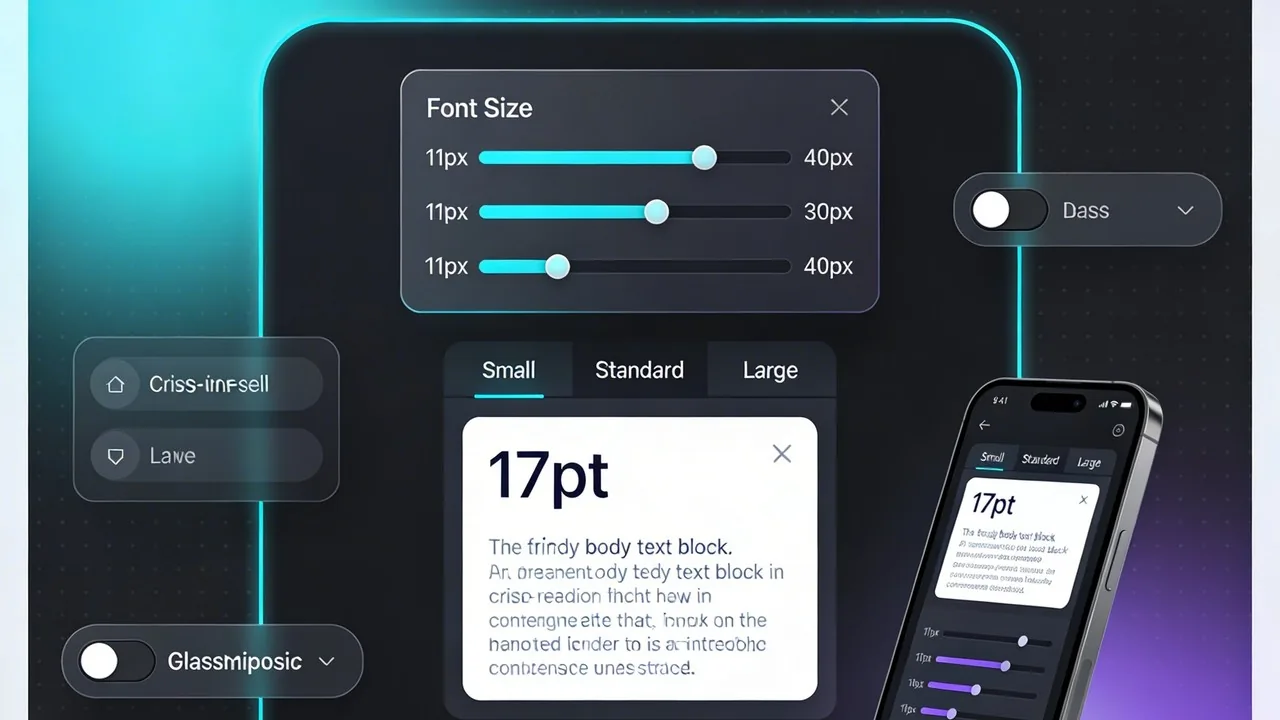
Apple’s Human Interface Guidelines (HIG) recommend a default body text size of 17pt using SF Pro, with a minimum floor of 11pt for any text in the interface.
Google’s Material Design 3 uses sp (scaleable pixels) instead of px, with a default body text of 16sp in Roboto. Their type scale is built on sizes of 12, 14, 16, 20, and 34 — a disciplined range that balances density and comfort.
| Element | iOS (Apple HIG) | Android (Material 3) | Status |
|---|---|---|---|
| Body / main text | 17pt (SF Pro) | 16sp (Roboto) | Recommended |
| Secondary / caption | 13–15pt | 12–14sp | Recommended |
| Subheadings | 17–20pt (semibold) | 16–22sp (medium) | Recommended |
| Headlines / H1 | 28–34pt | 24–32sp | Recommended |
| Absolute minimum | 11pt | 11sp | Accessibility floor |

Live type scale preview
Here’s how a practical type scale looks in action. Notice how the size jumps create clear visual hierarchy without requiring aggressive weight changes. This scale closely mirrors what both Apple and Google recommend in their official documentation.

Key Principles to Guide Your Decisions
1. 16px minimum for body
2. Use Dynamic Type
3. Limit your scale
4. Test on real devices
5. Line height matters
6. Contrast over size
Common Mistakes to Avoid
Even experienced designers make these typography missteps when transitioning from desktop to mobile thinking:
Using desktop type scales directly. A 14px body copy that reads fine on a 1440px desktop display becomes strained at arm’s length on a phone. According to Learn UI Design’s complete guide, always start fresh with a mobile-first scale — start at 17px and adjust from there.
Ignoring accessibility settings. Roughly 1 in 5 users have some form of visual impairment. Disabling Dynamic Type or capping font scaling breaks your app for millions of people. Apple’s App Store Connect even evaluates whether apps support Larger Text properly before granting the accessibility label.
Over-relying on weight alone for hierarchy. If all your text is 15px and you use bold to show importance, you’re making the hierarchy do too much heavy lifting. A proper size scale plus weight creates clear, effortless navigation.
Forgetting line length. On mobile, aim for 45–65 characters per line. As the original Material Design spec (citing the Baymard Institute) notes: around 60 characters per line is the target for a good reading experience — wider and the eye gets lost, narrower and reading feels choppy.
Quick Reference Cheat Sheet: The Ideal Font Size for Mobile App Design
Navigating the nuances between platforms can feel like a balancing act, but having a standardized type scale ensures your interface remains accessible and professional. While both Apple and Google provide extensive documentation, most high performing apps gravitate toward a shared set of ranges that prioritize readability without sacrificing screen real estate. This cheat sheet serves as your baseline for creating a harmonious visual hierarchy.
Mobile Type Scale: Recommended Ranges
When you are mapping out your typography, treat these ranges as your safe zones. Staying within these parameters ensures that your text is large enough to be legible on a standard smartphone screen while remaining distinct enough to guide the user’s eye from the most important headers down to the fine print.
| Element Type | Recommended Range | Minimum for Accessibility |
|---|---|---|
| Display Heading | 32pt – 40pt | 32pt |
| H1 Title | 24pt – 32pt | 24pt |
| H2 Subheading | 20pt – 24pt | 20pt |
| Body Text | 16pt – 17pt | 16pt |
| Secondary Text | 13pt – 15pt | 13pt |
| Caption / Footnote | 11pt – 13pt | 11pt |
Accessibility isn’t a feature you add later; it is the foundation of a usable product. If your caption text drops below 11pt, you aren’t just making it small, you are making it invisible to a significant portion of your audience.
According to the Apple Human Interface Guidelines[2], using text styles instead of fixed numbers allows the system to automatically adjust tracking and leading based on the selected font size. This native behavior ensures that a 17pt body font remains legible whether the user is viewing a dense list or a long-form article. Always verify your designs against these benchmarks during the wireframing stage; if your primary body text falls below 16sp or 17pt, you are likely creating a friction point for your users.
Conclusion
Mastering font size for mobile app design is a balancing act between aesthetic intent and technical necessity. By adhering to the established frameworks of iOS and Android while prioritizing a 16pt base, you ensure that your interface remains inclusive and readable for every user. Typography is the silent ambassador of your brand; it dictates how easily information is consumed and how quickly actions are taken. When you respect system scaling and contrast ratios, you move beyond simple decoration into the realm of high-performance product design. Ultimately, a thoughtful approach to type hierarchy transforms a standard application into a seamless, professional experience that users will trust and return to repeatedly.
Want to apply these principles to your next project?
Designing for global, English-speaking markets requires more than just a sharp eye for visuals; it demands a deep understanding of technical performance and user behavior. At Align, our team bridges the gap between high-end UX/UI design and the rigorous standards of modern mobile development. We specialize in creating accessible, high-performance interfaces that resonate with international audiences while ensuring every pixel serves a purpose. Whether you are launching a new product or refining an existing interface, we help you navigate the complexities of mobile design to deliver a product that is both beautiful and highly functional. Visit us today to see how our expertise can elevate your mobile strategy.