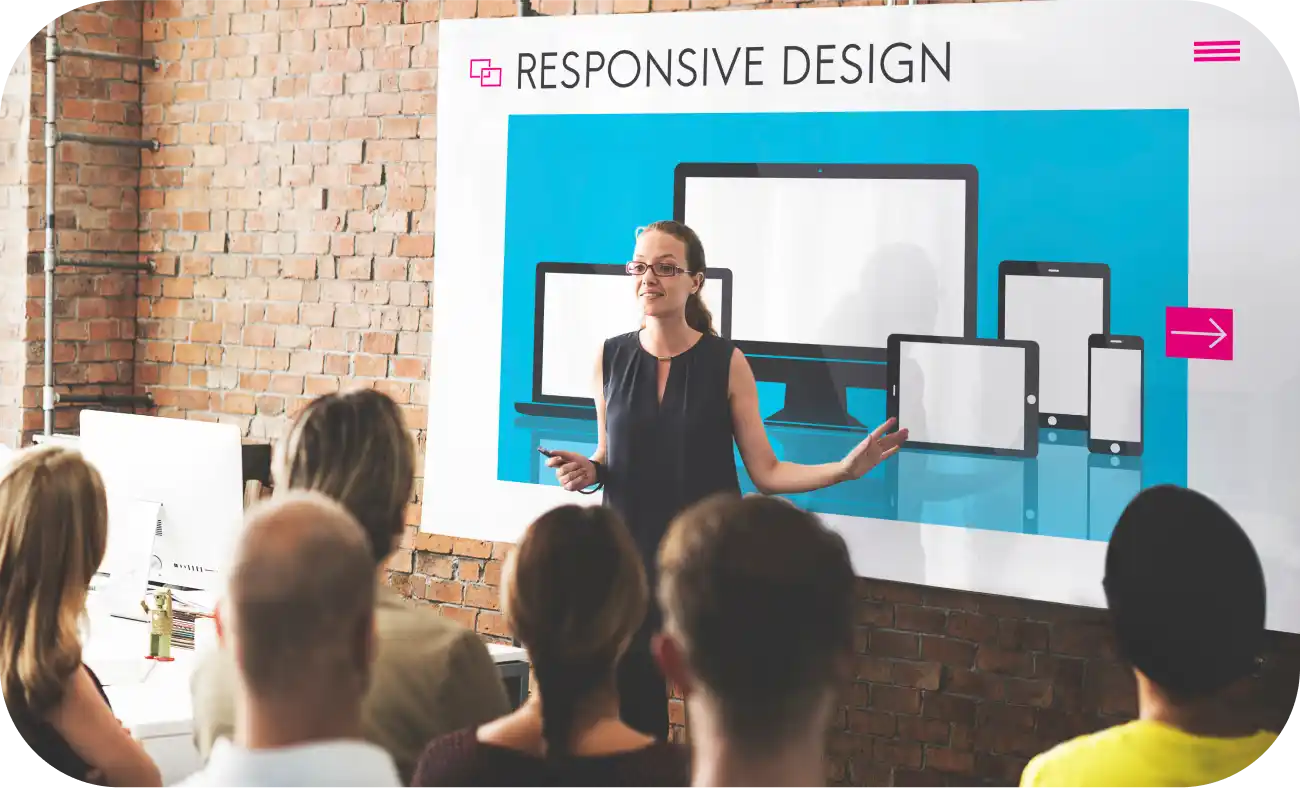
The Evolution of Web Design: In the early days of the internet, websites were typically designed for desktop computers. However, with the advent of smartphones and tablets, the landscape changed dramatically. Users began accessing the web from a myriad of devices with different screen sizes and resolutions, leading to the birth of responsive design.
What is Responsive Website Design (RWD)?
Responsive website design refers to the approach of creating a website that “responds to” or resizes itself depending on the type of device it is being seen through. This means no more squinting at tiny text on your phone or struggling to navigate a cluttered desktop interface on your tablet. A well-designed responsive website provides a consistent and optimal user experience no matter the screen size or device.

Core Principles of Responsive Design
Responsive design is based on three primary principles: fluid grids, flexible images, and media queries.
Fluid Grids
These grids use relative units like percentages, rather than fixed units like pixels, for layout elements. This fluidity makes the design adaptable to any screen size.
Flexible Images
Images in responsive design are also sized in relative units to prevent them from displaying outside their containing element.
Media Queries
These are simple filters added to CSS styles. They make it possible to change styles based on the characteristics of the device rendering the site, primarily the width of the browser.
Why is Responsive Website Design Important?
The internet is no longer confined to desktops. According to StatCounter, over 54% of global web traffic now comes from mobile devices. This means that if your website isn’t mobile-friendly, you’re essentially shutting out over half your potential audience.
But it’s not just about reaching more people. RWD also offers a number of other benefits:
Improved SEO
Google and other search engines prefer responsive sites. Mobile-friendliness is a significant ranking factor in search algorithms. A responsive website is more likely to rank higher, leading to more organic traffic.
Reduced bounce rate
Users are more likely to stay on a website that’s easy to navigate and use on their device. This leads to higher conversion rates as it provides a better experience for users.
Enhanced brand image
A responsive website shows that you care about your users’ experience and are keeping up with the latest trends. This can give your brand a positive image.
Cost-Effective Maintenance
Maintaining a single responsive website is less costly and less time-consuming than maintaining multiple versions of a site for different device types.
Enhanced User Experience
Responsive design offers a better user experience. Users can access content on any device without the need for horizontal scrolling or resizing.
Disclosure: Specializing in the design and programming of websites for a diverse range of companies, Align understands the critical importance of responsive design in today’s digital landscape, especially the transformative power of RWD. Every project is approached with a keen eye for detail and a deep understanding of the unique demands of modern web users. The agency’s commitment to crafting websites that are not only visually stunning but also highly functional across all devices underscores their dedication to delivering the best results for Align’s clients. Partner with Align, and let our expertise in RWD principles, cutting-edge frameworks, and user-centric design bridge the gap between your brand and your audience, no matter their device.
Challenges in Responsive Design
While responsive design is beneficial, it comes with its challenges:
Navigation
Designing a navigation system that works across different devices can be complex.
Load Time
Responsive sites might load more slowly on mobile devices due to additional responsive elements.
Complexity in Design and Development
Creating a responsive design requires a deeper understanding of CSS and HTML, along with a more strategic planning process.
Best Practices in Responsive Design
To create an effective responsive design, consider the following best practices:
Mobile First
Start designing for the smallest screen first and then scale up.
Touchscreen Considerations
Ensure that all elements are easily navigable by touch.
Test on Multiple Devices
Regularly test your design on various devices and browsers to ensure consistency.
Prioritize Content
Decide what content is most crucial and ensure it is easily accessible on smaller screens.

Exemplary Cases of Responsive Website Design
Responsive website design is best understood through real-world examples. Prominent sites like The New York Times, Google, Material Design, and Airbnb not only demonstrate responsive design but also set standards for others to follow.
1. The New York Times [https://www.nytimes.com/]:
– Adaptability: The New York Times website showcases a fluid layout that adapts seamlessly to various screen sizes. On smaller screens, the menu collapses into a hamburger icon, making navigation simpler.
– Typography and Images: The typography and image scaling adjust dynamically, ensuring readability and visual appeal across devices.
– Content Prioritization: The site maintains content hierarchy, prioritizing important news pieces regardless of the device used for access.
2. Google [https://www.google.com/]:
– Minimalistic Design: Google’s homepage is the epitome of simplicity and responsiveness. The search bar and buttons resize and reposition based on the screen size.
– Speed and Efficiency: The site’s design emphasizes speed and efficiency, ensuring quick load times and easy navigation on any device.
– Interactive Elements: The interactive elements, like the search bar and voice search, are optimized for both desktop and mobile use.
3. Material Design [https://material.io/]:
– Consistency Across Devices: Material Design’s website is a practical guide on responsive design, demonstrating consistent aesthetic and functionality across devices.
– Interactive and Educational: The site uses interactive elements to educate about responsive design, ensuring a great user experience on desktops, tablets, and smartphones alike.
– Resource Accessibility: Whether accessed on a phone or a computer, resources and guidelines remain easily accessible and readable.
4. Airbnb [https://www.airbnb.com/]:
– User-Centric Design: Airbnb’s website is designed with the user in mind, ensuring a seamless experience whether on a phone, tablet, or desktop.
– Flexible Search and Booking: The search and booking functionalities adapt effortlessly to different screen sizes, maintaining functionality and ease of use.
– Visual and Interactive Harmony: The use of images, icons, and interactive elements is harmonized across platforms, providing a consistent and engaging user experience.
In today’s digital landscape, Responsive Website Design is no longer a luxury, it’s a necessity. By embracing RWD, you can ensure that your website is accessible to everyone, regardless of the device they’re using. This will give you a competitive edge, improve your brand image, and ultimately lead to a more successful online presence.
So, what are you waiting for? Make your website responsive today and watch your audience grow. Partner with Align today.
Additional Resources:
W3Schools Responsive Web Design Tutorial: https://www.w3schools.com/css/css_rwd_intro.asp
Smashing Magazine: Responsive Web Design: https://www.smashingmagazine.com/2011/01/guidelines-for-responsive-web-design/
Google Developers: Mobile-Friendly Websites: https://developers.google.com/search/mobile-sites/


