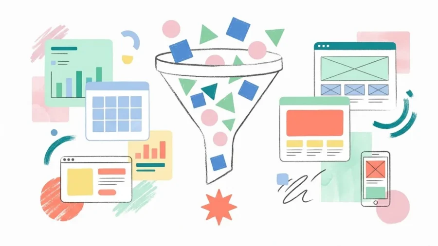
Most landing pages do not have a traffic problem. They have a hierarchy problem. You might be pouring thousands into ad spend only to watch your bounce rate skyrocket, but the issue rarely lies with your targeting; it lies with how your page prioritizes information. When a visitor arrives, they should not have to hunt for your value proposition or guess where to click next.
The first three seconds of a user’s visit are the most critical, and if your landing page hierarchy is cluttered or confusing, you lose them forever. Effective design is about more than aesthetics; it is about guiding the eye through a logical sequence of importance. By mastering the principles of visual organization, you can transform a high-bounce page into a conversion engine that speaks to the user’s needs before they even start scrolling. Let’s break down why your current layout might be failing and how to fix it.
What is Landing Page Hierarchy and Why Does It Matter?
At its core, landing page hierarchy is the intentional arrangement of elements to signal importance to the reader. It is the invisible hand that guides a visitor from a bold headline to a compelling call-to-action without them having to think about where to look next. When design lacks this structure, the user experience becomes a chaotic mess of competing buttons and blocks of text, leading to cognitive overload and immediate exits.
Visual hierarchy isn’t just about making things look pretty; it is the strategic roadmap that tells a user’s brain exactly what to prioritize first, second, and last.[1]
The Psychology of Scanning vs. Reading
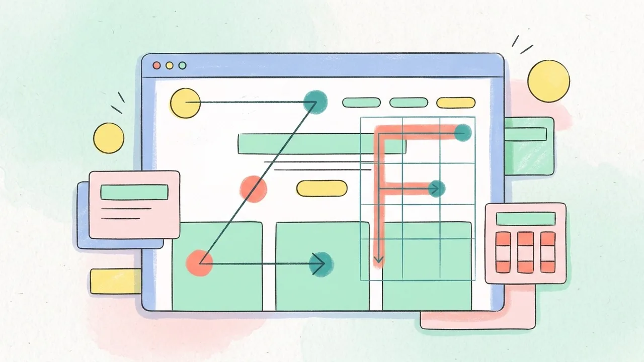
Modern web users rarely read every word on a screen. Instead, they scan in predictable patterns based on how we process visual information. The F-Pattern is common for text-heavy pages, where eyes move horizontally across the top and then down the left side. For landing pages with more visual weight, the Z-Pattern often takes over, as the eye zig-zags from the logo to the navigation, down through the hero image, and finally to the primary button. Understanding these behaviors allows you to place your most critical messages exactly where the eyes are already planning to land.
How Hierarchy Impacts Conversion Rates
A well-executed landing page hierarchy directly influences your bottom line by reducing friction. If your “Sign Up” button shares the same size and color as your “Learn More” link, you are forcing the user to make a choice, which creates a micro-moment of hesitation. By using scale, color contrast, and strategic whitespace, you can highlight the path of least resistance and drive higher engagement.
Quick Breakdown: The 3-Second Rule
- Identify: Can the user tell what you do in under three seconds?
- Locate: Is the primary call-to-action immediately visible without scrolling?
- Validate: Does the visual weight support your most important claim?
- Simplify: Are there any distracting elements competing for attention?
Core Elements That Define Your Landing Page Hierarchy
Establishing a successful landing page hierarchy requires more than just a good eye; it involves using specific design levers to pull the user through a narrative. Think of these elements as a visual GPS that guides the visitor from your value proposition to your final goal without them having to think twice about where to click next.[2]
Size and Scale: Making the Big Ideas Stand Out
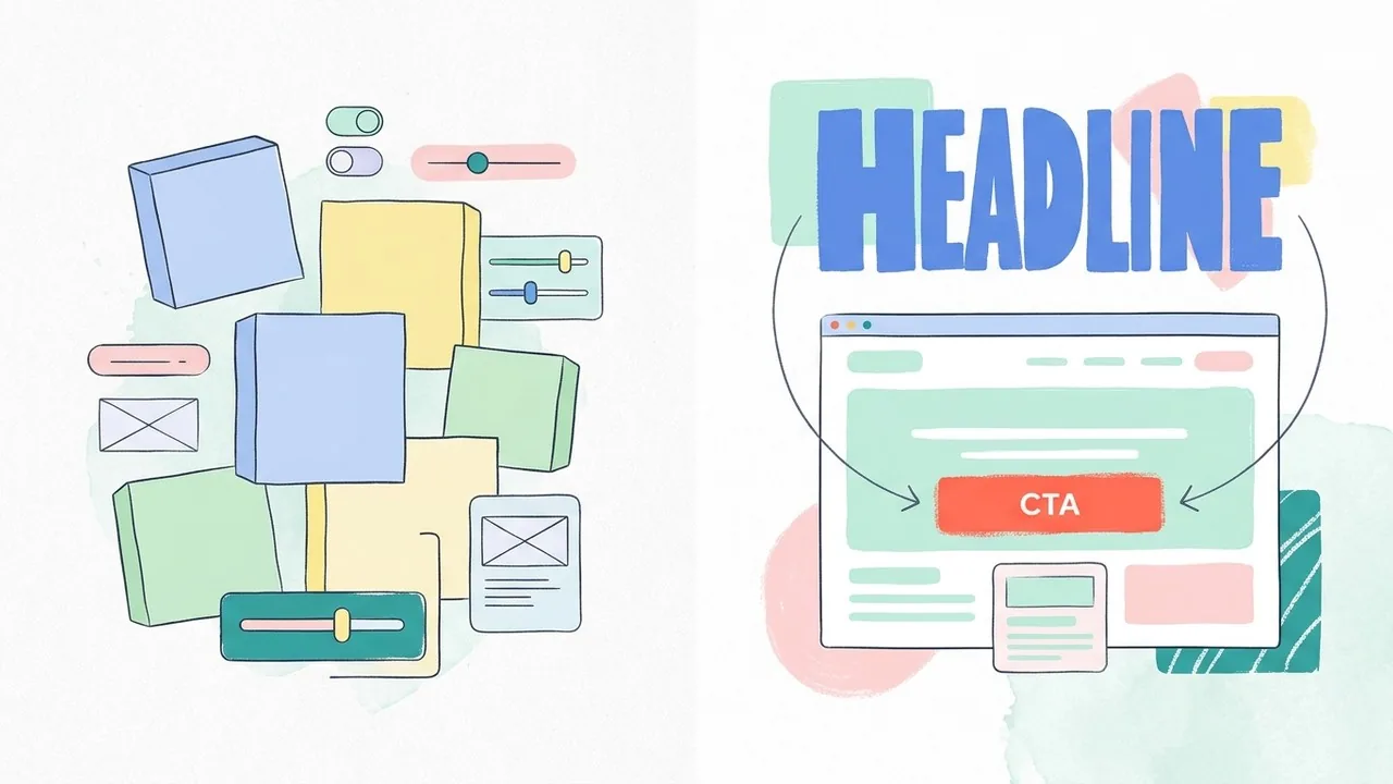
Human eyes are naturally drawn to the largest element on the screen. In the world of web design, scale is your most powerful tool for indicating importance. Your H1 headline should be the undisputed heavyweight champion of the page, signaling the primary message. If your subheadings or body text compete with the headline in size, the visual weight becomes unbalanced, leaving the user confused about where the story begins.
Color and Contrast: Directing the Eye to the CTA
Contrast is the secret sauce of conversion. While your brand colors might be muted or pastel, your primary call-to-action needs to pop against the background. Using a high-contrast color for your buttons creates a focal point that breaks the pattern of the rest of the page. This intentional use of color ensures that even a user skimming the content will stop when they hit that vibrant button.
Visual hierarchy isn’t just about making things look pretty; it’s about organizing information so that the user can process it with the least amount of cognitive effort possible.
Typography: Creating a Clear Information Architecture
Type choice influences how quickly information is digested. By varying font weights and styles, you create a nested structure that helps the brain categorize data. A bold, sans-serif font for headings paired with a clean, highly legible serif or light sans-serif for body copy establishes a professional rhythm that improves readability.
| Design Element | High Hierarchy (Priority) | Low Hierarchy (Secondary) |
|---|---|---|
| Typography | Bold, heavy sans-serif | Light, italic, or script fonts |
| Color | Vibrant, high-contrast hues | Neutral, muted, or grayscale tones |
| Scale | Large, dominant headlines | Small, supporting micro-copy |
Strategic Layout Patterns for Better Landing Page Hierarchy
Your layout functions as a roadmap for the user’s eyes. Without a clear path, visitors feel overwhelmed and bounce before they even understand your value proposition. Mastering landing page hierarchy means designing with intent; ensuring every element leads naturally to the next until the user reaches your primary goal.
The Hero Section: Establishing the Primary Focal Point
The hero area is the most critical real estate on your entire website. It is where you win or lose a lead in seconds. To maintain a strong landing page hierarchy, this section must be stripped of any noise that distracts from the core message. Clutter is a conversion killer; if your hero section feels crowded, the user’s brain will work too hard to find the point, leading to cognitive fatigue.
Checklist for a Perfect Hero Section:
- H1 Headline: A clear, benefit-driven statement of what you do.
- Sub-headline: Supporting context that builds trust or explains the ‘how’.
- Primary CTA: A high-contrast button that stands out from the background.
- Visual Anchor: A high-quality image or video that reinforces the message.
White Space: Giving Your Content Room to Breathe
White space is not ’empty’ space; it is a powerful design tool that helps categorize information. By increasing the padding around your most important elements, you signal their importance to the reader. According to design principles shared by the Nielsen Norman Group[3], using white space effectively is one of the top ways to create visual hierarchy in UX, as it prevents elements from competing for attention.
Visual Direction: Using Cues to Point Toward the Goal
Humans are naturally inclined to follow the gaze of others or the direction of an arrow. You can manipulate landing page hierarchy by using directional cues that point toward your lead form or CTA button. For example, if you use photography featuring a person, ensure they are looking toward your headline or button rather than off-screen. These subtle hints act as invisible hands, guiding the user’s focus exactly where you want it.
Effective hierarchy isn’t about making everything loud; it’s about knowing which elements should whisper so your call to action can scream.
Ready to turn your traffic into customers? Explore how Align’s UX/UI experts build high-converting landing pages tailored for your brand.
Common Mistakes in Landing Page Hierarchy (and How to Fix Them)
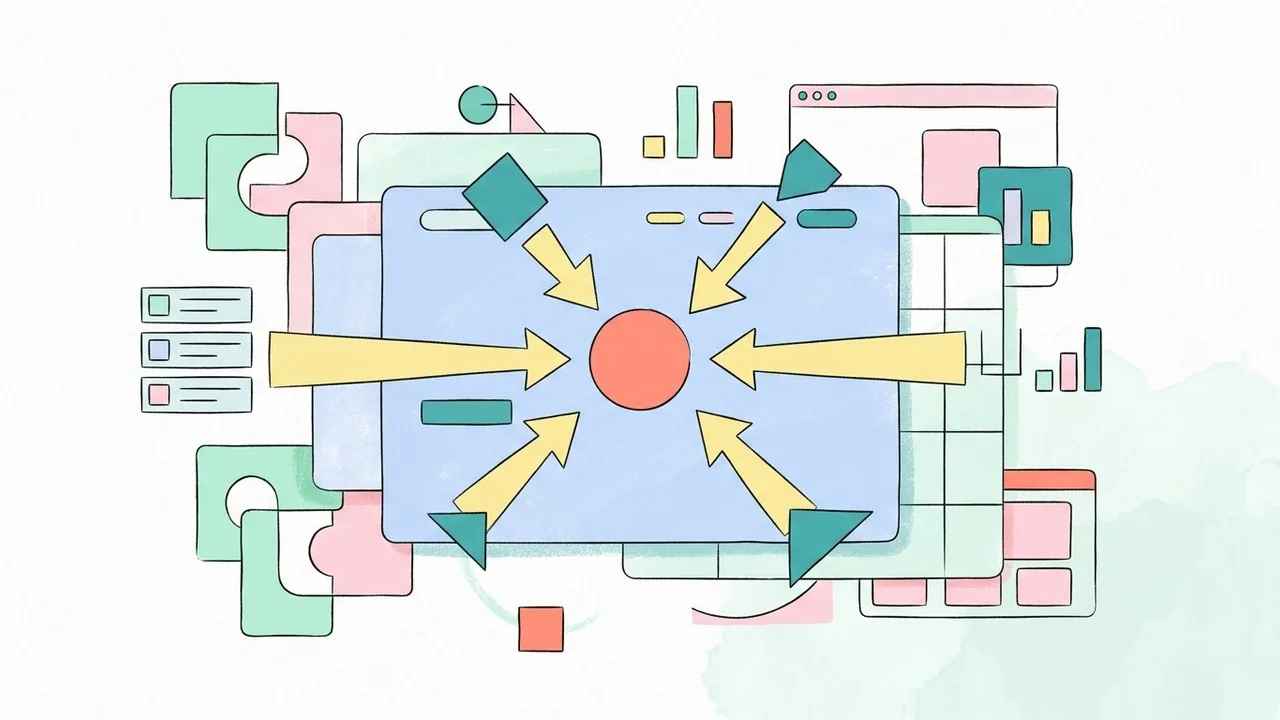
Even the most beautiful designs can fail if the landing page hierarchy is cluttered or confusing. When every element on the screen competes for attention, users experience cognitive overload and often bounce before taking action. Avoiding these common pitfalls ensures your message remains clear and your conversion path stays unobstructed.
The ‘Competing CTA’ Trap
A frequent error is giving three or four different buttons the same visual weight. If your ‘Sign Up,’ ‘Learn More,’ and ‘Contact Us’ buttons all use the same high-contrast primary color, you are forcing the visitor to stop and think about which one matters most. To fix this, use a clear primary action color for your main goal and neutral or outlined styles for secondary options.
Burying the Lead with Poor Text Weight
Typography plays a massive role in how users scan a page. When headlines and subheadlines have similar font sizes or weights, the reader’s eye gets lost in a sea of text. Proper landing page hierarchy requires a stark contrast between your value proposition and the supporting body copy; if your headline doesn’t immediately stand out, your visitors won’t know why they should stay.
Overwhelming Users with Visual Noise
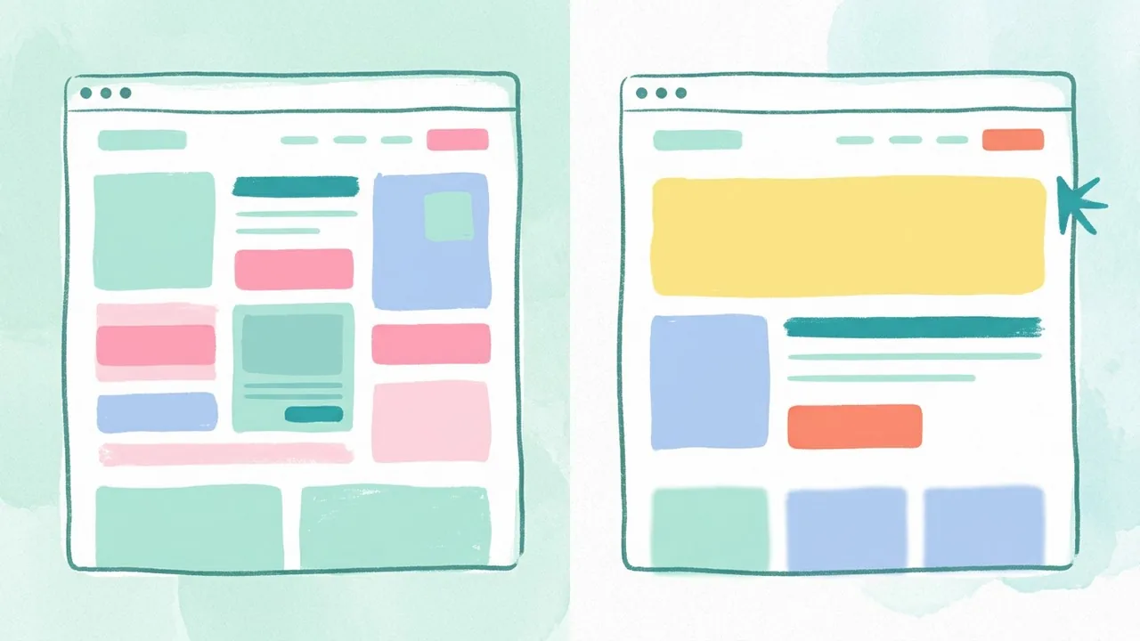
Too many competing colors, icons, and background patterns create visual noise that drowns out your core message. If everything is loud, nothing is heard. A great way to audit your design is the Squint Test: blur your eyes and look at your page. If you cannot immediately identify the most important element, your hierarchy needs work.[4]
Clarity tops aesthetics every time; a landing page that looks busy is a landing page that feels like work for your customer.
Quick Hierarchy Audit:
- Ensure the primary CTA is the most vibrant element on the screen.
- Use size and weight to create a clear 1-2-3 reading order for text.
- Increase white space around key sections to let the design breathe.
- Apply the Squint Test to see if the focal point remains obvious when blurred.
Is your site losing leads to a cluttered layout? Let the UX/UI design experts at Align audit your landing page hierarchy and streamline your path to conversion.
Testing and Optimizing Your Landing Page Hierarchy
Design is never a one-and-done task; it is a hypothesis waiting to be proven. While following best practices is a great starting point, the true effectiveness of your landing page hierarchy is determined by how real people interact with your content. According to the Interaction Design Foundation[5], visual hierarchy is a core tenet of UX that helps users process information and complete tasks with minimal friction. To ensure your layout is actually doing its job, you need to move beyond intuition and start looking at the data.
Using Heatmaps to Track User Attention
Tools like Hotjar or Crazy Egg provide a window into your users’ minds by visualizing where they click, move, and scroll. If your heatmap shows users hovering over a decorative image rather than your primary CTA, your landing page hierarchy is misaligned. These insights allow you to see if the visual weight of your elements is successfully guiding the eye or if users are getting stuck in ‘dead zones’ that offer no conversion value.
A/B Testing Element Placement
A/B testing is the ultimate tie-breaker for design debates. By creating two versions of a page with slight variations in hierarchy, such as swapping the order of a testimonial and a features list, you can identify which flow leads to higher engagement. Even small adjustments to the scale of a headline or the color contrast of a button can significantly shift user behavior.
Data-driven design replaces subjective opinions with objective proof, ensuring every pixel on your landing page earns its keep.
Iterating Based on Mobile User Behavior
Hierarchy must be fluid because screen real estate is not a constant. On a desktop, you might have a wide canvas to play with balance and symmetry; however, on mobile, your landing page hierarchy becomes a strictly vertical race. You must prioritize the most critical information to appear first, as mobile users are often more task-oriented and less patient. Regularly reviewing mobile-specific session recordings helps you identify where long blocks of text or poorly scaled images might be causing users to bounce before they reach your offer.
Optimization Checklist:
- Review heatmaps to identify high-engagement ‘hot spots’.
- Run A/B tests on CTA placement and headline sizing.
- Audit the mobile experience to ensure the most vital info is ‘above the fold’.
- Check session recordings for ‘rage clicks’ that signal hierarchy confusion.
Mastering the Flow of Your Landing Page Hierarchy
Building a successful landing page requires a delicate balance between artistic flair and psychological precision. By establishing a clear landing page hierarchy; you guide your visitors through a narrative that feels intuitive rather than forced. Remember that every element on your page, from the scale of your typography to the placement of your primary call to action, serves as a signal to the user. When these signals align with user intent, friction disappears and conversion rates naturally climb. Consistency is your best friend here; so continue testing your layouts and refining your visual cues to ensure your message always lands with maximum impact.
Perfect Your Landing Page Hierarchy with Align
Creating a high-converting digital presence is a complex challenge that requires a blend of high-end UX/UI design and data-driven SEO strategy. At Align, we specialize in helping businesses across English-speaking markets transform their websites into powerful growth engines. Our team focuses on the nuances of user flow and brand impact; ensuring your landing page hierarchy speaks directly to your target audience. Whether you need a comprehensive landing page audit or a complete ground-up redesign, we are here to help you scale. Visit Align.vn today to discover how we can refine your digital strategy and turn your visitors into loyal customers.