You only have a heartbeat to make a first impression before a visitor decides your brand isn’t worth their time. If your website bounce rate is climbing, it is likely because your site fails to answer a user’s subconscious questions the moment the page loads. High bounce rates are rarely a mystery; they are a direct response to friction, confusion, or a lack of immediate value that frustrates the modern browser.
A recent 1,000-person survey highlights that the margin for error is shrinking, especially as mobile users demand instant gratification. In fact, research shows that 53% of mobile visitors will abandon a page[1] if it takes longer than three seconds to load. When your site feels sluggish or cluttered, users do not stick around to see your portfolio; they simply hit the back button. To keep your audience engaged, you must master the delicate balance of technical performance and visual clarity from the very first second.
The 5-Second Rule: Why Your Website Bounce Rate is Bleeding Traffic
In the digital landscape, first impressions are not just important; they are instantaneous. A 1,000-person survey of modern consumers reveals that the window to capture interest has narrowed to a razor-thin margin. While users often form a subconscious aesthetic opinion in about 0.05 seconds, the 5-second mark represents the critical point of no return where a visitor decides to engage or contribute to your website bounce rate.
The Psychology of the Snap Judgment
When a page loads, the human brain performs a lightning-fast audit of credibility and relevance. If the visual hierarchy is messy or the value proposition is buried, cognitive load increases, which triggers a flight response. Users do not blame themselves for being confused; they blame the interface. This snap judgment is rarely about the quality of your services and almost entirely about the perceived effort required to find information.
In a world of infinite tabs and instant scrolling, a high bounce rate is the market’s way of telling you that your digital front door is stuck.
Defining the ‘Bounce’ in a Post-Core Web Vitals Era
Modern SEO has shifted how we view user retention. With Google’s emphasis on Core Web Vitals, a bounce is no longer just a metric in a dashboard; it is a signal of poor technical health. If your site takes too long to become interactive, users feel a sense of digital paralysis. According to recent industry data, 53% of mobile users will abandon a site[2] if it takes longer than three seconds to load. By the time the five-second clock runs out, more than half of your potential leads have already vanished into a competitor’s ecosystem.
The 5-Second Friction Audit:
- Visual Clarity: Is the primary call-to-action visible without scrolling?
- Load Velocity: Does the main content render before the user loses patience?
- Trust Signals: Are professional branding and security indicators present?
- Relevance: Does the headline match the link the user clicked to get here?
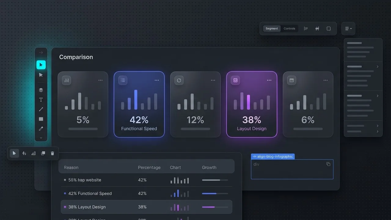
Survey Results: The Top 5 Reasons Users Hit the Back Button
Understanding why visitors flee requires looking beyond simple metrics and into the psychology of first impressions. Our recent survey of 1,000 digital consumers highlights a brutal reality: your website bounce rate is often decided before the user even reads your first sentence. While many brands obsess over deep-funnel content, the majority of exits happen because of fundamental friction points that signal a lack of professionalism or care.
The 5-Second Exit Data:
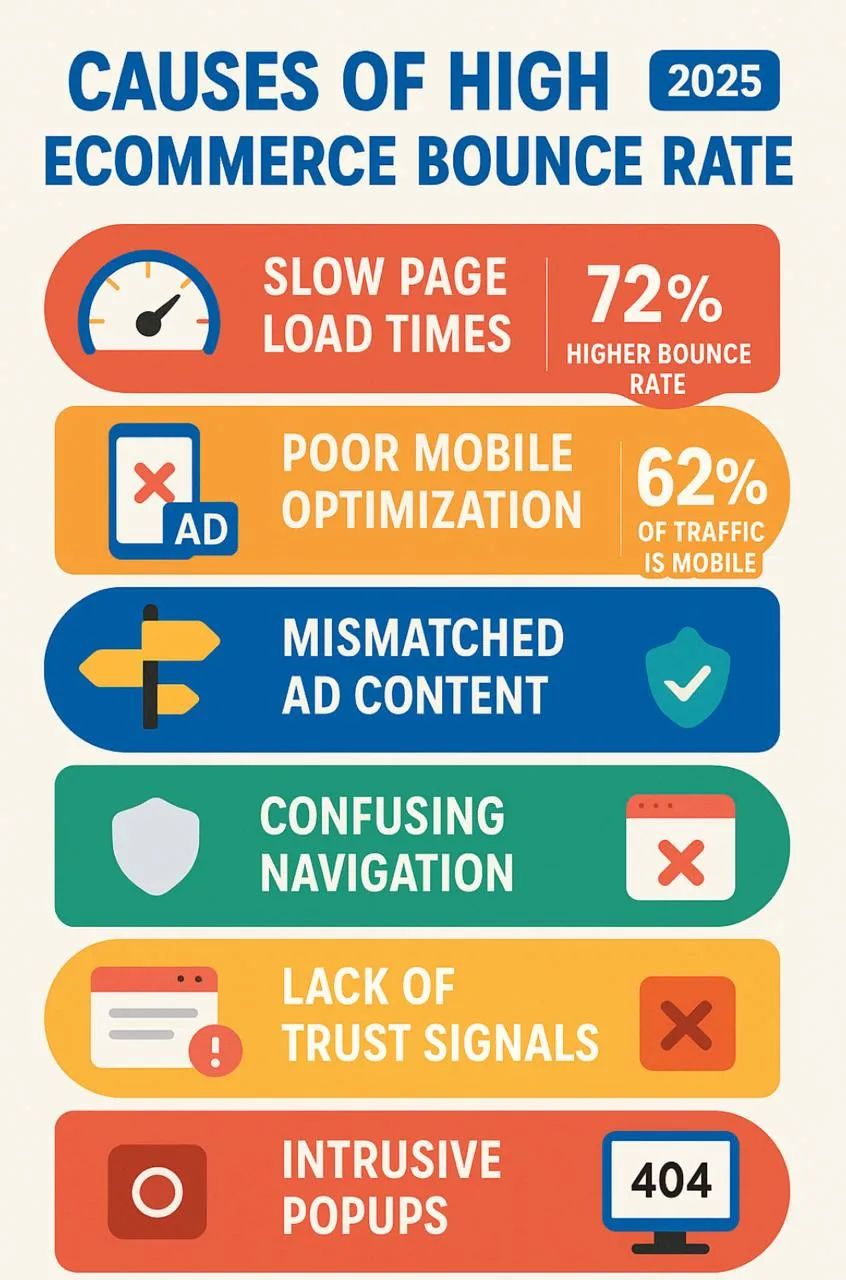
- 42% of users leave due to poor functionality and slow loading speeds.
- 38% of users abandon a site because of an unattractive or confusing layout.
- 10% cite intrusive elements like unprompted audio or aggressive pop-ups.
- 10% exit due to a lack of immediate relevance to their search query.
The Need for Speed: Load Times as a Dealbreaker
Speed is no longer a luxury; it is the baseline for digital trust. When a page hangs, users do not wait; they assume the site is broken or insecure. According to research from Google[3], as page load time goes from one second to ten seconds, the probability of a mobile site visitor bouncing increases by over 100%. Every millisecond of latency acts as a tax on your conversion rate.
Visual Chaos and Dated Aesthetics
Users judge a brand’s credibility based on visual design in a fraction of a second. A cluttered interface, inconsistent font choices, or a layout that looks like it belongs in 2010 will trigger an immediate exit. A clean, intentional aesthetic tells the user they are in the right place, whereas visual chaos forces the brain to work too hard to find value.
Design is the silent ambassador of your brand; if it looks neglected, users assume your product or service is too.
Autoplay Media and Intrusive Pop-ups
Nothing sends a user reaching for the back button faster than a sudden blast of audio or a full-screen overlay that appears before they have even seen the header. These intrusive elements create a hostile user experience. While marketers often use them to capture leads, they frequently have the opposite effect by driving up the website bounce rate and damaging long-term brand perception.
| What Users Expect | What They Get (The Reality Gap) |
|---|---|
| Instant visual feedback | White screens and loading spinners |
| Clear, intuitive navigation | Hidden menus and broken links |
| A quiet, focused environment | Autoplay videos and aggressive pop-ups |
| Modern, cohesive branding | Dated templates and mismatched assets |
The Speed Factor: How Performance Directly Impacts Website Bounce Rate
Patience is a rare commodity in the digital age; in fact, it has almost entirely vanished. When a user clicks your link, a silent countdown begins. If your site takes more than a heartbeat to render, most users will not wait to see your beautiful hero image or your compelling value proposition. This technical friction is the primary driver behind a high website bounce rate, as modern audiences equate speed with professional credibility.
The Correlation Between Latency and Abandonment
The relationship between load times and user retention is linear and unforgiving. Research from Google and ScientiaMobile highlights the severity of this trend, revealing that 53% of mobile visits are abandoned if a page takes longer than three seconds to load. Every millisecond of latency acts as a tax on your conversion rate, pushing potential customers back to the search results where a faster competitor is waiting to greet them. At Align, we view performance not just as a developer task, but as a fundamental pillar of the user experience.[4]
Speed is the first design element your user encounters; if the page doesn’t load, the rest of your UI simply doesn’t exist.
How Google’s Core Web Vitals Influence User Trust
Google has formalized these expectations through Core Web Vitals, a set of metrics that measure visual stability and interactivity. When a layout shifts unexpectedly or a button remains unresponsive to a click, user trust erodes instantly. High-performing websites bridge the gap between technical SEO and UX design by ensuring that the Largest Contentful Paint occurs almost immediately. By optimizing asset delivery and refining the critical rendering path, brands can ensure their first impression is one of efficiency rather than frustration.
Performance Audit Checklist:
- Compress high-resolution imagery to reduce payload size.
- Prioritize the loading of above-the-fold content.
- Minimize third-party scripts that block the main thread.
- Utilize browser caching and Content Delivery Networks (CDNs).
Visual Hierarchy and the ‘Clarity over Cleverness’ Principle
When a visitor lands on your page, their brain is performing a split-second audit to determine if they are in the right place. If your layout is a puzzle that needs solving, your website bounce rate will inevitably climb. Users do not read websites; they scan them. If the path to a solution is obscured by overly creative metaphors or hidden navigation, the user will simply find a competitor who makes the process easier.
The F-Pattern: Where Users Look First
Eye-tracking studies consistently show that users scan digital content in an F-shaped pattern, focusing heavily on the top and left sides of the screen. By aligning your most critical information and calls-to-action along these natural visual paths, you ensure that your value proposition is seen before the five-second window closes. If a user cannot locate the ‘Buy’ or ‘Contact’ button within three seconds, they perceive the interface as difficult and untrustworthy.
The Danger of ‘Mystery Meat’ Navigation
Navigation should never be a guessing game. Icons without labels or unconventional menu structures; often called ‘mystery meat’ navigation; force users to work too hard. Clarity should always trump cleverness; your primary goal is to minimize cognitive load so the user can move toward a conversion without friction.
Using White Space to Reduce Cognitive Load
White space is not ’empty’ space; it is a powerful design tool that guides the eye and provides breathing room for important elements. A cluttered page overwhelms the senses, making it impossible for a visitor to prioritize information. By utilizing generous margins and clear grouping, you signal professionalism and make your content digestible.
Good design is invisible; it allows the user to accomplish their goal without ever having to think about the interface itself.
Instant Trust Signals Checklist:
- Clear, benefit-driven H1 headline visible immediately.
- High-contrast Call-to-Action (CTA) button.
- Professional, high-quality imagery that matches the brand.
- Standardized navigation labels like ‘Services’ or ‘Pricing’.
- Visible social proof or recognizable partner logos.
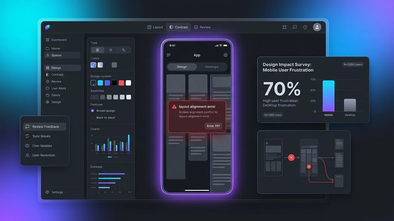
Mobile-First or Mobile-Last? The Survey’s Most Aggressive Findings
The transition from desktop to mobile browsing happened years ago, yet our survey reveals a startling disconnect between business intent and user reality. While most brands claim to be mobile-friendly, the data suggests otherwise. In our study of 1,000 participants, 70% of respondents reported significantly higher levels of frustration when navigating websites on their phones compared to their desktops. This friction is a primary driver of a high website bounce rate, as mobile users are often on the go and have zero patience for technical hurdles.
Thumb-Friendly Design as a Minimum Requirement
Mobile users interact with your site using their thumbs, not a precise cursor. When buttons are placed too close together or navigation menus require surgical precision to open, users don’t stick around to try a second time. A successful mobile interface prioritizes the ‘thumb zone,’ ensuring that the most critical actions are within easy reach. If a visitor has to pinch-to-zoom just to read your value proposition, you have likely already lost them.
On mobile, accessibility isn’t just a feature; it is the entire foundation of user retention.
The Frustration of Non-Responsive Elements
A single broken element, such as an unoptimized image that bleeds off the screen or a pop-up that cannot be closed on a small display, can trigger a permanent bounce. Our survey highlights that mobile users view these glitches as a sign of poor quality and lack of security. When a site fails to adapt to their device, users assume the brand is out of touch. Since 53% of mobile users will abandon a page if it takes longer than three seconds to load, the combination of slow speeds and broken layouts is a recipe for digital invisibility.[5]
Mobile Bounce Triggers:
- Non-responsive contact forms that are impossible to type in.
- Intrusive interstitials that block the main content.
- Fixed-width elements causing horizontal scrolling.
- Tiny font sizes that ignore mobile readability standards.
How to Audit Your Site and Stop the Exodus
Identifying why visitors are fleeing requires moving beyond basic traffic reports and looking at real human behavior. To lower your website bounce rate, you must pinpoint exactly where the friction occurs before users decide to click away. By combining visual data with technical performance checks, you can transform a leaking sales funnel into a high-conversion engine.
Heatmapping and User Session Recordings
Tools like Hotjar or Microsoft Clarity allow you to see your site through the eyes of your customers. Heatmaps reveal where users click, move, and scroll, while session recordings show exactly where they stumble or get frustrated by a non-responsive button. If your data shows people hovering over an image expecting a link that isn’t there, you have found a primary friction point that contributes to a high website bounce rate.
A/B Testing Your Hero Section
Since the first five seconds are critical, your hero section must do the heavy lifting. Test different headlines, primary call-to-action colors, and background imagery to see which combination keeps users engaged longer. A clear, value-driven message often performs better than vague, flashy animations that confuse the visitor’s intent.
Your website is a living product; if you aren’t testing your assumptions against real user behavior, you are designing in the dark.
Optimizing Core Web Vitals for Immediate Gains
Technical performance is the foundation of retention. Use Google PageSpeed Insights to audit your Core Web Vitals, specifically focusing on Largest Contentful Paint and Cumulative Layout Shift. According to research from Think with Google[6], as page load time goes from one second to ten seconds, the probability of a mobile site visitor bouncing increases by 123%. Prioritizing speed is the fastest way to stop the exodus.
How to Fix a High Website Bounce Rate and Retain Visitors
Understanding why visitors flee is only half the battle; the real work begins with strategic optimization. Based on our 1,000-person survey, the primary culprits for a high website bounce rate are visual clutter, confusing navigation, and a lack of immediate value. When users land on your page, they are looking for a reason to stay, not an excuse to leave. If your headline doesn’t clearly state what you do within the first three seconds, you have already lost them.
Practical Steps to Improve Retention
Start by simplifying your hero section. High-performing websites use a clear hierarchy where the most important information is the easiest to find. You should also audit your mobile experience specifically, as mobile users are significantly more sensitive to delays and poor formatting. Research highlights that mobile optimization is no longer optional, with roughly 53% of visitors leaving a page[1] if it takes longer than three seconds to load.
Quick Retention Audit:
- Ensure the H1 explains your core value proposition immediately.
- Remove intrusive pop-ups that block content upon entry.
- Check that your Call to Action (CTA) stands out with high contrast.
- Verify that images are compressed to prevent layout shift.
Clarity wins every time; if your visitor has to think too hard about how to use your site, they will find a competitor who makes it easier.
Let’s Optimize Your Digital First Impression
Your website should be your hardest-working salesperson, not a hurdle for your customers. At Align, we specialize in creating high-performance UX/UI designs that capture attention and drive conversions. If you are worried about your bounce rate, we can help you identify the friction points that are costing you leads. Contact us today for a free assessment of your website and let’s build something that converts.
Conclusion
The first five seconds a visitor spends on your site often determine the future of your brand relationship. Our survey highlights that modern users have zero patience for slow loading speeds, confusing navigation, or cluttered layouts that hide the value proposition. High website bounce rate is rarely a mystery; it is usually a direct symptom of friction in the user journey. By prioritizing performance, mobile responsiveness, and intuitive UI, you can transform your site from a digital revolving door into a high-converting asset. Success in the digital space requires a balance of aesthetic appeal and technical excellence to ensure visitors stay long enough to see what you offer.
Stop Losing Leads to a High Website Bounce Rate
If your analytics show that visitors are leaving as quickly as they arrive, it is time to look under the hood of your digital experience. At Align, we specialize in performance-driven UX/UI design that captures attention instantly and keeps it. We help businesses move beyond the 5-second bounce by creating seamless, accessible, and beautiful websites tailored for English-speaking markets. Whether you need a comprehensive UX audit or a complete website redesign, our team is ready to turn your high website bounce rate into a engine for growth. Visit us at Align to start building a site that converts visitors into lifelong customers.
References
- Mobile UX & Lead Gen: Why 53% Leave in 3 Seconds
- Why 53% Of Mobile Users Abandon Sites That Take Over 3 Seconds To Load
- The need for mobile speed.
- 53% of Mobile Site Visitors Abandon if it Takes More Than 3 Seconds to Load Page – ScientiaMobile
- Why 53% of Mobile Users Abandon Slow Websites: The Importance of Page Load Time – Tenacity
- Mobile site load time statistics – Think with Google