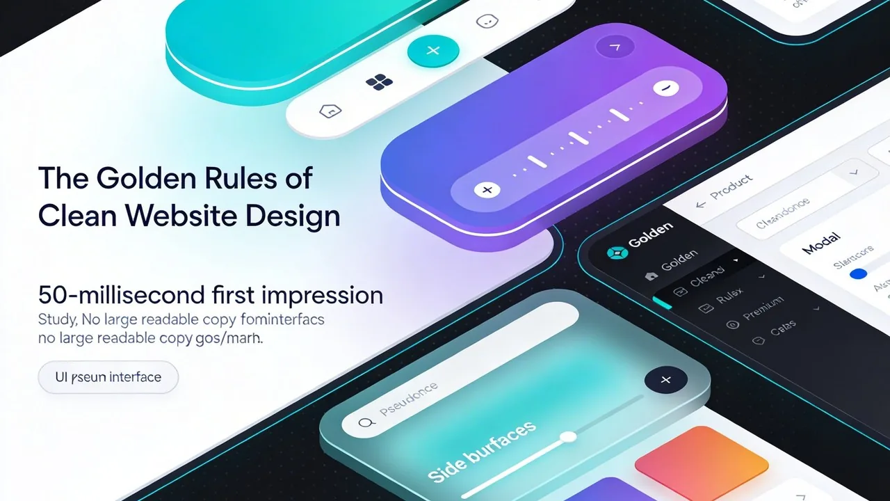
You have exactly 0.05 seconds to make a first impression online. That is not a typo. According to a study published in Behaviour & Information Technology by Gitte Lindgaard et al., website visitors form a visual judgment in as little as 50 milliseconds long before they read a single word of your content. So what determines whether that split-second reaction is trust or distrust, curiosity or confusion? In most cases, the answer comes down to one thing: clean website design. A clean website is not simply a “minimal” or “boring” website. It is a website where every element serves a purpose, where users can find what they need without friction, and where the visual language of the page reinforces the credibility of the brand behind it. Clean design is the intersection of aesthetics and function and it follows a clear set of rules that the best websites in the world consistently apply. This guide breaks down those rules, one by one.
What is Clean Website Design and Why Does it Matter?
📝 Section 1: What is Clean Website Design and Why Does it Matter?
Before diving into the rules, it is worth defining the term clearly.
Design is not just what it looks like and feels like. Design is how it works. — Steve Jobs
A clean website design is one that:
-Removes all unnecessary visual clutter -Guides the visitor’s attention with intention -Communicates clearly and loads quickly -Works seamlessly across all screen sizes -Reflects the brand’s identity with consistency
The opposite of clean design is not decorative design it is thoughtless design. A page overloaded with competing elements, mismatched fonts, slow loading images, and unclear navigation is not rich or expressive. It is simply hard to use.
Why Clean Website Design Matters When a site is cluttered with competing visuals, mismatched fonts, and redundant navigation, it creates cognitive friction. This friction forces the brain to work harder to process information, which often leads to visitors leaving the site in favor of a more intuitive competitor. A clean approach prioritizes visual hierarchy and intentionality, making the user journey feel effortless. According to research on visual perception, users often form an opinion about a site’s aesthetic quality in a matter of milliseconds, which directly influences their trust in the brand.
Quick Breakdown: The Pillars of Clean Design Purposeful White Space: Giving elements room to breathe to prevent sensory overload. Intuitive Navigation: Ensuring users find what they need without a manual. Visual Hierarchy: Using size and color to signal the most important information first. Fast Performance: Eliminating heavy, unnecessary scripts that slow down the experience.
Ultimately, clean design is the intersection of aesthetics and function. It ensures that your brand identity remains the focal point while providing a seamless user experience that converts visitors into loyal customers. Even industry leaders have long championed this approach, maintaining a focused layout to ensure users can complete their primary task without distraction.
8 Rules of Clean Website Design
📝 Section 2: 8 Rules of Clean Website Design
Rule 1: Embrace White Space
White space also called negative space is the empty area between and around elements on a page. And despite what many business owners instinctively believe, white space is not wasted space.
White space is to be regarded as an active element, not a passive background. — Jan Tschichold, typographer and book designer
White space performs several critical functions: -It draws attention. When an element is surrounded by breathing room, the eye naturally focuses on it. -It improves comprehension. Research from Wichita State University found that proper use of white space between paragraphs and in the left and right margins increases comprehension by almost 20%. -It communicates quality. Luxury brands like Chanel, Apple, and Rolex use abundant white space deliberately because spaciousness signals premium value.
What to do in practice:
1.Increase padding around text blocks and between sections 2.Do not feel pressure to fill every pixel of the page 3.Give your headline room to breathe above and below 4.Separate navigation items with enough spacing to prevent misclicks
Rule 2: Stick to a Limited Color Palette
Color is one of the most powerful tools in a designer’s toolkit and one of the most commonly misused. The more colors a website uses, the harder it becomes to create a coherent visual identity. The gold standard in web design is the 60/30/10 rule: | Role | Percentage | Purpose | | Primary (dominant) color | | 60% | | Backgrounds, large areas, overall tone | | Secondary color | | 30% | | Cards, sections, supporting UI elements | | Accent color | | 10% | | Buttons, links, highlights, CTAs|
This structure creates visual harmony while still giving the design energy and direction through the accent color.
Common color mistakes to avoid:
-Using more than 3 or 4 colors across the entire website -Choosing colors that have poor contrast with text (failing WCAG accessibility standards) -Picking colors based on personal preference rather than brand strategy and audience psychology -Ignoring how colors render differently across screens and devices
Pro tip: Tools like Coolors (coolors.co) and Adobe Color (color.adobe.com) help generate accessible, harmonious palettes in minutes.
Rule 3: Prioritize Typography
Typography is the backbone of web communication. If visitors cannot read your content comfortably, the quality of that content becomes irrelevant.
Typography is the craft of endowing human language with a durable visual form. — Robert Bringhurst, The Elements of Typographic Style
The three levels of a typographic hierarchy: | Level | | Element | | Recommended Size (desktop)| | H1 — Primary Heading | |Page title, hero headline | | 48px to 64px | | H2 / H3 — Subheadings | |Section titles, article headers | |28px to 40px | | Body text | | Paragraphs, descriptions | | 16px to 18px |
Typography rules for clean websites:
Limit font families to two or three. One for headings, one for body text, and optionally one for accents or captions. Maintain a minimum body font size of 16px. Anything smaller strains the eyes, especially on mobile. Set line height between 1.5 and 1.7 for body text. This dramatically improves readability. Ensure sufficient contrast. The Web Content Accessibility Guidelines (WCAG) require a contrast ratio of at least 4.5:1 for normal text. Avoid all-caps for long blocks of text. All-caps works for short labels and buttons, but slows reading speed significantly in paragraphs.
Recommended font pairing resources: Google Fonts (fonts.google.com), Fontpair (fontpair.co)
Conclusion
Clean website design is not about stripping away personality or creativity. It is about designing with intention choosing every element deliberately, removing everything that does not serve the user, and building an experience that communicates trust and clarity from the very first glance. The rules covered in this guide are not arbitrary. They are grounded in decades of UX research, cognitive psychology, and real-world conversion data. Applied together, they create websites that do not just look good they perform. Whether you are building a website from scratch or evaluating an existing one, these eight rules give you a clear, actionable framework to work from.
Ready to Build a Clean Website That Actually Converts? Knowing the rules is one thing. Executing them at a professional level with the right strategy, tools, and creative direction is another challenge entirely. That is where align.vn comes in. Align is a design and digital agency that specializes in building clean, conversion-focused websites for businesses that want to make a lasting impression online. From the first wireframe to the final launch, every decision is guided by the principles in this article white space, visual hierarchy, mobile performance, and brand consistency. What align.vn offers:
-Strategic web design built around your business goals -Mobile-first development with optimized Core Web Vitals -Clean, purposeful visual identity aligned with your brand -Ongoing support and performance optimization after launch
If your current website is not reflecting the quality of your business, it is time to change that. Explore Our Work at align.vn → or Get in Touch for a Free Website Consultation →