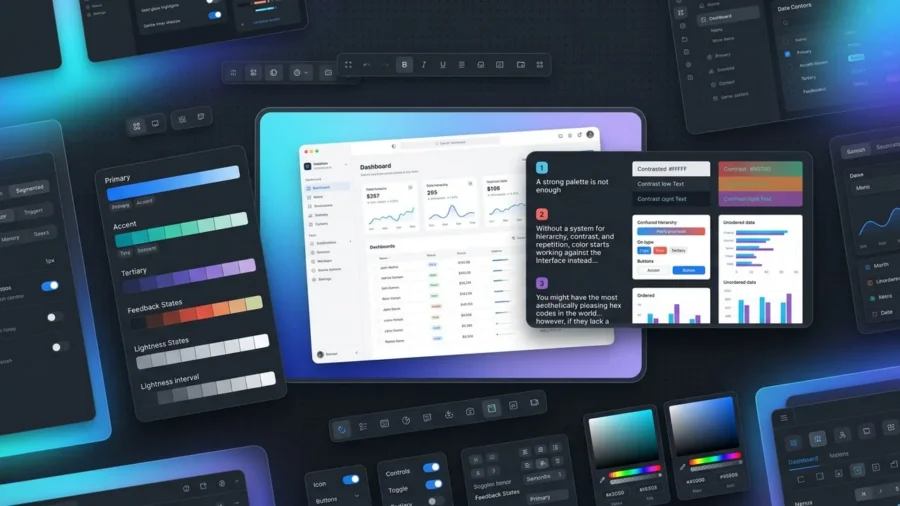
A strong palette is not enough. Without a system for hierarchy, contrast, and repetition, color starts working against the interface instead of guiding it. You might have the most aesthetically pleasing hex codes in the world; however, if they lack a logical framework, your users will likely feel a sense of friction they cannot quite name. This visual dissonance usually stems from a lack of structure rather than a lack of taste.
Building a high-performing interface color system is about more than just picking a primary blue and a secondary gray. It is about establishing a predictable language that communicates importance and functionality across every screen. When you prioritize accessibility, specifically aiming for the 4.5:1 contrast ratio required for standard text, you ensure your design remains usable for everyone. By moving away from random color selection and toward a scalable interface color system, you transform your website from a collection of pretty pages into a cohesive, professional digital product.[1]
What is an Interface Color System and Why Does It Matter?
A color palette is a collection of hues; an interface color system is a set of rules that governs how those hues behave. While a palette might tell you that your brand uses navy and gold, a system dictates which shade of navy serves as a background, which gold is reserved for primary buttons, and how those colors shift when a user hovers over a link. Without this underlying logic, design choices become arbitrary, leading to a fragmented user experience that feels unprofessional and confusing.
Moving Beyond Random Hex Codes
In the early stages of a project, it is tempting to eye-drop colors or grab hex codes on the fly. However, this approach quickly falls apart as a site scales. An interface color system replaces guesswork with a structured library of tokens, ensuring that every designer and developer on your team uses the exact same shade of slate for borders or errors. This move from manual selection to a systematic framework prevents the visual bloat that occurs when a website ends up with fifty different shades of gray that are nearly identical but just different enough to feel off.
The Role of Semantic Naming
The secret to a scalable system lies in semantic naming. Instead of naming a color “Light-Blue-v2,” you name it “Action-Primary-Default.” This shift in language focuses on the function of the color rather than its appearance. When you name colors based on their role, you create a design language that is easy to maintain and update. If you decide to rebranding your primary action color from blue to purple, you only have to update the value of that single token, and every button across your entire digital ecosystem updates automatically.
Consistency Across Digital Touchpoints
Consistency is the cornerstone of brand trust. When users navigate from your landing page to a complex dashboard, they should feel a continuous sense of place. A well-defined interface color system ensures that interactive elements look and behave the same way regardless of the page. This predictability reduces the cognitive load on your visitors, allowing them to focus on your content rather than trying to figure out which elements are clickable. By maintaining this visual harmony, you reinforce your brand authority and create a more polished, premium feel for your digital product.

The Core Components of a Robust Interface Color System
Building a scalable interface color system requires more than just picking a few pretty swatches; it involves architecting a hierarchy that balances brand identity with functional clarity. By organizing colors into specific roles, designers create a framework that remains stable even as the product grows. This structure ensures that every hue serves a purpose, whether it is guiding a user toward a purchase or signaling a successful form submission.
Primary and Secondary Brand Colors
Your primary colors are the workhorses of your brand identity, typically reserved for high-emphasis actions like call-to-action buttons, active states, and key highlights. Secondary colors play a supporting role, offering variety and visual interest without competing for the user’s attention. Together, these form the recognizable face of your interface color system, but they are often the least used colors in terms of total screen real estate.
Neutrals, Surfaces, and Backgrounds
It might surprise you to learn that neutrals often make up 90% of a modern UI. This palette of whites, grays, and blacks provides the essential structure for your layout, defining borders, dividers, and background surfaces. These shades create the necessary contrast that makes your primary brand colors pop. Properly defined surface colors help establish a sense of depth and elevation, guiding the eye through the information hierarchy without causing visual fatigue.
Functional Colors for Error, Success, and Warning States
Functional or signal colors are critical for user feedback and error prevention. These colors must stay consistent regardless of your brand palette; for instance, red almost always signifies an error, while green denotes success. According to guidelines on Color & Accessibility[2] from the University of Alabama, color should never be the only way information is conveyed, but these functional hues provide an immediate, intuitive layer of communication that helps users navigate complex tasks safely.

Designing for Accessibility Within Your Interface Color System
Building a beautiful interface color system is only half the battle; the real victory lies in ensuring every user can actually navigate it. Accessibility is not just a polite suggestion or a design trend, it is a fundamental ethical requirement and, increasingly, a legal necessity for digital products. When we overlook contrast and legibility, we effectively lock the door on millions of users with visual impairments or situational disabilities.
Meeting WCAG 2.1 Contrast Standards
To ensure your text remains readable against its background, you must adhere to the Web Content Accessibility Guidelines (WCAG). Specifically, the WCAG 2.1 AA standard requires a contrast ratio of at least 4.5:1 for normal text and 3:1 for large text. According to the Oregon Department of Education[3], maintaining these specific ratios ensures that individuals with low vision can distinguish text from the background. By embedding these ratios into your interface color system from the start, you prevent costly redesigns and create a more inclusive experience for everyone.
Designing for Color Blindness
Color should never be the sole messenger of information. Since a significant portion of the population experiences some form of color vision deficiency, relying on a red-to-green spectrum to signal success or failure can be problematic. A robust interface color system uses secondary cues like icons, patterns, or clear text labels to support the visual message. This multi-layered approach ensures that even if a user cannot distinguish specific hues, they still understand the status of their actions.
Testing Tools for Inclusive Design
You do not have to guess whether your palette is accessible. Integrating tools like Adobe Color or the Stark plugin into your workflow allows you to simulate various types of color blindness and check contrast ratios in real time. Testing early and often ensures that your interface color system remains functional for all users, proving that high-end aesthetics and universal accessibility can live together in perfect harmony.

How to Scale Your Interface Color System for Dark Mode
Scaling a digital product often requires more than just a light-themed palette; it demands a flexible interface color system that gracefully transitions into dark mode. This process is not a simple 1:1 swap. When you move to a dark theme, the goal is to maintain visual hierarchy and brand identity while significantly reducing eye strain for the user. Many designers avoid using pure black (#000000) for backgrounds because it can cause a vibrating effect against high-contrast text; instead, they opt for deep, charcoal grays that feel softer and more premium.
The Art of Color Inversion
True inversion is a delicate balance of logic and optical adjustment. While your primary brand colors might look vibrant on a white background, they often appear neon or overwhelming on a dark canvas. A professional interface color system accounts for these shifts by creating a specific dark-mode variant of the palette. This ensures that the brand remains recognizable without sacrificing the user’s comfort during late-night browsing sessions.
Adjusting Saturation for Dark Backgrounds
Saturated colors tend to visually vibrate against dark surfaces, making text difficult to read and UI elements hard to focus on. To solve this, designers typically desaturate their primary and secondary hues for dark mode. By leaning into lighter, more muted tones, you ensure the interface remains legible and meets accessibility standards. Following the guidelines found in the WCAG 2.1 requirements[4] helps ensure your contrast ratios remain compliant across both light and dark themes.
Elevation and Depth in Dark Themes
In light mode, we use shadows to indicate that an element is floating above the background. In dark mode, shadows are often invisible. To solve this, your interface color system should adopt the Material Design approach of using lighter overlays to indicate elevation. The higher an element sits in the stack, the lighter its gray background becomes. This creates a natural sense of depth that guides the user’s eye without relying on traditional drop shadows.
Ready to Build a Scalable Design System?
At Align, we craft high-performance interfaces that look stunning in every light. Explore our UX/UI Design services to see how we can elevate your brand.
Best Practices for Documenting Your Interface Color System
Building a robust interface color system is only half the battle; the real magic happens when your development team can implement those choices without guesswork. Documentation serves as the bridge between a designer’s vision and a functional product. Without a clear map, even the most sophisticated palettes can fall apart during the handoff process, leading to inconsistent hex codes and fragmented user experiences.
Creating Design Tokens for Developers
To ensure your interface color system scales, you must move beyond static hex codes and embrace design tokens. Tokens act as variables that store your color values, such as using “brand-primary-600” instead of a hard-coded #3B82F6. This approach bridges the gap between Figma and CSS, allowing developers to update a single variable that propagates throughout the entire codebase. It eliminates the need for manual inspections and ensures that your brand remains consistent across web, iOS, and Android platforms.
Building a Single Source of Truth in Figma
Your Figma library should be the definitive authority for every color decision. Organize your styles into clear categories like primitives, which are your raw color scales, and semantic tokens, which describe how a color is used. By naming a color “surface-error” rather than just “light-red,” you provide functional context that helps everyone on the team understand the intent behind the design. This structure also helps you maintain compliance with the Web Content Accessibility Guidelines (WCAG)[5], as you can bake contrast requirements directly into your token descriptions.
Maintenance and Evolution of the System
An interface color system is a living document, not a museum piece. As your product grows and new features emerge, your palette will inevitably face new challenges. Schedule periodic audits to identify “color debt,” such as orphaned hex codes or redundant shades that have crept into the UI. By treating your documentation as a dynamic asset, you ensure that your design system remains lean, performant, and ready for whatever the next phase of your product brings.
Need an Interface That Scales?
Align specializes in creating comprehensive design systems that empower your team to build faster and better. See how our UX/UI Design expertise can transform your digital product.
Mastering the Spectrum of Success
Building a robust interface color system is a strategic investment that pays dividends in consistency, accessibility, and brand trust. By moving beyond aesthetic choices and focusing on functional logic, you create a framework that supports both designers and developers. Remember that the best systems are those that simplify decision-making while remaining flexible enough to adapt to new user needs. As you refine your palette, prioritize clarity and inclusivity to ensure your digital product provides a seamless experience for every user, regardless of how or where they interact with your brand.
Build a Future-Proof Interface Color System with Align
Creating a scalable design system requires a delicate balance of technical precision and creative vision. At Align, we specialize in crafting high-performance digital products for global markets, ensuring your interface color system is accessible, performant, and ready for growth. Whether you need a comprehensive UX/UI audit to eliminate design debt or a full-scale design system build from the ground up, our team provides the expertise needed to streamline your workflow. We help brands bridge the gap between complex functionality and beautiful, intuitive design. Explore how our tailored solutions can elevate your product by visiting Align today.
References
- WebAIM: Contrast and Color Accessibility – Understanding WCAG 2 Contrast and Color Requirements
- Color & Accessibility – Technology Accessibility | The University of Alabama
- Oregon Department of Education : Color Contrast – WCAG 2.0 Ref 1.4.3 : Web Accessibility Checklist : State of Oregon
- Requirements for Web Content Accessibility Guidelines 2.1
- WCAG 101: Understanding the Web Content Accessibility Guidelines