Choosing a dark theme website isn’t just about looking sleek in a sea of bright white layouts; it is a strategic design move that can define your entire brand identity. While once reserved for late night coding sessions and high end gaming rigs, dark mode has transitioned into a mainstream preference for users who value visual comfort and modern aesthetics. However, flipping the switch from light to dark involves much more than just hitting an invert button on your CSS file.
The problem many brands face is that dark interfaces can quickly become muddy or unreadable if the contrast and depth aren’t handled with precision. Getting it right matters because a well executed dark theme reduces eye strain and can even help conserve energy on OLED screens, making your site more eco friendly. According to research from Bejamas, dark mode can significantly reduce power consumption on mobile devices, which is a major win for user experience and sustainability alike.[1]
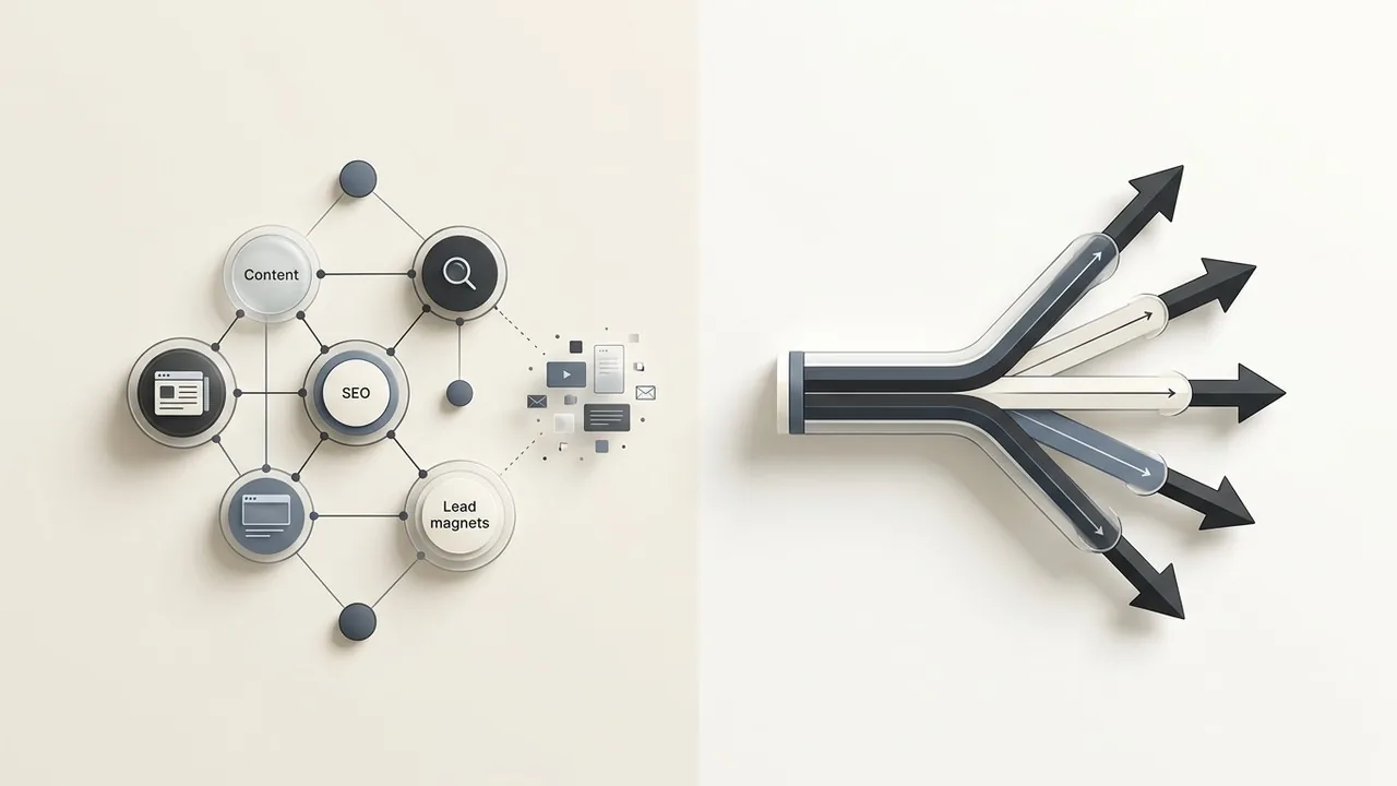
In this guide, you will learn exactly when to embrace the shadows and when to stick with a traditional light interface. We will explore the essential foundations of visual hierarchy in dark UI, ensuring your brand stands out while remaining perfectly accessible for every visitor.
Understanding the Dark Theme Website Phenomenon
Designing a dark theme website is no longer a niche choice for developers or gamers; it has evolved into a sophisticated design standard that high end brands use to convey luxury, modernism, and tech forward thinking. While it once lived exclusively in the realm of ‘Night Mode’ toggles, the modern web treats dark aesthetics as a primary experience that demands just as much attention as its light counterpart.
The shift from ‘Night Mode’ to a design standard
Initially, dark interfaces were a utility feature designed to reduce glare in low light environments. Today, however, we see a massive shift where users opt for dark mode as their permanent default setting. This transition is largely driven by the ubiquity of high quality OLED and AMOLED screens on mobile devices. Unlike traditional LCDs, OLED pixels actually turn off to display black, which leads to deeper contrast and significant energy efficiency. According to research cited by Forbes, using dark mode can help extend battery life on these devices, particularly when using high brightness settings.[2]
The psychological impact of dark aesthetics
Darker interfaces evoke a completely different emotional response than white backgrounds. While white feels airy and clinical, a dark theme website often feels premium, mysterious, and immersive. It minimizes distractions by receding into the background, allowing vibrant imagery and bold typography to take center stage. This creates a focused environment that is ideal for portfolio sites, streaming platforms, and data heavy dashboards where visual hierarchy is paramount.
Why users are demanding dark mode in 2024
User expectations have shifted toward personalization and comfort. With increased digital screen time, ‘digital wellness’ has become a priority. Users want to reduce eye strain during late night browsing sessions, and they expect their favorite brands to respect their system level preferences. If your site doesn’t adapt to a user’s dark mode setting, it can feel jarring and outdated.
Key Takeaway: User Preference Trends
- Visual Comfort: Reduces blue light exposure and ocular fatigue during extended use.
- Battery Efficiency: Saves power on OLED screens by turning off individual pixels.
- Premium Perception: Often associated with luxury and cutting edge technology brands.
- Accessibility: Provides a high contrast alternative for users with specific visual sensitivities.
A great dark theme is not just a color inversion; it is an intentional exercise in depth, where shadows define space and light creates focus.

When to Use a Dark Theme Website for Your Brand
Choosing a dark theme website is a strategic branding decision that goes far beyond aesthetic preference. It sets a specific emotional tone and dictates how users interact with your content. While light modes are often the default for data-heavy applications and long-form reading, dark interfaces excel when you want to create a sense of prestige, focus, or immersion.
Elevating luxury and high-end branding
There is a reason why premium automotive brands and high-end fashion houses frequently opt for darker palettes. Dark backgrounds naturally evoke a sense of elegance, mystery, and exclusivity. By reducing the visual ‘noise’ of a bright white screen, a dark theme allows your brand elements to feel more grounded and sophisticated. It transforms the digital space into a gallery-like environment where every piece of copy and every call-to-action carries more weight.
Reducing eye strain for long-form interaction
For platforms where users spend hours on end, such as coding environments or gaming dashboards, a dark theme is often a functional necessity. Lowering the overall luminance of the screen helps minimize ocular fatigue, especially in low-light settings. However, it is a common misconception that dark mode is always a massive energy saver; research from Purdue University suggests that while it helps, the battery savings on OLED screens are most significant when switching from high brightness levels. For your brand, providing this comfort shows a user-centric approach to design.[3]
Highlighting visual content and vibrant imagery
If your brand relies on high-quality photography, cinematography, or vibrant digital art, a dark theme website acts as the perfect canvas. Light colors and bright images pop with much higher perceived contrast against a dark backdrop. This technique draws the eye exactly where you want it to go, making it an ideal choice for portfolios, streaming services, and creative agencies looking to showcase their work without the distraction of a stark white border.
Quick Breakdown: Light vs. Dark Vibes
- Light Theme: Clarity, traditional professionalism, high readability for dense text, and a feeling of openness.
- Dark Theme: Luxury, modern edge, high visual drama, and reduced eye fatigue in dim environments.
- The Hybrid Approach: Using dark sections for impact while keeping content-heavy areas light for accessibility.
A dark theme should never be a default; it should be a deliberate choice to prioritize visual depth over traditional document-style layouts.

When to Avoid Dark Mode (And Stick to the Light)
While a dark theme website can feel modern and high-end, it is not a universal solution for every brand or user experience. Choosing a dark interface solely for the aesthetic often leads to significant usability hurdles, especially when the primary goal of the site is information consumption. Designing for the dark requires a delicate balance of contrast and spacing; when that balance fails, your users are the ones who suffer from eye strain and cognitive overload.
Content-heavy sites and data-dense platforms
If your website functions as a library, a news portal, or a complex dashboard filled with small text and intricate data tables, light mode is usually the safer bet. High-contrast text, such as pure white on pure black, can cause a visual phenomenon known as halation for users with astigmatism, making letters appear blurry or washed out. For long-form reading, the human eye generally finds dark text on a light background easier to track over extended periods. If your users are spending hours reading documentation or analyzing spreadsheets, a light theme reduces the physical effort required to process that data.
B2B industries requiring high trust and transparency vibes
In sectors like healthcare, government services, or traditional finance, a light and airy design often communicates openness and reliability. Dark themes can sometimes feel secretive, moody, or overly exclusive, which might conflict with a brand identity centered on accessibility and public trust. When the goal is to make a user feel secure and guided, the clarity of a well-structured light interface provides a sense of professional stability that dark mode struggles to replicate.
Outdoor use cases and high-glare environments
Context is everything in UX design. If your target audience frequently uses your platform outdoors or in brightly lit offices, a dark theme website becomes a literal mirror. Screen glare competes with dark backgrounds, making content nearly invisible under direct sunlight. This is a critical accessibility point; while many believe dark mode is always better for the eyes, it actually performs poorly in high-glare environments compared to the high-contrast clarity of a light theme.
Quick Check: Stick to Light Mode If…
- Your site requires reading more than 1,000 words of body text per session.
- The primary user environment is outdoors or under bright fluorescent lighting.
- Your brand pillars are ‘Transparency,’ ‘Safety,’ and ‘Utility.’
- Your interface relies on complex data visualizations with many overlapping colors.
Accessibility is not a toggle; if your dark theme fails WCAG contrast requirements in bright light, it is a decorative choice rather than a functional one.

The ‘Pure Black’ trap: Why #000000 is often a mistake
Designing a dark theme website often leads beginners to reach for pure black as a background. However, #000000 creates an unnaturally high contrast against white text, leading to a visual phenomenon known as ‘halation.’ This effect causes text to appear as if it is glowing or blurring, which quickly fatigues the eyes. By using dark grays like #121212 or deep navy tones, you soften the blow to the user’s retina while still maintaining the sophisticated aesthetic of a dark interface.
Layering with elevation and shadows in dark space
In light mode, we use shadows to indicate depth. In a dark theme, shadows are often invisible. To create a visual hierarchy, you must use ‘elevation through illumination.’ Higher surface levels should be represented by lighter shades of gray. This creates a logical structure where the closest elements to the user are the brightest, and the furthest are the darkest. This method ensures that modals and cards pop against the background without relying on heavy borders.
| Element | Bad Contrast (Avoid) | Good Contrast (Try) |
|---|---|---|
| Background | #000000 (Pure Black) | #121212 (Dark Gray) |
| Primary Text | #666666 (Too Dim) | #E0E0E0 (Soft White) |
| Accent UI | #0000FF (Pure Blue) | #82B1FF (Desaturated Blue) |
Managing saturation and neon accents
Vibrant colors that look stunning on a white canvas often ‘vibrate’ painfully against a dark background. To solve this, you should desaturate your primary brand colors for your dark theme website. This ensures they remain accessible and legible without causing eye strain. When you do use high-saturation colors, save them for small, critical touchpoints like call-to-action buttons or status indicators to guide the user’s eye through the layout.[4]
In dark mode, light is a limited resource; use it to define depth rather than just to decorate the surface.

Step-by-Step Process for Implementing a Dark Theme
Building a dark theme website is not as simple as flipping a switch or hitting an ‘invert’ button in your design tool. It requires a systematic approach to layering and color theory to ensure the interface feels expansive rather than claustrophobic. By following a structured implementation process, you can maintain brand consistency while providing a superior viewing experience for users in low-light environments.
Defining your primary, secondary, and surface grays
Avoid using pure black (#000000) for large surface areas, as it can make UI elements like shadows disappear and cause ‘smearing’ on OLED screens. Instead, start with a very dark gray as your base. From there, define a palette of grays that represent different elevations. In dark mode, the lighter the gray, the ‘closer’ the element appears to the user. This creates a natural hierarchy where cards and modals sit on top of the background.[5]
The Designer’s Checklist: Dark Mode Foundations
- Use dark gray (e.g., #121212) instead of pure black for the main background.
- Create at least three levels of surface elevation using subtle color shifts.
- Ensure background-to-text contrast meets WCAG 2.2 standards for legibility.
- Apply a slight tint of your primary brand color to your grays for a cohesive feel.
Adapting your brand color palette for dark backgrounds
Your existing brand colors were likely designed to pop against white, but they may become overwhelming or illegible on dark surfaces. You must audit your palette and create ‘dark mode equivalents’ for each color. This usually involves increasing the brightness and decreasing the saturation. High-vibrancy colors should be used sparingly as accents, while functional colors like success greens or error reds should be adjusted to remain soft on the eyes while still conveying urgency.
Testing readability across different screen types
The final step is rigorous testing. Dark themes behave differently depending on the hardware; a design that looks crisp on a high-end MacBook Pro might look muddy or high-contrast on a budget mobile device. Always test your dark theme website across various brightness settings and panel types to ensure that text remains sharp and that subtle elevation shifts are still visible to the naked eye.
Success in dark mode design is found in the shadows; if your layers don’t communicate depth, your interface will feel flat and fatiguing.

Accessibility and Readability in Dark Mode
Designing a dark theme website is not just a stylistic choice; it is a technical commitment to accessibility. While dark backgrounds can reduce eye strain in low-light environments, they also introduce specific legibility challenges that can exclude users with visual impairments if not handled with precision. High-performance design requires balancing the aesthetic of the ‘dark’ look with the strict requirements of universal usability.
Meeting WCAG 2.1 AA standards for contrast
To ensure your content is accessible, you must adhere to the Web Content Accessibility Guidelines (WCAG) 2.1 AA standards. This requires a contrast ratio of at least 4.5:1 for body text and 3:1 for large text. It is a common mistake to use pure white text on a pure black background, as this creates a contrast ratio that is actually too high for many readers, leading to visual vibration. Instead, aim for off-white or light grey text against dark grey surfaces. You can use professional tools like Stark, Adobe Color, or the Axe DevTools browser extension to validate your color pairings in real-time during the design phase.
The ‘Halation Effect’ and how to mitigate it
The halation effect occurs when bright text on a dark background appears to bleed or blur into the darkness, making the letters look fuzzy. This is particularly problematic for users with astigmatism, who may find high-contrast dark modes difficult to read for long periods. To mitigate this, avoid using pure #FFFFFF white. By softening your white to a light grey, such as #E0E0E0, you reduce the light ‘bleed’ and create a much more comfortable reading experience.
Dark Mode Typography Checklist:
- Increase letter spacing (tracking) slightly to prevent characters from merging.
- Avoid ultra-thin font weights; use regular or medium weights to maintain stroke integrity.
- Use off-white text to reduce the halation effect and ocular fatigue.
- Ensure interactive elements have a distinct focused state for keyboard navigation.
Font weight and letter spacing adjustments
Typography behaves differently when light is emitted through the letterforms rather than reflected off a white page. On a dark theme website, text often appears thinner than it does on a light background. To compensate, you may need to slightly increase the font weight or add a small amount of letter spacing (tracking) to ensure the counters of the letters remain open and legible. This prevents the ‘pinched’ look that occurs when white light overwhelms the dark space between characters.
Accessibility in dark mode isn’t an afterthought; it’s the difference between a website that looks cool and one that actually works for everyone.
When coding these adjustments, you can use specific CSS properties to ensure the cleanest possible rendering across different browsers and operating systems.
Pro Tip: Font Smoothing
To help text look crisp on dark backgrounds in macOS and iOS, apply the following CSS to your typography: -webkit-font-smoothing: antialiased; -moz-osx-font-smoothing: grayscale;
Common Dark Theme Website Mistakes to Avoid
Designing a dark theme website involves more than flipping a toggle; it requires a disciplined approach to visual weight and technical architecture. Many designers fall into the trap of prioritizing aesthetics over usability, leading to interfaces that look sleek in a static mockup but fail during real-world interaction. By identifying these common pitfalls early, you can ensure your dark mode is as functional as it is beautiful.
Inconsistent iconography and thin-line strokes
Icons that look perfectly balanced on a light background often ‘disappear’ or appear too faint when placed on a dark canvas. Thin-line strokes lack the visual punch needed to remain legible against deep grays or blacks. When building your dark theme website, you should audit your icon library to ensure stroke weights are slightly increased or that filled versions of icons are used to maintain clarity and tap-target visibility.
Hard-coding colors instead of using CSS variables
One of the most expensive technical mistakes is hard-coding hex values like #000000 or #FFFFFF directly into your stylesheets. This makes maintenance a nightmare and prevents a smooth transition between modes. Instead, you should implement a system of design tokens that adapt based on the user’s preference.
Pro-Tip: Use Semantic Naming
Avoid naming your variables --black or --white. Use semantic names like --bg-primary, --text-main, or --border-subtle. This allows the value to change from light to dark without the variable name becoming a lie.
Ignoring the ‘Light Mode’ fall-back experience
While the focus is often on the dark aesthetic, the user experience must remain cohesive for those who prefer light mode or have it set to a system schedule. A common error is neglecting how brand colors translate back to a light interface, resulting in poor contrast or ‘muddy’ brand identity. Interestingly, while many users prefer dark mode for comfort, its impact on hardware efficiency varies. According to research on whether dark mode saves electricity[6], the benefits are most significant on OLED screens where true blacks actually power down pixels, whereas older LCD screens may see negligible gains.
A great dark theme is never an island; it is a mirrored reflection of a solid light-mode foundation, built with technical flexibility in mind.
Quick Breakdown: Dark Mode Red Flags
- Pure black backgrounds (#000000) that cause high-contrast eye strain.
- Saturated primary colors that ‘vibrate’ against dark surfaces.
- Shadows that are lighter than the background, breaking the laws of physics.
- Lack of a manual toggle for users who want to override system settings.
Best Examples of Dark Theme Website Design in Action
Theory is essential, but seeing dark mode executed at the highest level reveals the nuance required to balance branding with usability. These industry leaders do not just flip a color switch; they curate an entirely different atmosphere that remains consistent with their core identity. When analyzing these examples, notice how depth is created through layering and how color is used sparingly to guide the eye toward specific actions.
Apple: The gold standard of product-focused dark UI
Apple pioneered the modern dark mode movement across iOS and macOS, and their website reflects this mastery. They utilize a deep, rich palette that feels premium rather than gloomy. By using high-quality product photography with dramatic lighting, the hardware seems to emerge from the shadows. This approach minimizes visual noise, allowing the vibrant colors of an iPhone screen or an iMac display to pop with incredible intensity. It is a masterclass in using darkness to create a sense of luxury and focus.
Linear: Mastering the ‘Developer’ aesthetic
Linear has become the benchmark for the modern SaaS aesthetic, particularly for tools aimed at technical audiences. Their dark theme website uses a sophisticated palette of subtle grays and deep blues instead of pure black. They utilize ‘glow’ effects and thin, crisp borders to define sections without adding bulk. This creates a high-performance feel that mimics a code editor, making the user feel productive and focused. It is proof that a dark UI can feel incredibly clean and spacious if the padding and line weights are handled with precision.
Spotify: Using darkness to enhance emotional connection
Spotify is one of the few platforms that remains almost exclusively dark across all touchpoints. For them, darkness is about the ‘theater’ experience; it recedes into the background so the album art and artist imagery can take center stage. Because music is an emotional, immersive product, the dark theme helps set a mood that feels intimate and personal. They use soft gradients and blurred background accents to ensure the interface never feels flat or cold.
Quick Breakdown: Why These Work
- Apple uses ‘true black’ to highlight hardware sleekness and premium branding.
- Linear uses elevation and subtle borders to maintain a high-density, functional layout.
- Spotify uses dark backgrounds to make colorful album artwork feel more vibrant.
- All three avoid pure white text, opting for off-white or light gray to reduce eye strain.
The Dark Mode Implementation Checklist
Designing a dark theme website is not a one-click inversion process; it is a meticulous restructuring of your brand’s visual hierarchy. Before you push your dark mode update to production, use this final audit framework to ensure your interface is as functional as it is stylish. This checklist covers the essential pillars of contrast, technical stability, and user comfort to guarantee a premium finish.
Visual Audit: Contrast and Depth
The biggest risk in dark mode is losing the sense of structure. Without traditional shadows to define layers, you must rely on color elevation. Ensure your surfaces use varying shades of gray to indicate depth, where the ‘highest’ elements are the lightest. Check that your brand colors have been adjusted for vibrancy against dark backgrounds; often, saturated colors that look great on white will appear to vibrate or ‘bleed’ on black, requiring a slight desaturation for better legibility.
Technical Audit: Variables and Toggles
A seamless dark theme relies on clean code. Your CSS should utilize variables that allow for easy switching between themes without duplicating entire stylesheets. Verify that your toggle switch is easy to find and that it respects the user’s system preferences by default. Furthermore, consider the environmental impact of your build. While often debated, choosing dark themes for OLED screens can contribute to energy efficiency by reducing the power required to light up pixels.
User Experience Audit: Context and Comfort
Finally, test the experience in the environment where it will actually be used. A dark theme that looks crisp in a bright office might feel overwhelming or muddy in a low-light bedroom. Avoid pure #000000 black for large surface areas if you want to prevent ‘smearing’ on certain mobile screens, and ensure your typography remains crisp by slightly increasing letter spacing or decreasing font weight.
Quick Breakdown: The Launch Checklist
- Contrast Ratio: Meet WCAG AA standards for all body text and interactive icons.
- Elevation: Use lighter gray overlays rather than drop shadows to show depth.
- Graphics: Ensure all transparent PNGs and SVGs are visible on dark backgrounds.
- System Sync: Default the theme to match the user’s OS settings (Light/Dark).
Dark mode is not just a color swap; it is an exercise in managing light, depth, and visual energy to create a more focused digital environment.[1]
Ready to level up your digital presence?
Building a high-performing dark theme website requires a balance of aesthetic intuition and technical precision. At Align, we specialize in creating bespoke UX/UI designs that look stunning in any light. Whether you are looking for a complete rebrand or a high-converting web design, our team is here to help. Contact Align today to start your next project.
Conclusion: Embracing the Shadows
Designing a dark theme website is a sophisticated dance between elegance and utility. While the aesthetic appeal of a deep, moody palette is undeniable, the true success of a dark interface lies in how well it serves the user experience. By focusing on accessibility, maintaining appropriate contrast ratios, and managing visual hierarchy through depth rather than just brightness, you can create a digital environment that feels premium and effortless to navigate. It is about more than just flipping a switch from white to black; it is a strategic decision that affects brand perception and user comfort. As digital habits continue to evolve, offering a well-executed dark mode is no longer just a trend, but a standard expectation for modern, high-quality web experiences. When you approach your design with intentionality and a focus on readability, you ensure that your brand stands out in the most crowded digital spaces while providing a comfortable viewing experience for every visitor.
Ready to Launch a Stunning Dark Theme Website?
Choosing the right aesthetic for your brand is a pivotal decision that impacts how your audience perceives your professionalism and innovation. At Align, we understand that a dark theme website requires a delicate balance of technical SEO, high-end UX design, and visual storytelling. Our team of experts is ready to help you navigate these design choices to ensure your site is as functional as it is beautiful. Whether you are curious if a dark palette aligns with your brand identity or you need a comprehensive UX audit to optimize your existing interface, we provide the strategic insight necessary to elevate your digital presence. We invite you to explore our portfolio at Align.vn to see how we have helped global brands shine in any light. Let us collaborate to build a website that captures attention and drives meaningful engagement for your business.
References
- Does dark mode actually save battery life and is more eco-friendly? | Bejamas
- Dark Mode Saves Battery Life, But You Might Not Notice
- Dark mode may not save your phone’s battery life as much as you think, but there are a few silver linings – Elmore Family School of Electrical and Computer Engineering – Purdue University
- Best Practices for Accessible Color Contrast in UX
- Contrast requirements for WCAG 2.2 Level AA | Make Things Accessible
- Does Dark Mode Really Save Electricity? The Shocking Truth in 2025