Navigating a city is stressful enough without having to decipher a dozen different interface styles across various apps and kiosks. For modern mobility providers, a cohesive transit design system is the engine that drives user trust and operational efficiency. By centralizing visual languages and interaction patterns, agencies can ensure that a commuter feels the same sense of familiarity whether they are checking a bus schedule on their phone or topping up a fare card at a physical station.
Building this framework requires more than just a library of icons; it demands a scalable architecture that bridges the gap between physical signage and digital wayfinding. As cities grow and technology evolves, a unified design system allows teams to deploy updates rapidly while maintaining a seamless experience. This approach transforms fragmented touchpoints into a reliable journey, ensuring that every passenger stays informed and on time regardless of the platform they use.
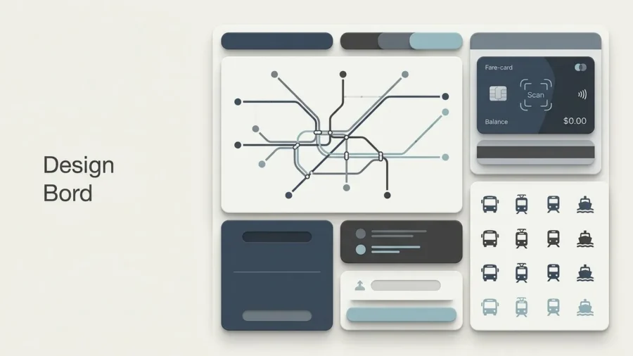
Why Modern Mobility Needs a Unified Transit Design System
In the world of urban mobility, the journey is rarely a straight line. A commuter might start by checking a mobile app for real-time arrivals, transition to a digital kiosk at a bus stop, and finally rely on physical overhead signage at a bustling train terminal. When these touchpoints speak different visual languages, the result is cognitive friction that leads to missed transfers and frustrated passengers. A robust transit design system acts as the connective tissue between these environments, ensuring that information remains legible and intuitive across every medium.
The Transit Design System Impact:
- Speed to Market: Launching new features or routes becomes a modular process rather than a ground-up redesign.
- Universal Accessibility: Standardized contrast ratios and typography ensure compliance with modern accessibility mandates for all users.
- Brand Reliability: Visual consistency reassures passengers that they are interacting with an official, safe, and managed service.
Reducing Cognitive Load for Commuters
Commuting is often a high-stress activity, particularly during rush hour or service disruptions. By standardizing iconography, color-coded wayfinding, and data visualization, agencies can help passengers process information almost subconsciously. When a specific shade of blue always represents the express line and a specific chevron always indicates an exit, the brain doesn’t have to work as hard to navigate the environment. This efficiency is especially critical for tourists or individuals with cognitive disabilities who rely on predictable patterns to move through the city safely.
Bridging the Gap Between Digital and Physical Touchpoints
The greatest challenge for transit agencies is the handoff between the screen and the station. A transit design system isn’t just about UI; it’s about a holistic approach to wayfinding where the digital map in a passenger’s pocket perfectly mirrors the physical map on the platform wall. This alignment builds a sense of continuity, making the transition from a smartphone to a physical kiosk feel like a single, uninterrupted conversation.
A transit design system is more than a UI kit; it is a commitment to accessibility and wayfinding that ensures every passenger, regardless of their tech-savviness, can navigate their world with confidence.
Scaling Services Without Fragmenting the Brand
As cities expand and transit networks integrate new modes of transport such as bike-sharing or on-demand shuttles, the risk of brand fragmentation grows. A modular design system allows agencies to scale their services rapidly while maintaining a unified identity. By using a shared library of components, developers and designers can roll out updates to mobile apps or digital signage in a fraction of the time, ensuring that the latest accessibility standards, such as those outlined by the ADA’s latest web and mobile rules[1], are applied universally across the entire ecosystem.

Core Components of a High-Performance Mobility Framework: transit design system
Building a robust transit design system requires moving beyond aesthetics to focus on utility, speed, and cognitive load. In a high-stakes environment where a commuter might only have seconds to glance at a screen before a train departs, every pixel must serve a functional purpose. By standardizing the ‘atoms’ of the interface, transit agencies ensure that whether a user is checking a physical kiosk or a mobile app, the logic remains identical.
Iconography and Universal Symbols
Icons in a mobility context act as a global language, bypassing linguistic barriers to guide passengers toward exits, platforms, or elevators. A successful system utilizes a geometric, stroke-consistent library where symbols are instantly recognizable at small scales. These icons must be tested for legibility in various lighting conditions, ensuring that a ‘Bus’ or ‘Delay’ notification is understood even on a low-resolution digital display or under heavy glare.
Color Theory for High-Contrast Accessibility
Color in transit is more than branding; it is a critical tool for wayfinding and safety. High-contrast pairings are essential to assist users with visual impairments or those navigating in bright sunlight. To remain compliant and inclusive, designers must adhere to rigorous contrast ratios that ensure text and interactive elements stand out clearly against their backgrounds.
Quick Breakdown: Accessibility Standards
- Level AA (Text): Requires a contrast ratio of at least 4.5:1 for normal text and 3:1 for large text.
- Level AAA (Text): The gold standard, requiring a 7:1 ratio for normal text to maximize readability.
- Non-Text Elements: UI components and graphical objects must maintain a 3:1 ratio against adjacent colors.
- Color Independence: Never use color as the sole indicator for information; always pair with icons or text labels.
Typography for Rapid Information Processing
When it comes to typography, sans-serif typefaces like Inter or Frutiger are the industry gold standard for a reason. These fonts feature open counters and distinct character shapes that prevent letters from blurring together at a distance or on low-quality screens. A transit design system prioritizes high x-heights and generous tracking to ensure that station names and arrival times are legible from across a crowded platform, facilitating rapid information processing for every commuter.
In the world of mobility, design is successful only when it becomes invisible, allowing the passenger to move from point A to point B without a second thought.

Mapping the Digital Journey: From Route Planning to Real-Time Updates
The digital experience of a transit app is a high-stakes environment where users are often stressed, in a hurry, or navigating unfamiliar territory. A robust transit design system ensures that the transition from a desktop route planner to a mobile real-time update feels seamless. By standardizing the way information is presented across these touchpoints, agencies can reduce the cognitive load on passengers who need to make split-second decisions about their commute.
Standardizing Data Visualization for Maps
Maps are the heart of transit navigation, yet they are often the most cluttered elements of a digital interface. A design system solves this by implementing a layered approach to map styling. Instead of showing every bus stop and landmark at once, the system uses zoom-dependent logic to reveal details progressively. This ensures that a user looking for a city-wide train connection isn’t distracted by hyper-local bus stops until they actually need them.
Dynamic Components for Live Arrival Times
Live arrival data is only useful if it is trustworthy and legible. Within a design system, dynamic components for countdown timers should use distinct visual cues to separate scheduled times from real-time GPS data. Using a pulsing animation or a specific brand color for “Live” updates helps users immediately distinguish between a static timetable and a moving vehicle, providing the certainty they need to stay on track.
| Common Design Pitfall | Design System Solution |
|---|---|
| Cluttered, static maps | Layered, zoom-filtered views |
| Ambiguous arrival data | Distinct “Live” vs. “Scheduled” states |
| Inconsistent alert styles | Standardized, color-coded status banners |
Error Handling and Service Alert Patterns
When delays happen, clarity becomes the priority. A transit design system defines specific patterns for service alerts, ensuring that a minor delay doesn’t look the same as a total line closure. Following established accessibility standards, such as the Web Content Accessibility Guidelines, ensures these critical alerts are perceivable by all users, including those using screen readers or navigating in high-glare outdoor environments.[3]
Effective transit design doesn’t just show the way; it provides the confidence to move forward even when the unexpected happens.

Accessibility as a Foundation, Not a Feature
Transit is a fundamental public utility, which means a transit design system cannot treat accessibility as an afterthought or a secondary phase of development. If a commuter cannot read a digital timetable due to low contrast or navigate a station because the app’s wayfinding logic contradicts physical signage, the system has failed its primary purpose. Inclusivity must be baked into the component library from the very first pixel, ensuring that every traveler, regardless of their physical or cognitive abilities, can move through the city with dignity and independence.
Designing for Neurodiversity and Visual Impairments
For users with visual impairments, consistency in screen reader labels and focus states is vital. A scalable design system defines these properties at the atomic level, so every button and input field is inherently accessible. When designing for neurodiversity, the focus shifts to reducing cognitive load. This involves using predictable layouts, clear iconography, and avoiding sensory overload through minimalist UI patterns that prioritize essential travel information over decorative elements.
Accessibility Audit Checklist:
- Ensure all touch targets are at least 44×44 pixels for easy tapping on moving vehicles.
- Verify color contrast ratios meet WCAG 2.1 AA standards for all text and UI icons.
- Standardize ARIA labels for real-time data updates to assist screen reader users.
- Test typography scales for legibility in high-glare, outdoor environments.
Multi-language Support and Global Mobility Standards
Modern cities are hubs of international diversity, requiring transit systems to speak multiple languages fluently. A robust design system accounts for text expansion in different languages and ensures that iconography is culturally neutral and universally understood. By adhering to global mobility standards, agencies ensure that a tourist from another continent can navigate the local metro as easily as a daily commuter.
Physical-Digital Parity in Wayfinding
There should never be a disconnect between what a user sees on their phone and what they see on a station platform. Physical-digital parity ensures that the colors, symbols, and terminology used in the app are identical to the physical environment. This seamless transition reduces anxiety and builds trust, creating a unified experience that guides the user from their front door to their final destination without friction.
In the world of public transit, accessibility is not a compliance box to check; it is the benchmark of a truly functional and civilized urban infrastructure.
Operational Efficiency: How Design Systems Empower Transit Teams
Building a transit design system is not just an exercise in aesthetics; it is a calculated investment in operational longevity. For many agencies, the primary bottleneck in modernization is design debt, where fragmented codebases and inconsistent assets slow down every new feature rollout. By establishing a centralized source of truth, transit agencies can transition from reactive fixes to proactive innovation.
Accelerating Development with Reusable Code
A robust design system provides developers with a library of pre-tested, accessible components that can be deployed instantly. This approach eliminates the need to rebuild buttons, map interfaces, or schedule tables from scratch for every update. When the underlying code is standardized, pushing a system-wide update to accessibility standards or branding becomes a singular task rather than a multi-month overhaul across disparate platforms.
Efficiency Gains for Transit Agencies:
- Reduced time-to-market for critical service alerts and app updates.
- Lower maintenance costs by eliminating redundant CSS and legacy code.
- Guaranteed compliance with the latest ADA web and mobile accessibility rules.
- Consistent user experiences across web, iOS, and Android platforms.
Streamlining Cross-Departmental Collaboration
Transit projects involve a complex web of stakeholders, from urban planners and marketing teams to third-party software vendors. A shared design language acts as a bridge between these groups, ensuring that everyone uses the same terminology and visual standards. This clarity reduces the friction of handoffs and minimizes the risk of miscommunication that often leads to costly mid-project revisions.
Future-Proofing for Micro-Mobility and AI Integration
The modern transit landscape is expanding beyond buses and trains to include e-scooters, bike-sharing, and AI-driven route optimization. A scalable design system is built to absorb these new modalities. By defining how a “transportation provider” is represented visually and technically, agencies can seamlessly integrate micro-mobility partners into their primary apps without breaking the user experience or cluttering the interface.[1]
A design system is the engine room of a modern transit agency; it allows teams to scale their impact without scaling their headcount.
Conclusion: The Long-Term Value of Digital Consistency
Building a transit design system is not a one-off project; it is a strategic investment in the future of urban mobility. By centralizing components and defining clear interaction patterns, agencies can stop reinventing the wheel and start focusing on what truly matters: the passenger experience. This structured approach ensures that whether a user is checking a schedule on their watch or buying a ticket on a desktop, the brand remains recognizable and the interface remains intuitive. Ultimately, a well-maintained system reduces technical debt and allows transit providers to remain agile as new technologies and micro-mobility trends continue to reshape how we move through our cities.
Build a Seamless Journey with Align
Navigating the complexities of digital infrastructure requires a partner who understands the intersection of high-level UX strategy and technical scalability. At Align, we specialize in helping organizations in complex industries transform fragmented tools into cohesive, user-centric ecosystems. Whether you are looking to audit your current interface for accessibility gaps or need a robust transit design system built from the ground up, our team is ready to help. Visit align.vn today to learn how our expertise in design systems and digital product strategy can streamline your operations and improve passenger satisfaction across every touchpoint.
References
- Fact Sheet: New Rule on the Accessibility of Web Content and Mobile Apps Provided by State and Local Governments | ADA.gov
- WCAG 2.1 Accessibility Checklist – Pilot Digital
- Web Content Accessibility Guidelines 2.1 | Accessibility | Oregon State University
- New ADA Title II Rule on Web Accessibility: Fact Sheet Guide | Accessible.org