A strong palette is not enough. Without a system for hierarchy, contrast, and repetition, color starts working against the interface instead of guiding it. You might have spent hours hand-picking the perfect brand blues and energetic oranges; however, if your buttons disappear into the background or your text strains the eye, the aesthetic appeal becomes irrelevant. Many designers fall into the trap of choosing colors based on mood boards alone, forgetting that digital products require a rigorous logic to remain functional.
Building a scalable interface color system is the bridge between a pretty mockup and a high-performing product. It is about more than just hex codes; it is about establishing a functional framework that ensures every shade serves a specific purpose, from signaling an error to highlighting a call to action. When you prioritize accessibility, such as meeting the specific contrast ratios defined by WebAIM, you ensure your design is usable for everyone. Let’s explore how to move beyond basic swatches and create a robust system that feels intentional, professional, and perfectly aligned with your user goals.[1]
What is an Interface Color System and Why Does It Matter?
An interface color system is far more than a collection of aesthetic choices or a simple brand palette. It is a disciplined framework of logical rules that dictates how color functions across a digital product. While a brand palette might tell you what your colors are, a system defines what they do. It transforms abstract hues into functional tools that guide user behavior, communicate status, and establish a clear visual hierarchy. Without this underlying logic, even the most beautiful designs risk becoming confusing or inaccessible to the end user.
Defining the Foundation: Primary, Secondary, and Accent Colors
At the core of every robust system lies a tiered hierarchy. Primary colors act as the face of the brand, appearing most frequently in the UI to establish identity. Secondary colors provide essential support, helping to distinguish different sections or features without competing for attention. Finally, accent colors are used sparingly to draw the eye toward critical interactive elements, such as buttons or notifications. This structure ensures that the interface remains balanced and that the user always knows where to look first.
The Psychological Impact of Color in UX
Color is the most immediate way to evoke emotion and influence perception in design. It can build trust, create a sense of urgency, or provide a feeling of calm. Beyond emotion, color serves a vital functional role in accessibility. For a design to be effective, every color paring must maintain enough contrast to be readable. Following established standards for color contrast ensures that text is legible against its background, which is a fundamental requirement for inclusive design.
3 Pillars of a Color System:[2]
- Consistency: Ensures that the same color always implies the same action or meaning across every page.
- Accessibility: Guarantees that the interface remains usable for everyone by maintaining high contrast ratios.
- Hierarchy: Uses color weight to guide the user’s eye toward the most important information first.
A great interface color system doesn’t just make a product look better; it makes the product work better by reducing cognitive load and highlighting the path to success.

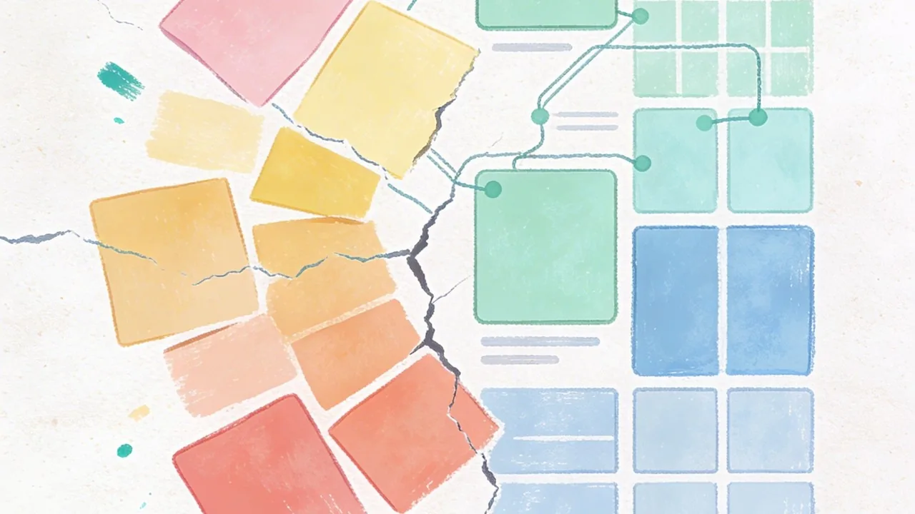
The Anatomy of a Professional Interface Color System
Building a scalable interface color system requires more than picking a few shades that look good together; it requires a structured hierarchy that separates the raw color values from their functional purpose. This architecture allows design teams to make sweeping visual updates without breaking the logic of the application.
Base Palettes vs. Semantic Colors
A professional system begins with a base palette, often called global or primitive colors. These are the raw ingredients, such as Blue 500 or Grey 100. However, designers should rarely use these primitives directly in a layout. Instead, we map them to semantic colors, which describe the intent of the color rather than its appearance. For instance, instead of telling a developer to use Blue 600 for a button, you tell them to use Action-Primary. This abstraction makes it incredibly easy to switch to a dark mode or rebrand the entire product by simply remapping the underlying base values.
| Type | Example Token | Definition / Use Case |
|---|---|---|
| Base Color | Blue 600 | The raw hex code or primitive value used as a source. |
| Semantic Color | Action-Primary | The functional role, such as the main call-to-action button. |
| Semantic Color | Status-Success | Used for positive feedback, regardless of the specific hue. |
Establishing Tints, Shades, and Neutrals
Once the primary brand colors are set, we generate a spectrum of tints and shades to handle various UI states like hover, active, and disabled. Neutrals are the unsung heroes of any interface color system; they provide the necessary structure for borders, backgrounds, and text hierarchy. By creating a robust scale of greys, you ensure there is enough contrast to meet accessibility standards, such as those outlined by the WCAG guidelines[3] for readability.
The Role of Data Visualization Colors
Data visualization requires its own logic within the system. These colors must be distinct from the primary brand palette to avoid confusion and must be tested for color blindness. A well-constructed system includes a dedicated categorical palette that ensures charts and graphs remain legible and aesthetically balanced alongside the rest of the UI.
A semantic color system acts as a translation layer between design intent and engineering execution, ensuring the product remains maintainable as it grows.

How to Build an Interface Color System for Accessibility
Accessibility is not a post-launch checklist item; it is the foundation of a functional interface color system. When we design with inclusivity in mind, we ensure that every user, regardless of their visual capabilities, can navigate and interact with a digital product with ease. The goal is to eliminate barriers by creating high-legibility environments that respect the diverse ways people perceive light and color.
Meeting WCAG 2.1 Contrast Standards
To satisfy international standards, your color choices must pass specific contrast ratios. For standard body text, a ratio of 4.5:1 against the background is the mandatory baseline for AA compliance. This ensures that users with moderate low vision can read your content without strain. Larger text or bold headings have a slightly more relaxed requirement of 3:1, but aiming higher is always the safer bet for a truly inclusive experience.
Designing for Color Blindness and Visual Impairments
Color should never be the sole carrier of information. If a user has protanopia or deuteranopia, a red error message and a green success message might look identical without additional cues. By pairing your interface color system with icons, patterns, or clear text labels, you create a fail-safe design. This multi-sensory approach ensures that even if the color is stripped away, the meaning remains intact.
Testing Tools for Inclusive Design
Building a robust system requires constant validation through specialized tools. Designers should use plugins that simulate various types of color blindness and automated checkers to verify contrast across different components.[4]
Accessibility is not a constraint on creativity; it is a framework that ensures your design is actually usable by the people you built it for.
Accessibility Checklist:
- Verify a 4.5:1 contrast ratio for all primary body text.
- Check contrast for all state changes, including hover, focus, and active states.
- Ensure icons or text labels accompany color-coded alerts.
- Test the palette using a grayscale filter to check for value hierarchy.

Maintaining Consistency with an Interface Color System
Building a palette is only half the battle; the real magic happens when you turn those swatches into a living, breathing interface color system. Without a clear structure, even the most beautiful colors can lead to design sprawl and technical debt as your product scales. The goal is to create a shared language that bridges the gap between a designer’s vision and an engineer’s implementation.
Naming Conventions and Design Tokens
Rather than referring to a color as “Light Blue” or by its hex code, sophisticated teams use design tokens. Tokens act as an abstraction layer, naming colors based on their function, such as “action-primary-hover” or “surface-background-subtle.” This semantic approach allows for global updates; if you decide to tweak your primary brand blue, you change the value in one place and it propagates throughout the entire application without manual hunting and pecking.
Documentation and Dark Mode Transitions
A well-documented interface color system in tools like Figma ensures that every stakeholder understands the logic behind each choice. This documentation becomes critical when managing dark mode transitions. By mapping light mode tokens to their dark mode counterparts, you ensure that the visual hierarchy remains intact and that contrast ratios meet essential standards. According to WebAIM[1], maintaining proper contrast is a core requirement for accessibility, making these systematic mappings vital for a usable product.
A design system is only as strong as its handoff; tokens turn color from a subjective choice into a scalable engineering asset.
The Benefits of Color Tokens:
- Eliminate hard-coded hex values in the codebase.
- Enable seamless theme switching, such as light to dark mode.
- Reduce the risk of “color bloat” where similar shades multiply.
- Speed up the handoff process between design and development teams.

Common Mistakes When Implementing an Interface Color System
Building a robust interface color system is a feat of logic, but even the most well-intentioned frameworks can crumble during execution. Small inconsistencies at the start often snowball into technical debt that haunts both designers and developers for months.
Overcomplicating the Palette
One of the most frequent traps is creating too many options. Designers often fall victim to “Color Creep,” a phenomenon where dozens of nearly identical hex codes wander into the codebase because there was no clear rule for which grey to use. When your palette is too broad, the interface loses its visual cohesion, making the product feel unpolished and fragmented.
Ignoring Contextual Contrast
A color might look stunning in a vacuum, but its utility depends entirely on its environment. Failing to account for how colors interact leads to significant usability hurdles. According to WebAIM[1], following specific contrast requirements is essential for readability; ignoring these standards often results in “invisible” text or buttons that fail to guide the user effectively.
Hardcoding Colors Instead of Using Variables
If your developers are still copy-pasting hex codes directly into CSS, your system is already broken. Hardcoding makes global updates impossible and creates a nightmare for theme management. Without a tokenized approach, a simple brand refresh becomes a manual, error-prone scavenger hunt through thousands of lines of code.
Consistency isn’t just a design preference; it is a technical requirement for a scalable product.
Fix This / Avoid That:
- Avoid: Adding a new shade for every minor edge case.
- Fix: Stick to a defined scale of 5 to 9 shades per hue.
- Avoid: Choosing colors based solely on brand aesthetics.
- Fix: Test every pairing against WCAG contrast standards early.
- Avoid: Using raw hex codes like #2D2D2D in stylesheets.
- Fix: Use semantic variables like @color-text-primary.
Mastering Your Interface Color System
Building a robust interface color system is far more than an exercise in aesthetics; it is a strategic investment in your product’s longevity and usability. By moving away from arbitrary hex codes and embracing a structured, tokenized approach, you bridge the gap between creative vision and technical execution. A well-defined palette ensures that your brand remains recognizable while providing the necessary contrast for accessibility and the flexibility for future growth. As you refine your digital presence, remember that consistency is the foundation of user trust. When your colors work in harmony, your users can focus on what truly matters: engaging with your content and achieving their goals without friction.
Elevate Your Brand with a Custom Interface Color System from Align
Navigating the complexities of color theory and technical implementation can be daunting for even the most seasoned product teams. At Align, we specialize in crafting sophisticated design systems that empower businesses in the US and international markets to scale effortlessly. Our team combines deep UI/UX expertise with a rigorous approach to accessibility, ensuring your digital products are as inclusive as they are beautiful. Whether you are launching a new platform or managing a complex rebranding effort, we help you eliminate design debt through semantic architecture. Contact us today to book a consultation and audit your current interface colors; let’s build a high-performing digital experience that resonates with your audience and stands the test of time.
References
- WebAIM: Contrast and Color Accessibility – Understanding WCAG 2 Contrast and Color Requirements
- Oregon Department of Education : Color Contrast – WCAG 2.0 Ref 1.4.3 : Web Accessibility Checklist : State of Oregon
- Color contrast – Accessibility – MDN Web Docs – Mozilla
- Web Accessibility Color Contrast Checker – Meet WCAG Conformance