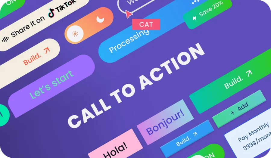
Imagine your website as a vibrant clothing marketplace with possibilities. Customers browse your wares, intrigued by your yellow T-shirt offering. But how do you turn that interest into action? That’s where the call to action (CTA) steps in. A well-crafted CTA button is not just a directive; it’s the culmination of a website’s narrative, guiding users towards a definitive action, be it making a purchase, signing up for a newsletter, or learning more about a service.
This blog delves into the anatomy of effective CTAs, shedding light on their importance, design principles, and showcasing examples of exemplary CTAs in action. By understanding and implementing strategic CTAs, you can transform passive browsers into active participants, significantly enhancing the user experience and achieving your website’s goals.
What is a Call to Action?

At its core, a CTA is a clear, concise message that compels website visitors to take a specific step. It’s the bridge between browsing and engagement, the spark that ignites action. CTAs come in various forms – from ‘Sign Up’ buttons leading to a registration page, ‘Learn More’ links providing additional information, to ‘Buy Now’ commands facilitating immediate purchases.
The design and placement of CTAs are pivotal in this journey. An effective CTA stands out visually and linguistically, offering clear direction while aligning with the overall website aesthetic. It’s not just about the look; it’s about creating an intuitive path that feels natural and unforced to the user. For instance, a ‘Subscribe’ button at the end of an engaging blog post capitalizes on the reader’s heightened interest, making the call to action feel like a natural next step.
Why the Mighty CTA Matters:
The benefits of a strong CTA go far beyond simply boosting conversions. They act as the persuasive whisper in your visitor’s ear, highlighting the value of taking action. Here’s why CTAs are crucial for your website’s success:
- Clarity and Focus: CTAs eliminate ambiguity, guiding visitors towards your conversion goals. Gone are the days of leaving users wondering what to do next.
- Increased Conversions: From a business perspective, CTAs are the measuring stick of a website’s success. A well-placed and effectively designed CTA can dramatically increase conversion rates, turning a passive visitor into an active customer and boosting your lead generation, sales, or engagement metrics.
- Improved User Experience: CTAs provide a clear path forward, guiding users through your website and encouraging them to explore deeper. The psychological aspect of CTAs cannot be understated. A compelling CTA triggers an emotional response, be it the urgency to not miss out (FOMO) or the satisfaction of discovering something new
- Brand Messaging Reinforcement: Effective CTAs reflect your brand voice and messaging, further solidifying your brand identity in the user’s mind.
7 Design Tips for Buttons That Make People Click
Designing CTAs that resonate with your visitors is both an art and a science. Here are some tips to transform your buttons into irresistible click magnets:
- 1. Clear and Concise:Keep your CTA wording short, direct, and action-oriented. Use verbs like “Download,” “Buy now,” “Subscribe us,” “Learn More,” “Contact us” or “Start Free Trial.”
- 2. Action-Oriented Language:Focus on the benefit for the user, not just your own goals. Use phrases like “Get Results Now” or “Unlock Your Potential.”
- 3. Color that Pops:Choose a button color that stands out from your website’s background, emphasizing the call to action.
- 4. Contrast is Key:The use of contrasting colors, while maintaining the website’s color scheme, is a strategy that makes the CTA stand out.
- 5. Size and Placement:The size of the button should be large enough to be noticed, but not so large that it distracts from the content. Positioning it strategically above the fold or near relevant content.
- 6. Responsiveness:Another key aspect is the button’s responsiveness and ease of use, especially on mobile devices. A button that is difficult to click or doesn’t respond well on a touchscreen can deter users from taking action.
- 7. A/B Testing is Your Friend:Testing different versions of a CTA button (A/B testing) is crucial. This involves changing one aspect of the CTA (like color, text, or placement) and seeing which version performs better. This data-driven approach ensures that the CTA is optimized for the highest possible conversion rate.
5 CTA Inspiration: Websites Doing It Right:
Now, let’s step out of the theory and into the realm of practical examples. Here are some websites that masterfully wield the power of the CTA:
1. Sportify

Music to your ears, literally! Spotify’s vibrant, animated “Sign up Free” button pulsates with energy, mirroring the platform’s vibrant music experience. You can clearly see the contrast in the call to action area compared to the black background of the application. So outstanding! This visual cue effectively grabs attention and adds a touch of fun to the call to action.
2. Dropbox:

Remember the classic “Get Started” CTA? It stands out against the calming blue backdrop, clearly conveying the value proposition and encouraging immediate action. Their “Create Free Account” button transitions to “Get 2GB Free” on hover, highlighting the immediate benefit and incentivizing action. This micro-interaction adds a touch of engagement to the CTA.
3. Airbnb:

“Become a Host” is strategically placed next to enticing images of beautiful homes, tapping into users’ dreams of sharing their own space.
4. Figma:

The CTA button of Figma ‘Get Started for Free’ is prominent and easy to find, above the fold and bottom on the webpage. This ensures it’s seen by the majority of visitors and invites them to explore further. If you’re looking to craft compelling CTAs for your own projects, Figma’s approach offers valuable inspiration. Remember to focus on simplicity, highlight benefits, use strong action verbs, and tailor your message to your audience’s needs.
5. Slack:

Known for their landing page expertise, Slack doesn’t disappoint with their CTA game. What stands out on Slack homepage are more CTAs like “Try for free” and “Talk To Sales” buttons that repeat many times. This straightforward web design compels visitors to progress in their customer journey.
Remember, your website is a journey, and your CTAs are the signposts directing visitors towards a desired destination. By understanding the power of effective CTAs, designing them with purpose, and constantly testing and refining them, you can transform your website into a conversion-generating powerhouse. So, unleash the persuasive power of the CTA and watch your website visitors turn into engaged customers, one click at a time.
Ready to harness the persuasive power of CTAs for your website? Align’s expert website design services can transform your online presence. Let’s make your website a conversion-generating powerhouse, one click at a time!
Interested? Reach out to us today and let’s get started on your journey to online success.
Additional Tips:
– Consider tailoring your CTA for different sections of your website or visitor segments.
– Personalize your CTA messaging whenever possible to strengthen the connection with your audience.
– Use urgency or scarcity tactics strategically to motivate action, but avoid being overly pushy.
– Track the performance of your CTAs and use data to inform future optimization efforts.